
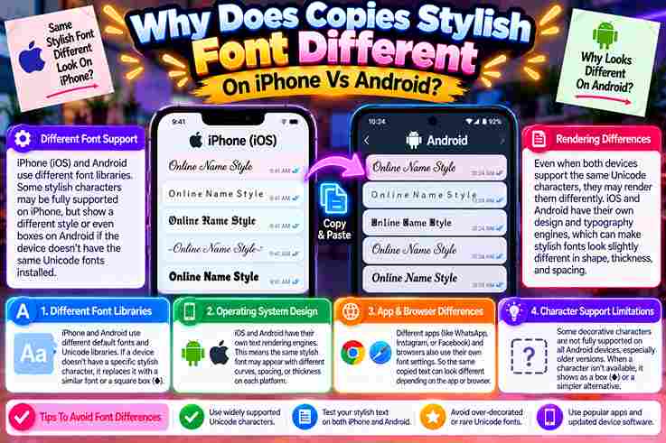
After personally testing styled lettering across iPhone and Android, I found the surprise starts after pasting: each operating system selects its font library, so an identical Unicode string may render differently despite looking stable initially.
In practice, Apple can draw a character with San Francisco, while Google reaches into Noto or a fallback chain. When glyph coverage is missing, unusual symbols can appear as a box, replacement symbol, or shape.
Table of Contents
Why Fonts/Text Look Different On iPhone Vs Android (Core Cause)
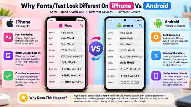
From my testing, styled characters are not actual typefaces; they are Unicode characters. Each OS uses own fonts, coverage, and glyph shapes, so identical copied text can render visually different across iOS and Android devices.
The sender’s device stores and sends the same code points, but the reader’s phone selects an available font. Missing glyph coverage, app rules, font spacing, and combining marks create boxes, thinner letters, or unexpected substitutions.
Also Read: Transform Your Text with G Fonts Generator
Why Some Characters/Boxes Show Up Differently (Missing Glyph Coverage)
When a stylish symbol becomes an empty square, the issue is usually glyph coverage, not the transfer action. I have seen iOS choose a different fallback source, while unsupported symbols become tofu on-screen after posting.
The surprising part is that the sender may see perfection. On another handset, a mid-string symbol can become a block because the local library lacks that shape; the software simply doesn’t know what to draw.
Which Styles/Fonts Are Safe/Consistent Across Both Platforms
From testing display name and bio text on different devices, I’ve found bold, italic, small caps, and monospace safest. Their shapes are broadly covered, appearing nearly identical across major platforms, apps, keyboards, and browsers today.
By contrast, fraktur, double-struck, and obscure decorative styles often diverge when each phone chooses fallback fonts. I reserve them for short headings, keeping names, links, dates, prices, and essential wording in plain characters for clarity.
Custom/Installed Font Rendering Differences (Developer-Side, TTF/OTF Issue)
In testing hybrid apps, I found a bundled ttf or font file can render differently when iOS and Android resolve font-weight, fallback glyphs, and asset paths; the visible difference often starts inside configuration, not copying.
A fix is verifying src, url, assets, font-family, font-style, and Ionic CSS Variables, then testing each selected word on another device; mismatched OTF naming or unsupported characters may trigger a separate font, boxes, or substitution.
Non-English/Multi-Language Character Rendering
Arabic, Urdu, Hindi, and accented scripts may look polished on one device yet uneven on another because each installed typeface supplies different glyph shapes, spacing, and fallback behavior across the receiving app in daily messaging.
From testing bilingual profiles, I find plain text safest for names and contact details, while a restrained style suits a brief status. Always inspect the saved result on both platforms before publishing multilingual captions publicly.
How To Copy, Paste & Fix Fancy Fonts On Mobile
How To Copy And Paste Fonts On iPhone And Android: Quick Steps
On iPhone, I launch Safari, visit a service, type a short phrase into the input box, review results, and pick the selected result. Use Copy, move to the target app, press, hold, and select Paste.
On Android, begin with Chrome, compare available results, select Copy beside the chosen style, then launch your destination app. Press and hold the text field, select Paste, and check spacing before finalizing the main message.
Device-Specific Instructions — iPhone
On iPhone, I start inside Safari, not the destination app: enter text in a font generator, choose style, tap Copy, then open the target field and use the press-and-hold editing menu for insertion cleanly afterward.
Before saving, I paste into Notes first; this catches stacked marks or characters that display incorrectly. My practical habit is previewing the draft caption, keeping essential profile wording plain, and testing visibility on another device.
Device-Specific Instructions — Android
On modern Android, I begin with outcome: if styled text survives saving, the basic process worked. Paste through the clipboard interface, inspect the editing preview, then compare behavior inside the same app before publishing anything.
From my testing, keyboard clipboard history helps when failed pastes occur, yet Android versions vary. Recopy the short profile text, strip unusual symbols, preserve a plain-text copy, and verify visible fields after reopening profile once.
Also Read: Stunning Instagram Fonts to Stand Out
Which Apps Support Fancy Fonts?
Most social apps do not install a new font; they accept different characters that resemble styled lettering. In practice, ordinary letters remain safer, while decorative text depends on each app, field, and the viewer’s device.
The comparison below reflects copy operations, not guaranteed typography. A destination field may accept styling while another rejects it, especially when native app formatting, moderation rules, or a browser field handles the same text differently.
| App | Commonly Accepted Areas | Best Use | Main Limitation |
| Profiles, captions, comments | Brief visual emphasis | Some character sequences may be simplified after storage | |
| Chats, status, About text | Short emphasis | Dense styling reduces clarity | |
| TikTok | Profiles, captions, comments | Hooks and creator names | Ornamental strings may render unevenly |
| Discord | Messages, nicknames, profiles, channel labels | Identity and light emphasis | Bots and fallback fonts may process characters unevenly |
| X | Posts, replies, profiles, display names | Small visual accents | Tight layouts expose spacing problems |
Instagram usually accepts stylish Unicode in bios, captions, comments, and a display-name field. However, a published caption can change after saving when the platform decides internally to reject an unsupported character sequence or normalize spacing.
I recommend using decorative text only as a small accent around one important phrase. Leave links, prices, and profile details in plain characters, because assistive tools and search systems may interpret ornate lettering less reliably.
WhatsApp handles pasted styling well inside chats, statuses, and profile text, yet long messages become harder to scan. I test a WhatsApp draft first, then leave critical information in standard lettering for dependable reading everywhere.
When pasting fails, open the keyboard clipboard, choose a shorter phrase, and copy again. Some phone keyboards insert hidden spacing, so trying a basic text field before returning to WhatsApp reveals whether characters are compatible.
Also Read: ASCII Generator Made Easy
TikTok
TikTok generally displays stylish Unicode in bios, captions, and comments, but crowded designs can weaken clarity. Use a short heading or one styled word, then preview the post carefully because rendering may vary across phones.
Creators should avoid filling every caption with symbols. A simpler style improves recognition for calls to action, usernames, and hashtags. When letters appear as boxes, remove combining marks or replace the phrase with ordinary text.
Discord
Discord supports pasted styles in messages, nicknames, channel labels, and profiles, although moderation bots may process them differently. For community instructions, use a readable bio approach: ornament for identity, standard text for important community rules.
Desktop and mobile Discord can show subtle differences when a custom font or system fallback changes glyph shape. I compare an editing preview with another device, keeping load-bearing words readable instead of styling every line.
X
X usually accepts stylish characters in posts, replies, bios, and display names, but compact layouts punish excess decoration. Make each phrase brief, protect important profile information, and check whether links remain separate from surrounding symbols.
For dependable reach, treat fancy lettering as throwaway flair, not essential meaning. Search, screen readers, and reposting tools handle ordinary letters more consistently, so place the key statement first and style only a secondary fragment.
Fix Boxes, Failed Pastes, And Disappearing Text
When characters box out, I first test whether the phrase was copied correctly in Apple Notes and Google Keep. This separates missing character set coverage from an app field rejecting decorative symbols during storage attempts.
If text vanishes after saving, I remove certain characters, retain a plain version, then shorten phrase inside the username field. In practice, basic bold survives better than italic style or obscure decoration across app versions.
Fancy Fonts Appear As Boxes
When decorative Unicode symbols exceed a phone’s glyph coverage, users may see a question mark, blank square, or failed characters. In my testing, old Android builds may hide gaps that a modern phone reveals immediately.
Boxes do not prove the sender copied text incorrectly; the reader’s device decides whether the replacement remains readable. I usually retry with widely-covered bold, italic, or plain copy, then check a second device before publishing.
Also Read: Is It Safe To Use Unicode Text For Gmail Password
The Text Will Not Paste
When pasted characters refuse to appear, the issue is rarely the font itself. In my testing, the main difference is the destination field: its field rules, allowed characters, or app version silently block unsupported Unicode.
Before blaming the phone, test the same text in a mobile browser or note. I have found in-app browser interfaces interfere with clipboard menus, while technical account fields apply stricter rules than visible profile text.
The Text Disappears After Saving
When disappearing text appears only after content is saved, the editor has usually filtered unsupported Unicode during validation. I have seen a phone app accept stylish letters initially, then silently replace or delete them afterward.
My practical fix is to remove decorative marks, test a short word, and save again. When that survives, add styling gradually; otherwise, try another field, because captions, bios, and usernames often apply different storage rules.
Best Practices For Cross-Platform Compatibility
Best Practices For Readable Fancy Text
From testing profiles across mobile platforms, I treat small caps as a safer choice than dense decorative styles. Keep labels to few words, preserve ordinary numbers, and check every display name before publishing publicly online.
On iPhone and Android, I test the result inside apps, then compare bio, description, and status lines. When spacing feels crowded, I shorten it, respect the field limit, and keep important details easy to read.
Accessibility Note
From accessibility testing, I have found that decorative Unicode text may appear attractive yet confuse screen readers, weaken searchable names, and hide a visible letter when a device lacks a suitable glyph or font support.
Use style few words, keep the full paragraph plain, and provide a clear description beside decorative headings. I also recommend testing with older Android, iPhone, browser, and assistive tools before publishing essential profile details carefully.
Also Read: Free Copy and Paste Font Generator
Ionic Forum Thread — Unresolved Side Issue
In one Ionic forum thread, the .ttf versus .otf conflict never reached a documented reason. My testing showed TrueType and OpenType files could load, while hidden subfamilies, naming properties, and standard weight mappings changed results.
The unresolved side issue was not iPhone-specific. A variant may work in simulator, yet fail when Windows metadata exposes regular as the main font or assigns a subtype, leaving Ionic unable to recognize the file.
Why Does Fancy/Styled Text Look Different On iPhone Vs Android?
From my testing, default font choices, family metrics, and missing symbol coverage explain most variation. iPhone often favors Helvetica Neue, while Android rendering may differ, so tight text, accent marks, and bold style shift visibly.
Why Do Some People See Boxes And Others Don’t / Why Do Fancy Fonts Show As Boxes?
From testing mixed devices, boxes usually mean a gap in glyph support, not broken text. One phone’s Noto family may cover symbols another leaves unavailable, so a simpler sans-serif fallback or system update restores clarity.
Which Styles Look The Same / Are Safe On Both iPhone And Android?
From testing both platforms, monospace styles look nearly identical and are safest for dates, addresses, a short heading, or paragraph text. The toughest case appears when editing profile fields, so preview every view before publishing.
Is It My Phone Or The Sender’s That Causes The Difference?
From testing across phone brands, I’ve found the sender creates the Unicode style, while your device’s engine, font coverage, and app rules determine its final display; therefore, both sides can cause a slightly different result.
Is The Process The Same On iPhone And Android?
From my testing, both platforms follow similar steps: create styled text, copy it, then paste it. Android may show a confirmation message after opening the app, while iPhone displays the result quickly with fewer prompts.
Why Don’t Fancy Fonts Work In Instagram Captions?
From testing, Instagram accepts fancy Unicode in post text, yet some account fields, comments, or username areas apply stricter filters. The issue is rarely copying; unsupported symbols, moderation checks, and platform rules often remove styling.
Why Will The Fancy Font Not Paste?
When fancy text refuses to paste, confirm the app accepts Unicode, then try a plain field. If it appears elsewhere, the issue affects a different part. Keep an available backup, paste directly, and return afterward.
Why Does Fancy Text Disappear After I Save It?
In my testing, content can appear saved yet disappears because an app rejects unsupported characters. Use a basic style, tap save, and check whether it remains visible before adding more text to the bio field.