What Makes a Font Easy to Read?
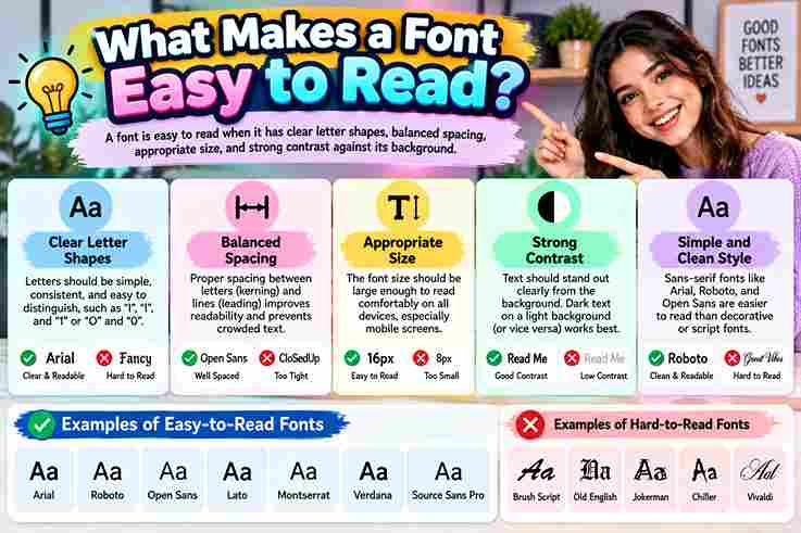
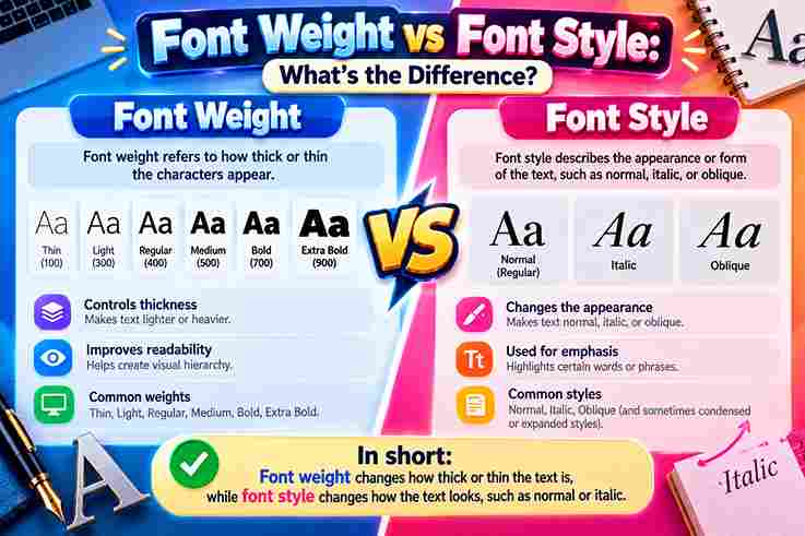
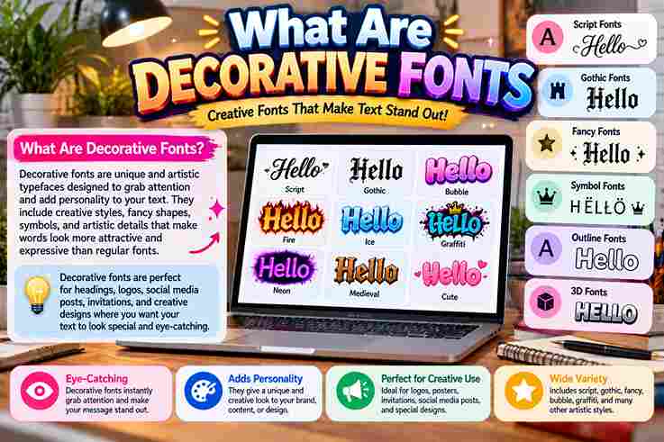
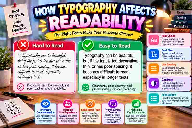
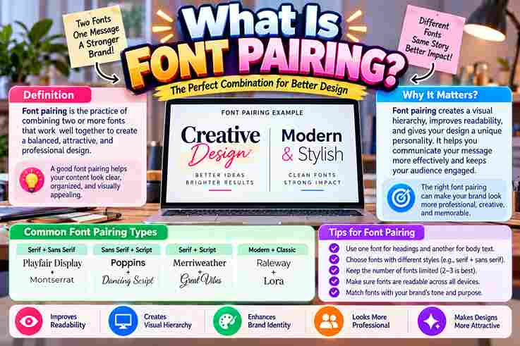
A readable font starts with clarity, but experienced designers look beyond appearance. Letterforms, x-height, proportions, and character distinction determine whether body text feels effortless during sustained eye scanning, especially on modern screens and digital contexts. From my testing, effective design balances simplicity, consistency, and visual flow rather than chasing novelty. Good kerning, letter spacing, suitable font structure, and careful testing help preserve readability across devices, formats, and audiences with confidence. What Makes a Font Easy to Read? A truly readable typeface balances letterform clarity, x-height, spacing, font weight, and contrast before visual style matters. I test body text across digital interfaces, checking screen readability, clarity, and legibility at practical font size ranges. Strong choices respect audience, context, and environment rather than trends. Clear character distinction, consistent typography hierarchy, comfortable line spacing, and accessible text visibility make long-form content easier to scan, especially on mobile devices and websites. Serif Vs. Sans-Serif: Which Is Easier To Read? Serif and sans-serif choices rarely determine readability alone; in practice, typeface, font size, spacing, and contrast interact with audience needs. I often test letterforms across context before judging either category carefully in testing with users. For digital interfaces, screen readability can favor simpler forms, while long-form print may benefit from familiar details. Yet print readability depends on typography choices collectively, not a universal serif or sans-serif rule in every setting. Letter Spacing, Kerning, And Spacing Thoughtful line spacing and measured gaps create a steady reading rhythm. I often refine these details after testing paragraphs, because crowded characters can undermine otherwise strong type choices, especially when text density increases on screens comfortably. Visual rhythm depends on more than equal gaps: letter distinction and distinguishable characters must remain obvious. A consistent approach to kerning and spacing prevents clusters, helping readers move across words without unnecessary pauses or hesitation. Also Read: Fancy Text Generator – Transform Your Text Into Something Fancy X-Height And Proportions Lowercase characters with a generous x-height often feel larger at identical font size, improving screen readability and reducing effort. In my testing, balanced proportions make letterforms easier to scan across small text and dense interfaces. Good ascenders and letterforms create recognizable shapes, while consistent proportions support legibility, visual consistency, and accessibility. I favor typefaces whose weight, context, and audience remain comfortable when reading long passages on screens without unnecessary visual strain. Character Distinction And Letterform Clarity Good type rarely announces itself. In practice, character distinction depends on open shapes, clear counters, and consistent letterforms. Strong visual clarity lets readers separate similar glyphs quickly, especially when small text appears on screens efficiently. I test fonts by scanning real sentences rather than isolated samples. Balanced letterform construction, adequate spacing, and recognizable lowercase characters reduce hesitation, while distinct ascenders and descenders preserve legibility throughout dense reading consistently across layouts. Font Weight And Stroke Characteristics Font weight changes how quickly letters separate during reading, while stroke contrast controls visual texture. In my testing, moderate weight with consistent letterforms improves clarity, especially when smaller text meets demanding screen readability conditions well. Heavy strokes can reduce open space and make confusing characters merge, yet overly light forms disappear against a background. Good choices balance text visibility, accessibility, and readability, particularly across digital interfaces and healthcare materials daily. Font Size And Scale Font size changes readability before decorative detail matters. On screen, a slightly larger body text setting can improve legibility, especially across digital interfaces where users scan quickly and device dimensions vary significantly between common conditions. A practitioner’s useful starting point is a comfortable range, then testing 16–18px against audience needs. Screen readability depends on scale, viewing distance, and context; real users reveal whether sizing supports accessibility without weakening hierarchy. Clarity, Simplicity, And Decorative Fonts Readable typography begins with clarity, not ornament. In practice, I find body copy performs best when simple fonts preserve legibility, while decorative fonts remain reserved for display type, where reduced reading demands allow more personality. I often test typeface selection against real screens before approving font pairing or decorative type. Excess styling can weaken text visibility and user experience; restraint improves visual clarity, especially when font size and spacing change across. Contrast Contrast does more than separate letters from backgrounds; it guides attention, reduces strain, and sharpens reading decisions. In practice, I assess body typography with font combinations whenever text must remain reliable at varying screen conditions. A strong relationship between foreground and background can outperform heavier type. I adjust tone before weight, especially for headline typeface and supporting text, because balanced design clarity preserves scanning speed and comfortable reading across devices. Line Length And Leading In practice, leading matters as much as letter spacing when readers move through dense material. Tight settings create cramped lines, while excessively loose spacing interrupts reading flow and weakens text clarity across screens and pages. I usually adjust tracking, character spacing, and text spacing together, then test scanning at normal speed. A measured visual rhythm keeps balanced text comfortable, especially when paragraphs extend across wider layouts or narrow columns online. Consistency And Typography Hierarchy In practice, consistency lets readers recognize patterns before they consciously process meaning. A stable typography hierarchy separates headings from body text, while font selection keeps each level predictable on interfaces and devices across multiple screens. I have found that strong visual consistency reduces hesitation, especially when readability depends on repeated letterforms and spacing. Clear levels create clarity, support usability, and make dense pages easier to scan without adding decorative noise. Also Read: Discord Fonts: Rule Every Server Combined Font Examples Strong font pairings often work because each font family has a distinct role. I test headings against body text, checking hierarchy and spacing until the combined setup feels calm, clear, and effortless across screens consistently. A practical visual system can combine serif warmth with sans-serif efficiency, but typography should still protect readability. In real projects, I compare font selection across digital layouts and print samples before approving one pairing carefully. Why Are Legible, Simple Fonts Important For Businesses? Businesses benefit when readable fonts reduce … Read more