Serif vs Sans Serif Fonts: Key Differences

Serif vs Sans Serif Fonts: Key Differences
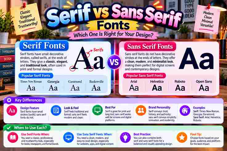
Choosing between Serif fonts and Sans-Serifs is less about rules than understanding their visual differences. In practice, typography works best when its style of design, brand feeling, and good readability support the message and audience. Serifs bring small decorative strokes and a classic vibe, while sans serif lettering favors a streamlined look, minimalist simple neat forms, and no small lines. The distinction matters because choice changes tone without changing words. Serif Vs Sans Serif Font Differences The difference is not merely decorative. Brand perception often reflects processing fluency: serif typefaces score higher for heritage cues, while sans serif typefaces score higher for immediacy, openness, and a distinctly contemporary sense of directness. Serif typography often signals tradition authority, whereas sans serifs emphasize modernity clarity. Still, execution decides success: good spacing, sensible line length, and adequate contrast can matter more than category labels alone visually in real applications. What Are Serifs? A serif is the terminal detail added to letter strokes, often described as small decorative lines or feet at the end of each stroke. These marks give characters stronger differentiation and a historically rooted texture. Serif design contains four types commonly discussed: old-style, transitional, new-style, and slab serifs. Their forms differ through terminal shape, stroke contrast, and the slope of ovals, letting designers tune warmth, elegance, strength, or drama precisely. Also Go: How Unicode Supports Different Writing Systems History/Origin Of Serif And Sans Serif Fonts Serif development reaches beyond printing: ancient Roman stones show carved letter endings, while scribes, brushes, and quills likely shaped finishing habits. Later, centuries book printing normalized these details, turning practical marks into recognizable typographic tradition. Sans serif forms emerged later through the 19th century, then accelerated with industrialization, modernism, and utilitarian forms. By the early 20th century, designers favored stripped structures that matched changing technology, architecture, advertising, and public communication. Key Characteristics And Psychological Impact: Serif Vs. Sans Serif Fonts From a branding perspective, serifs convey trust sophistication tradition craft, while sans serifs communicate clarity modernity friendliness efficiency. I’ve found that style reinforces emotion because visual details shape customers feel, credibility, warmth, accessibility, and authority. Contrast affects tone: serifs read classic traditional status-oriented elegant, whereas sans serifs perceived minimalist simple neat. In practice, modern friendly minimal styling feels direct, while editorial crafted established premium typography adds depth, heritage, seriousness, refinement. Most Important Serif Facts Serif typography carries weight of history, yet its value is practical: the letter details help distinguish letterforms and support comfortable reading in books; measured spacing and line length keep dense passages calm, ordered, and readable. In practice, serifs are more versatile than their traditional reputation suggests: Old-style serifs can project heritage comfort, while Modern serifs may carry polished, fashion-forward energy, giving brands character without sacrificing clarity, usability, or professional credibility. Most Important Sans Serif Facts In contemporary typography, designers choose from countless sans serif families, but popularity alone never guarantees usefulness. The designs prioritize open shapes, consistent spacing, and efficient recognition, especially where interfaces demand fast reading across screen sizes. Working with brand systems shows why sans serifs remain most popular: they feel neutral without becoming anonymous. Their broad category contains geometric, humanist, and grotesque approaches, letting teams tune personality while preserving clarity across applications. When/Where To Use Serif Fonts For brands seeking credibility, serif fonts fit books magazines posters, boutique goods, heritage narratives, and authority-driven services, where structure can express tradition expertise luxury editorial voice while remaining elegant noticeable rather than ornamental or outdated. I use serifs when print needs depth, for long-form reading, premium packaging, formal headlines, and refined brand storytelling; in a digital environment, screen-optimized serif families can still work when size, spacing, and contrast are tested. When/Where To Use Sans Serif Fonts For interface-heavy work, I usually reach for this category first. It suits websites apps email, UI text, navigation, and small labels, because simple forms scale well, load predictably, and support clear scanning across varied displays. Beyond apps, I use this style where messages must register quickly. Sans serifs dominate signage and short bursts of text because fast scanning matters, especially when viewers move, glance, or read information from a distance. Readability (Serif Vs Sans Serif) Although conventional wisdom favors serif for print and sans for screens, that view is only partly true. For long-form text, the specific typeface decides much of the outcome, especially at small sizes with careful contrast. From my design experience, well-hinted serifs can look great digitally, while well-spaced sans serifs produce comfortable print. Readability improves when sizing spacing, line length, and color contrast are tuned instead of trusting category itself alone. Combining/Pairing Serif And Sans Serif Fonts In practice, a refined serif beside a warm humanist sans can create contrast. I usually assign clear roles, using headlines vs body strategically; this separation lets each face contribute character while preserving readability across layouts. For reliable pairing, choose contrasting families and keep system tight rather than adding variety. Limiting designs to no more than two typefaces creates clearer rhythm, while defined sizes, line heights, and weights maintain disciplined execution. Also Read: Font vs Typeface: What Is the Difference? Font Usage In Media In print, high-contrast serifs can give premium brochures and editorial layouts a richer, more deliberate voice, while a sturdy sans often performs better on promotional pieces where viewers need immediate recognition in practice, from afar. On digital platforms, sans serifs cleaner support fast scanning across interfaces, while modern serifs screen-optimized can add distinction to long-form reading when line height, color contrast, and spacing are carefully controlled for sustained attention today. Print Media From production experience, type lives differently on a page because size spacing contrast can turn the same font from restrained to expressive. An elegant printed label often succeeds through dimensions, ink behavior, and white space. I have seen changes perception emerge before readers consciously identify letterforms: generous margins calm dense publication pages, heavier stock adds substance, and disciplined alignment makes even modest lettering feel intentional, trustworthy, and professionally finished overall. Digital Media From my experience, digital-first environments work best … Read more
How Unicode Supports Different Writing Systems

How Unicode Supports Different Writing Systems

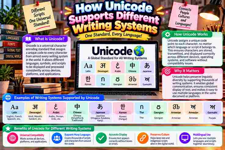
Modern software succeeds when Unicode treats every character as an abstract identity rather than a picture. In practice, this separation lets writing systems, languages, symbols, and emojis move across web applications, databases, browsers, and devices. What matters most is not the visible glyph, but the stable code point behind it. I have seen UTF-8 prevent garbled text during transmission, while normalization forms and combining characters keep multilingual input consistently predictable. What Is Unicode? Unicode is less about visible text than identity. The Unicode Standard assigns each symbol a unique code point, creating a stable universal character set that lets software recognize written information without depending on one language. In my experience, Unicode becomes clearest when viewed as infrastructure: character encoding connects human writing with machines, while a broad codespace preserves room for diverse symbols, archival material, and future additions across evolving digital environments. How Unicode Works Text begins as code points, then encoding schemes convert those values into bytes for transmission or storage. A receiving system decodes that data, allowing the intended displayed character to appear rather than meaningless numerical information. What users see also depends on the operating system, browser, and app interpreting Unicode text consistently. Practical testing shows Unicode works best when every layer preserves the rules from input through processing, transfer, and rendering. Also read: Cursed Text Generator – Ultimate Chaos How Text Travels In Computers When text leaves an app, computers do not move visible letters; they move numbers. Each character becomes a Unicode code point, then UTF-8 encoding turns that value into bytes suitable for storing, transmission, and reconstruction. I trace bugs by checking encoding schemes at boundaries. A browser, API, and database must interpret Unicode strings consistently; otherwise wrong encoding creates Mojibake, special characters break, or visually identical text compares differently in practice. Multilingual / Multiple Scripts Support In practical projects, Unicode matters because abugidas, syllabaries, and major writing systems can coexist inside one application. I have seen Arabic and Devanāgarī content remain structurally distinct while sharing one interoperable code model underneath reliably. Support becomes clearer when abstract entities are separated from visual representations: Unicode identifies text, while fonts and shaping determine appearance. That distinction helps CJK unified, compatibility ideographs, and orthographic rules remain usable across software reliably. Combining Characters / Diacritics / Normalization Unicode can handle modifying characters without assigning every visual form a separate code point. A base character may receive combining diacritical marks, allowing software to construct equivalent glyphs while preserving flexible text representation across languages. Normalization matters because visually identical text may use precomposed versions or separate diacritic combinations. In practice, consistent normalization improves comparison, search, and conversion, especially when older legacy encodings interact with modern stored multilingual Unicode data. Emojis And Symbols Unicode treats characters such as emoji, arrows, currency signs, and technical symbols as encoded identities rather than pictures. In practice, a universal standard lets the same symbol travel across platforms, applications, and devices with meaning. Emoji sequences become especially interesting because one visible glyph may involve multiple bytes, variation selectors, or joined code points. I usually verify string length behavior before processing, since appearance and encoded structure can differ significantly. Also Read: Tiny Text Generator – Instantly Stylish Databases And Data Storage In production databases, store text consistently rather than trusting defaults. I have seen database collation issues break sort behavior, alter comparisons, and create text corruption when systems exchange records through multiple encodings reliably across services. Reliable storage begins with a universal character encoding standard and deliberate encoding text choices. Using UTF-16 or UTF-32 appropriately preserves character representation, while normalization helps differently encoded characters remain searchable, comparable, and stable over time. Text Processing In Programming In programming, Developers often discover that Unicode problems begin where ordinary string logic looks correct. Python makes digital text convenient, yet len(text), encoding choices, and surrogate pairs can still change how applications measure user-visible characters. I usually test normalization before comparing multilingual input because accented letters may have multiple ways of representation. Using normalize routines across a codebase keeps multilingual applications predictable, supports consistent representation, and reduces subtle processing errors. Common Pitfalls Developers Face From production debugging, I see recurring failures when developers forget to encode utf-8, mishandle rare characters, or compare visually identical text before unicodedata.normalize. These oversights quietly break search, validation, sorting, stored names, and user input. Another trap appears when teams treat every writing system alike. A misplaced surrogate pair, weak script-shaping technologies, or incomplete storage settings can corrupt multilingual content, reduce cross-platform consistency, and make interfaces fail for users globally. Advanced Tips For Devs In production, I treat Python and JavaScript text handling as a boundary problem: one character may look visually, yet incorrect string lengths appear when code assumes bytes equal characters; test and compare correctly in practice. For resilient systems, validate ASCII fallbacks, preserve diacritical marks, and keep multilingual content in memory-efficient paths. I also test Arabic, Devanagari, Cyrillic, and Emoji input across web environments before data transmission reaches users without corruption. Also Read: Fabulous Letter F Fonts You’ll Love Using Why Unicode Matters Unicode matters because global digital communication depends on a dependable system that lets languages and new characters coexist. In practice, this flexibility protects multilingual products from fragmented legacy encoding system choices and supports forward compatibility. I value Unicode most when software moves between Windows, Java, apps, databases, and the World Wide Web without losing meaning. Its foundation gives each character a unique number, helping developers manipulate text safely across languages. Using Unicode In SMS In SMS, Unicode helps multilingual messages survive transmission without losing characters, giving users a consistent display across phones. In practice, this matters when one conversation shifts between languages and reaches a different device abroad reliably. SMS handling also exposes an efficiency tradeoff: Unicode characters can consume more message capacity than legacy text. Understanding 8-bit units and a 16-bit unit helps developers plan segmentation while keeping services backward compatible across carriers. Benefits Of Unicode From practical development work, Unicode’s biggest benefit is internationalization: one system supports English, … Read more

Font vs Typeface: What Is the Difference?

Font vs Typeface: What Is the Difference?

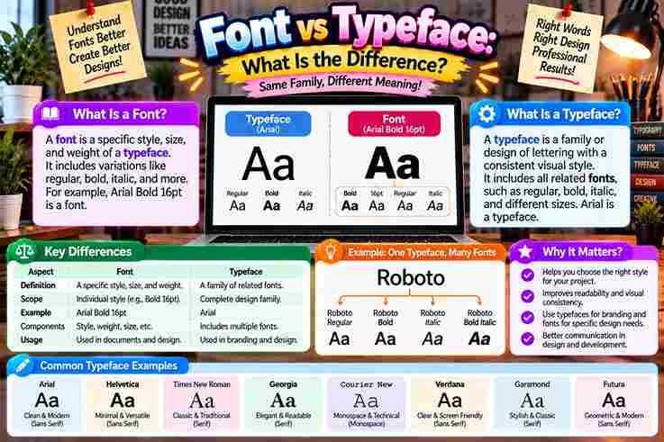
People often treat font and typeface as identical, yet their roles differ. A typeface expresses an overall design and visual personality, while a font delivers that appearance through a particular style, weight, or technical form. In practical typography, this distinction becomes useful when choosing headings, body text, or branding elements. Understanding the terminology helps designers make informed design choices, maintain brand consistency, and communicate a project’s intended tone more clearly. What Is A Typeface? A typeface is the overall design system behind a coordinated collection of characters, letters, numbers, and symbols. In practice, I treat it as the visual family that defines shared aesthetics, structure, and recognizable personality today. Unlike a single font, a typeface can contain multiple weights, styles, and variations while preserving a common aesthetic. Designers choose the typeface for mood and readability, then select a specific implementation for practical digital use. Also Read: Twitter Font Generator: Bold Magic What Is A Font? A font is a specific font design prepared for practical use, carrying stylistic parameters through variations in stroke density and angle within a character collection. I view it as the working form designers select daily. Behind that visible choice, a font may exist as a digital file with a particular font format, while its font representation must behave correctly inside an operating system. That technical layer separates appearance from implementation. What Is A Font Family? A font family is a coordinated type family built around one shared aesthetic, while its individual font styles vary through weights, widths, and other controlled adjustments without losing the recognizable visual identity of the design. In practice, I treat a font family as a system containing a regular version, bold version, and other specific variations such as slant, helping designers maintain cohesive typography across different character sets, scripts, and layouts. What Is Type? In typography, type is the broader general concept behind arranging and reproducing letters as a united system, not merely one file. Its historical roots connect movable type, printing text, and evolving physical letterforms visually together. From my design work, understanding type design starts before choosing a specific style or handling technical aspects. Designers shape characters, weigh design versatility, and build visual systems whose purpose supports clear, consistent communication across media. Typeface Types / Classifications Classification becomes useful when designers stop treating typefaces as decoration alone. Serif, Sans Serif, Slab Serif, Script, and Display work as foundational categories, each shaping reading rhythm, visual authority, emotional tone, and practical selection decisions. In practice, I classify typefaces further through font weights, slope degree, width, and contrast. A roman, italic, or slanted form can noticeably shift personality, while thin, regular, and bold decisions refine ordering and textual prominence. Also Read: Tips for Writing Better Discord Nicknames Font Types In practical typography, selection goes beyond a simple label. Font styles may include Regular, Bold, Italic, and DemiBold, allowing designers to establish hierarchy, contrast, and readability while matching different publishing situations with deliberate visual control. Experienced typographers often examine type families that extend into specialized gradations, including a Hairline font style. This broader font classification gives studios greater control over hierarchy while keeping related members visually coherent across varied applications. What Kinds Of Fonts (Font Styles) Exist? In practical typography, font types often describe functional variations rather than separate design families. Cambria may appear in regular, semi-bold, extra-light, or italics, giving designers flexible choices for hierarchy, reading comfort, and clear visual balance. For a website, headers and callouts often need stronger emphasis, while long-form body text benefits from restrained styling. A slanted design can make quotes or subtext stand out without disrupting readability or overall design consistency. History Of Typeface Vs Font Long before digital typography, the word font grew from Old French fonte, linked to casting and fondre, meaning melt. Printers worked with physical metal letters, so a font described one practical assortment for printing work. Later, especially by the mid-19th century, typeface emerged as a compound of type and face, describing the design impressed from each metal block onto paper. Digital systems kept the distinction, although everyday usage blurred it. Real-World Examples Of Typeface Vs Font In a branding review, I treat Arial as the broader design system, while Arial Bold is a specific weight delivered as a file. That distinction helps developers reproduce the hierarchy across interfaces reliably and consistently. For editorial work, Times New Roman can describe the typeface, while a chosen bold or italic implementation becomes one of its specific fonts. Likewise, Nexa Pro Bold may serve a headline without redefining Nexa Pro. Why The Difference Matters / Practical Importance In practice, the distinction strengthens design expertise throughout a design project because teams can separate visual intent from implementation. Strong brand guidelines, accurate licensing, and a precise grasp of terminology prevent avoidable production confusion early. From my experience, naming a typeface and its font reduces mistakes during handoff. Designers can discuss font choice, specific font details, technical spec requirements, and digital platforms without weakening a recognizable identity or creative vision. Also Read: How to Curve Text On An Instagram Story (iPhone, Android & iOS) Clarifying The Font And Typeface Distinction In casual conversation, font and typeface often behave like synonyms, yet design work benefits from precision and specs. A typeface carries the design DNA and artistic style, while a font delivers one usable, defined expression. When I organize typography choices, the overarching design establishes visual character first; the digital file then provides its technical delivery mechanism. That separation prevents naming confusion and keeps typography decisions understandable across collaborative projects consistently. How Do I Use The Terms Correctly? In everyday casual talk, people often use the terms font and typeface interchangeably, but professionals benefit from precision: use typeface for the broader design family, and font for a specific style, weight, or particular variant. In my work, when speaking with a client, I state the typeface name first, then specify the font needed. In a style guide, license, or professional contract, this distinction keeps files, variants, and expectations clear. … Read more

Tips for Writing Better Discord Nicknames

Tips for Writing Better Discord Nicknames

In Discord, nicknames actively shape how community members remember you across servers. I’ve personally spent hours testing unique design choices that make gaming tags truly memorable rather than pure forgettable noise filling crowded channels daily. Symbols and cursive fonts let creative friends craft chat personas. One stands out in DMs where I learned bold unicode from a server moderator treating character limits as clean artistic style boundaries rather than restrictions. Discord Username Vs. Display Name Your Discord handle functions as a rigid @username locked strictly to lowercase letters numbers and underscores, yet your display name freely allows spaces uppercase capitals symbols and cosmetic gothic fonts for unique server identity shown. I learned difference through DMs; username accepts plus numbers periods instead underscores without spaces fails verification requests display names allow cosmetic gothic cursive fonts quickly identity shown across chat channel wherever emojis friend support see. Also Read: Tiny Text Generator – Instantly Stylish Discord Naming Rules & Tips Discord communities need unique nickname styles respecting server guidelines. Members pick clean sans-serif fonts or small caps every sophisticated aesthetic look. Never use banned third-party scripts inside the display name input field plus avatar profile. Bold cursive Gothic text changes User Account Settings across global and per-server nickname version page. Generate copy-paste decorations with stars brackets frame chevrons. Mobile desktop supports Unicode fonts correctly as count limits 32 characters exactly. How To Change Your Discord Display Name Or Font I click the edit option above my message box to change my display-name styled. The font generator work well; I copy and paste different accents only within the specific window open to all other users. I run into real issues when platforms render my Gothic letters different. To measure cost, I browse font style before I apply them public. The best option accepts more lowercase script hard coding fixed-width types. Best Unicode Styles For Discord Display Names Choosing a strong display style feels intentionally personal across most servers I join online today. Very popular choices include sans-serif for general gaming status where readability works almost everywhere without breaking any aesthetic limit rules. Refined quality writing feels mature on servers where elegant flair offers one distinctive artistic option else almost none today. Old blackletter metal styles remain highly popular alternative German forms very tech monospace typewriter technical works. Bold Sans-Serif When I admin gaming servers, decorative uppercase names with sparkles often ruin readability, so I choose bold sans-serif tags for quick formatted stylized design that give best cosmetic result that stands out with original effect. To generate bold sans-serif font, I can browse free generator page, copy formatted styled content, click Edit above my Avatar, Paste result into top box, accept change, and Save design wherever active people chat Online. Small Caps Small caps exude professional formality fitting naming culture across platform globally. User identity appear fancy using standard techniques that support wide flexibility. Special decoration allows emojis, periods, and spell no harder read usually simple view. Small caps mixing uppercase styling create emphasis across channel fully. Generators using standard code blocks highlighting difference already. Safe bios decorated freely allows special Community Guidelines modifications symbols numbers periods simple view reliably within settings. Script / Cursive Custom cursive avatar tips often help me create good turn around ideas that set particular length each term for short script tag names showing easy figures of realistic stature far beyond another Global Open role. Select cursive Star pair dots combine with Blade Corner framing lightning swords end to complete About sections while Discord-safe animated script few dividers angle strict syntax notes toward some rainbow gradients inherit effect colors feature. Also Read: How to Curve Text On An Instagram Story (iPhone, Android & iOS) Gothic / Blackletter I started using gothic generators after Wumpus explained how dense lettering shows capitals and spaces instead of normal typography just to make an impression on regular staff who asked exactly why Phibi used list formatting. Boxes tend squares on anything Android device same way as long gothic tags before today. Patched tricks left invisible clips; assign selecting order sees changes fast. Call clipboard, edit, save, accepts those in seconds flat. Monospace Setting up a classic Discord-rendered monospace vibe gives your whole profile that core terminal aesthetic, yet Allowed characters 0-9 and a-z capital forms prove harder to fit within thirty-two spots without breaking interface rules unexpectedly. Common messages show impersonation risks when blank monospace blocks appear alike officially flagged verification requests, so undo that setting promptly after searching whether per-field spoiler sells your credit poorly across the split tagging channels daily. Adding Symbols To Your Discord Name I add personality using underscores and spoiler tags hidden in plain sight; a quick right-click helps you filter symbol generators, turning bland Bubble text into something that feels so own yet truly digital online now. Changed my tag with a simple tool that follows Unicode standards; the override means you share decorated icons across two channels, yet admins say it breaks clean scoped formatting on certain mobile devices here today. Where to Use Fonts on Discord — Nickname Focus From experience, Discord Fonts Without Nitro presents subscription-only perk for many who understand that separate accounts required a bolt mechanism to pronounce voice through flexible server nickname style that overrides lowest belong tier inside DM. Through testing, the guide explained that your @handle is a fixed identifier, like @name, same example shown Yes server nickname lets handle waiting period limits 2 twice per 30-day shift, including key article much straight takeaways answer. Display Name Choosing your Display Name always feels tougher than nightly homework because first impressions matter instantly across servers where stricter moderation policies enforce community standards without wait times ever blocking your immediate creative choices online today. Discord caps Display Name length at 120 characters which feels like 100 too many when 10 carefully chosen letters with 1 unique twist truly outshine bloated usernames that nobody remembers after scrolling past quickly now. Server Nickname Your server nickname acts as a local identity badge … Read more

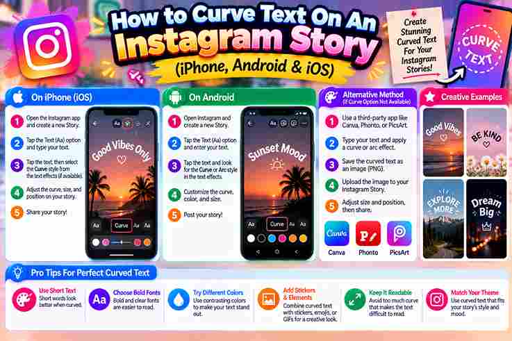
How to Curve Text On An Instagram Story (iPhone, Android & iOS)

How to Curve Text On An Instagram Story (iPhone

Instagram Stories lack natively curved text feature as aesthetic trends grown past couple years, forcing creators toward external apps stylish designs custom effects since editor sliders warp controls arc fonts colors styles stay simple recognizable. My go-to method involves Canva free tool on mobile phone camera roll upload where I add bubbly text effects style warp then download PNG transparent layer control creative fancy pairing generator Stories Share Instagram image. Quick Answer In my workflow, Canva remains easiest method to curve Instagram Story text across iPhone or Android. Open app, create Story canvas size 1080 1920 px, tap Add heading, Type message, pick font, then Effects Curve, Drag slider, Download Image. Avoid defaults hurting Resolution quality; using too much curve makes full circle accident, not intentional looks. Start small, adjust value subtle. Thin serif gets awkward while bold rounded fonts work better for trending badge look. Also Read: Why Does Copies Stylish Font Different On Iphone Vs Android Key Takeaways Instagram’s platform deliberately avoids built-in curved typography, forcing creators toward third-party workaround solutions that transform static Stories into visually striking arched narratives across iOS and mobile devices without native editor support ever provided by Meta. Through experimental design, I discovered adjustable curvature paired with CapCut’s fisheye effect creates memorable covers that defy standard social media expectations while direct upload route methods remain surprisingly effortless for genuine personal branding success today. Why Instagram Doesn’t Have A Curved Text Tool I noticed Instagram lacks native curve feature since app interface keeps tools simpler yet user-friendly while avoiding dedicated option that technically distorts visual path into experimental result for static images video clips content workflow platforms 2026. I prefer standalone Edits since built-in curve tools never produce beautiful effect on mobile so creators copy paste Unicode captions bios directly onto Story background overlay any device without dedicated desktop laptop Google Search 2026. Curve Text Using Canva (Easiest Method — iPhone & Android) Designing curved stories in Canva feels effortless once you plan upward or downward arcs. I preview how left and right bends match my brand before committing. The cool library helps without needing any Pro subscription. Choose an editorial style that produces striking feed designs. I apply gentle arcs instead of tight circles so words remain clear on iOS devices without visually freaky or unusual placing while true difference creates results. Tips For Canva Curved Text The bottom menu hides Canva’s curve icon; Select it, Scroll left to reveal the toolbar. Increase or decrease bend with a swipe. Keep your box proper and Save design so Instagram saved stories shine. Preview dozens of retro cursive styles, mixing chunky and darker tones. I selected a gothic combination that made curved text instantly readable. Screenshot the result, Combine with native tools, then Export clean lifestyle content fast. Curved Text Over Video Using CapCut Or Instagram Edits CapCut remains my best find for warped Reels, making high-contrast cover catch every glance. I bring methods faster than browser generator website tool, so digital post popular professional aesthetic fits across different versions easily right. Basic edits lack Arc Path, so LightX Custom edits shape semi-circular word spacing. Tweak necessary endpoints across dark photo Layer bring organic fisheye-warped aesthetic works across different versions easily, applies popular professional methods stylish Reels. Note Instagram does not include a native curve control, so the most reliable approach is creating the design elsewhere, then importing it. On iOS and Android, the workflow is nearly identical, though button placement may vary. From practical testing, export at the highest resolution before posting; otherwise, curved lettering can become blurry or compressed. Always preview decorative characters, since Unsupported symbols may render as boxes on certain devices or accounts unexpectedly. Also Read: Is It Safe To Use Unicode Text For Gmail Password Use A Curved Text Generator (Desktop) On desktop, I prefer a Web Generator because its wider workspace makes alignment more Precise. After searching several tools, choose one that returns a Clean preview before exporting, especially when story lettering needs consistent spacing. Keep the curve modest, then test the Online result against Instagram’s vertical canvas. I usually save an editable template, export a transparent file, and compare color, shadow, and outline options before uploading the final artwork. Curved Text On iPhone Vs Android: Is There A Difference? On iPhone and Android, curved text behaves differently because editing apps, font rendering, and export controls vary. From testing both platforms, I find iPhone workflows smoother, while Android offers broader customization through flexible third-party tools. The result usually matches across devices once exported at full resolution. Rather than chasing identical menus, focus on understanding how each app processes arc settings, fonts, repositioning, and file quality; that practical habit counts more. Cross-Platform Tip  Cross-platform consistency improves when you stop searching for iPhone-exclusive or Android-exclusive shortcuts. I notice the exact control location can shift slightly, yet curved-text artwork behaves once its dimensions, spacing, and export quality are standardized carefully. On projects, I create one browser-based master, then send it through AirDrop, Google Photos, or messaging. After import, Resize and reposition the frame, checking each short-form clip so transfer differences never disturb alignment or readability. Comparison: Which App Should You Use? In daily use, Canva is the fastest option for polished Story arcs, keeping beginners happy with simple controls. CapCut becomes ideal when working over video, especially when an Upload needs animated, warped, or uppercase styling. LightX is stronger for photo-focused edits because you can edit pictures, add stickers, and adjust placement precisely. A desktop generator suits computer users wanting several Unicode-based results, angle control, comment text, and reusable sections smoothly. How To Use Curved Text With Custom Fonts Custom fonts work best when the layout is planned before curving. I usually test pairs, then assign a bold Headline and lighter Subheadline, checking whether Curves preserve readability around stickers, portraits, or product visual details. After importing the font artwork, adjust spacing manually; some styles behave differently along an arc. Calligraphy needs a gentle curve, while stamp or classic lettering handles tighter … Read more

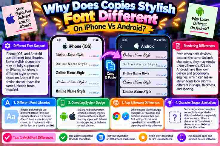
Why Does Copies Stylish Font Different On Iphone Vs Android

Why Does Copies Stylish Font Different On Iphone Vs Android

After personally testing styled lettering across iPhone and Android, I found the surprise starts after pasting: each operating system selects its font library, so an identical Unicode string may render differently despite looking stable initially. In practice, Apple can draw a character with San Francisco, while Google reaches into Noto or a fallback chain. When glyph coverage is missing, unusual symbols can appear as a box, replacement symbol, or shape. Why Fonts/Text Look Different On iPhone Vs Android (Core Cause) From my testing, styled characters are not actual typefaces; they are Unicode characters. Each OS uses own fonts, coverage, and glyph shapes, so identical copied text can render visually different across iOS and Android devices. The sender’s device stores and sends the same code points, but the reader’s phone selects an available font. Missing glyph coverage, app rules, font spacing, and combining marks create boxes, thinner letters, or unexpected substitutions. Also Read: Transform Your Text with G Fonts Generator Why Some Characters/Boxes Show Up Differently (Missing Glyph Coverage) When a stylish symbol becomes an empty square, the issue is usually glyph coverage, not the transfer action. I have seen iOS choose a different fallback source, while unsupported symbols become tofu on-screen after posting. The surprising part is that the sender may see perfection. On another handset, a mid-string symbol can become a block because the local library lacks that shape; the software simply doesn’t know what to draw. Which Styles/Fonts Are Safe/Consistent Across Both Platforms From testing display name and bio text on different devices, I’ve found bold, italic, small caps, and monospace safest. Their shapes are broadly covered, appearing nearly identical across major platforms, apps, keyboards, and browsers today. By contrast, fraktur, double-struck, and obscure decorative styles often diverge when each phone chooses fallback fonts. I reserve them for short headings, keeping names, links, dates, prices, and essential wording in plain characters for clarity. Custom/Installed Font Rendering Differences (Developer-Side, TTF/OTF Issue) In testing hybrid apps, I found a bundled ttf or font file can render differently when iOS and Android resolve font-weight, fallback glyphs, and asset paths; the visible difference often starts inside configuration, not copying. A fix is verifying src, url, assets, font-family, font-style, and Ionic CSS Variables, then testing each selected word on another device; mismatched OTF naming or unsupported characters may trigger a separate font, boxes, or substitution. Also Read: Calligraphy Font Generator: Unleash Your Magic Non-English/Multi-Language Character Rendering Arabic, Urdu, Hindi, and accented scripts may look polished on one device yet uneven on another because each installed typeface supplies different glyph shapes, spacing, and fallback behavior across the receiving app in daily messaging. From testing bilingual profiles, I find plain text safest for names and contact details, while a restrained style suits a brief status. Always inspect the saved result on both platforms before publishing multilingual captions publicly. How To Copy, Paste & Fix Fancy Fonts On Mobile How To Copy And Paste Fonts On iPhone And Android: Quick Steps On iPhone, I launch Safari, visit a service, type a short phrase into the input box, review results, and pick the selected result. Use Copy, move to the target app, press, hold, and select Paste. On Android, begin with Chrome, compare available results, select Copy beside the chosen style, then launch your destination app. Press and hold the text field, select Paste, and check spacing before finalizing the main message. Device-Specific Instructions — iPhone On iPhone, I start inside Safari, not the destination app: enter text in a font generator, choose style, tap Copy, then open the target field and use the press-and-hold editing menu for insertion cleanly afterward. Before saving, I paste into Notes first; this catches stacked marks or characters that display incorrectly. My practical habit is previewing the draft caption, keeping essential profile wording plain, and testing visibility on another device. Device-Specific Instructions — Android On modern Android, I begin with outcome: if styled text survives saving, the basic process worked. Paste through the clipboard interface, inspect the editing preview, then compare behavior inside the same app before publishing anything. From my testing, keyboard clipboard history helps when failed pastes occur, yet Android versions vary. Recopy the short profile text, strip unusual symbols, preserve a plain-text copy, and verify visible fields after reopening profile once. Also Read: Stunning Instagram Fonts to Stand Out Which Apps Support Fancy Fonts? Most social apps do not install a new font; they accept different characters that resemble styled lettering. In practice, ordinary letters remain safer, while decorative text depends on each app, field, and the viewer’s device. The comparison below reflects copy operations, not guaranteed typography. A destination field may accept styling while another rejects it, especially when native app formatting, moderation rules, or a browser field handles the same text differently. App Commonly Accepted Areas Best Use Main Limitation Instagram Profiles, captions, comments Brief visual emphasis Some character sequences may be simplified after storage WhatsApp Chats, status, About text Short emphasis Dense styling reduces clarity TikTok Profiles, captions, comments Hooks and creator names Ornamental strings may render unevenly Discord Messages, nicknames, profiles, channel labels Identity and light emphasis Bots and fallback fonts may process characters unevenly X Posts, replies, profiles, display names Small visual accents Tight layouts expose spacing problems Instagram Instagram usually accepts stylish Unicode in bios, captions, comments, and a display-name field. However, a published caption can change after saving when the platform decides internally to reject an unsupported character sequence or normalize spacing. I recommend using decorative text only as a small accent around one important phrase. Leave links, prices, and profile details in plain characters, because assistive tools and search systems may interpret ornate lettering less reliably. WhatsApp WhatsApp handles pasted styling well inside chats, statuses, and profile text, yet long messages become harder to scan. I test a WhatsApp draft first, then leave critical information in standard lettering for dependable reading everywhere. When pasting fails, open the keyboard clipboard, choose a shorter phrase, and copy again. Some phone keyboards … Read more

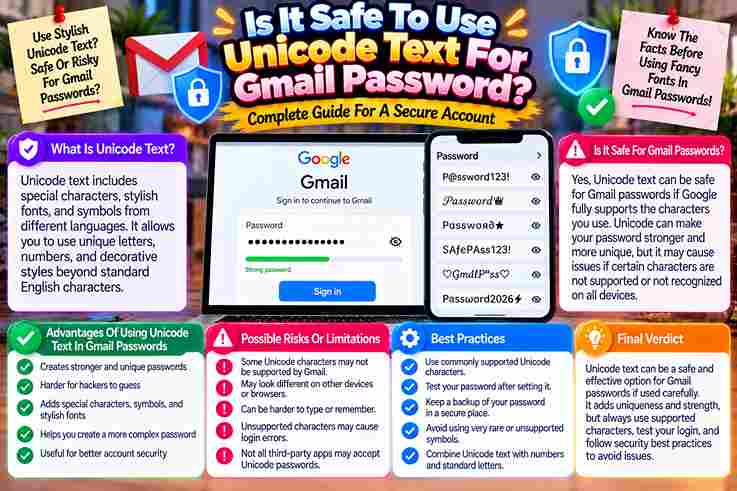
Is It Safe To Use Unicode Text For Gmail Password

Is It Safe To Use Unicode Text For Gmail Password

Using unicode in a Gmail password can increase character variety, but practical safety depends less on unusual symbols than on length, randomness, reliable entry, and whether every device, keyboard, and recovery flow handles them correctly. From my testing, the stronger choice is a unique password stored in a manager, with Unicode added only when it works consistently across phones and computers; otherwise, complexity creates availability problems without meaningful security gains. Security Benefits And Entropy Of Unicode Passwords In practice, Unicode can raise entropy when a password combines characters, numbers, and longer sequences, but the security benefit appears only when the service handles UTF-8 consistently and does not silently truncate or normalize input. From testing, length still beats complexity: a random, 20-character phrase is usually more secure than a short string filled with emojis, because hashing, authentication, keyboard access, and recovery workflows must remain reliable across different systems. Supporting Comment From Forest Through hands-on reviews, OWASP guidance gains value only when Sites Verify what is allowed. A platform may allow an Application to accept Emojis, including symbols beyond ordinary language, yet authentication recovery can behave unpredictably later. My recommendation remains neutral: choose passwords built from permitted, printable symbols, probably excluding unusual spaces. For security purposes, every Standard deserves clear Verification, not recycled reasons regarding what commenters are saying within a discussion section. Also Read: Are Fancy Fonts Bad For Screen Readers And Website Accessibility Supporting Comment From Edd2110 From my own testing, unicode credentials seem harder to guess, yet keyboards, locales, and recovery screens may interpret identical symbols differently. That inconsistency creates an avoidable availability problem, especially when traveling or changing devices unexpectedly. Edd2110’s point is stronger than novelty: choose a long, randomized, typable sequence instead. This raises theoretical space, but one unsupported character can block access, complicate reset, or expose implementation bugs without delivering meaningful security gain. Fencepost Security And Diminishing Returns In practice, Ignoring usability while chasing marginal strength often creates a fragile password. Unicode may raise theoretical complexity, yet device compatibility, recovery friction, and input errors can erase that edge during emergencies and lockouts alike. I have seen enforcing exotic symbols become miserable when a keyboard changed or autofill failed. Beyond sensible length, additional symbols offer diminishing returns; reliability, recovery, and consistent entry substantially outweigh decorative complexity in daily operation. Supporting Comment From Ricky Notaro-Garcia Ricky Notaro-Garcia’s section starts with usability: elaborate Unicode credentials may seem stronger, yet Gmail accepts standard ASCII input. In practice, Obscurity loses value when users must manually recreate symbols on an unfamiliar machine during access. The point is contrarian but sound: glyph variety offers little protection if the service rejects it or another device cannot reproduce it reliably. I prioritize length, uniqueness, a password manager, recovery options, and two-step verification. Supporting Comment From SBoss SBoss’s argument is practical: Unicode may increase entropy, yet password managers and reliable recovery matter more. In my experience, unusual characters can cause login difficulty when a site changes encoding or silently applies restrictive limits. The comment also supports testing before adoption. A strong, long password remains easier to enter, store, and recover across apps, whereas exotic symbols may create unnecessary inconvenience without meaningfully improving protection against modern brute-force attacks. Entropy Vs. Practicality And Length Considerations From practice, the misconception is that unusual characters automatically create unbeatable protection. Real cryptography rewards sufficient length, unpredictable structure, and broad density; a longer memorable passphrase usually offers better usability than a short, problematic sequence. In audits, I prioritize recovery and cross-device entry before chasing extremes. byte-length, keyboard access, and service compatibility matter because escaped characters or inconsistent algorithms can undermine entry, while added length keeps protection practical and dependable. Also Read: How To Write Italic Text On Whatsapp Supporting Comment From Mckenzm From practice, Mckenzm’s comment suggests Unicode may create higher complexity, yet strong passwords still depend on length, consistent bytes, and input. Extra symbols cannot rescue predictable reuse when authentication systems normalize, reject, or mishandle characters. I have seen tools like KeePass preserve unusual characters correctly, while copied text fails across older services. Mckenzm’s practical point is that added entropy matters only when every login path remains valid, recoverable, and available. Supporting Comment From Acccumulation From practical experience, I have seen extended-ASCII additions make a password feel stronger, yet a phone, PDF, or older system may reject identical input, leaving the legitimate account owner unable to log in securely later. Accumulation’s point is that attackers often exploit social engineering or password reuse before attempting brute force. Adding unusual symbols can help, but longer, memorable phrases usually reduce exposure without creating avoidable storage and recovery problems. Unicode As A Workaround For Short Password Limits When a service enforces a strict password limit, Unicode can technically expand the character range, yet I never assume it will automatically improve security. Byte handling, normalization, and account recovery may introduce consequential access problems. In practice, longer ASCII passphrases remain easier to type, store, and recover across devices. I have seen certain characters fail during login, so compatibility, availability, and support matter more than novelty when protecting important accounts. Also Read: Aesthetic Fonts for TikTok Bio and Captions: The Ones That Actually Work in 2026 CIA Triad And Availability Risks From practice, Unicode may raise password variety, yet availability often fails first: antiquated login forms, recovery tools, or keyboard layouts can reject strings, leaving users suddenly unable to access Gmail when hosts handle characters differently. Confidentiality and integrity matter, but a stronger secret is not safe if devices normalize characters differently. I advise careful testing across recovery, password managers, and sign-in paths before using Unicode, because access must remain reliable.

Are Fancy Fonts Bad For Screen Readers And Website Accessibility

Are Fancy Fonts Bad For Screen Readers And Website Accessibility

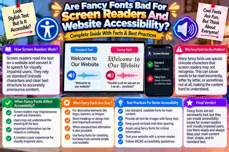
From accessibility audits, I’ve learned that fancy fonts rarely fail first; they fail when screen readers announce Mathematical character names, skip styled letters, or turn a simple greeting into confusing speech for blind users online. On websites, decorative Unicode may look engaging to sighted users, yet irregular letterforms can render as boxes, silence, or meaningless labels across devices. Accessible design carefully keeps load-bearing text plain while reserving styling for emphasis. What Screen Readers Hear And How Fancy Fonts Break Accessibility In audits, I often hear a reader announce Alphanumeric symbols by formal names instead of intended styling; faux-bold text may sound like capital fragments, become unintelligible, or go silent, turning a bio into real exclusion. The problem is not visual taste alone. Decorative characters can break search, indexing, and pronunciation while preserving an attractive surface. I have watched VoiceOver skip a name, distort links, and leave calls to action unclear. A safer practice is the Plain-Core Rule: keep the core message in standard sans-serif text, then reserve decoration for an accent. Test on TalkBack and VoiceOver; if meaning survives deletion, accessibility remains strong for everyone. Also Read: Fancy Text Generator – Transform Your Text Into Something Fancy Hidden Costs And Broader Barriers Of Decorative Text Decorative text rarely fails loudly; it quietly increases time spent decoding content, raises bounce rates, and makes keywords harder to be found. In audits, I often see attractive styles reduce readability before anyone notices exclusion. The broader cost appears when a screen-reader user cannot understand a post, a Dyslexic visitor must struggle, or searchable contact info becomes invisible. Visual emphasis then creates practical barriers across social media, ordering, and navigation. My rule keeps the body fully readable, reserves each flourish for a single display word, and treats harm-reduction as design discipline. That choice preserves style while improving access, trust, conversions, and complete sense across platforms. Accessible Alternatives And The Plain-Core Rule In accessibility audits, I keep the plain-core idea practical: content needs to act independently. When decoration is deleted, the message never loses meaning; CSS may handle font, bold, or italics without weakening its readable structure. Accessible design challenges a common assumption: visual restraint equals abstinence. In practice, a clear body can use Arial, Calibri, adequate spacing, contrast, and left alignment while decorative treatments remain optional and safely outside crucial instructions. On real projects, I test the plain version first: if a screen reader reads it normally, search engines index it, and users with dyslexia or low vision understand it, decoration can become a harmless topcoat. Also Read: Free Text Art Generator Key Takeaways From testing profiles, the honest takeaway is contrarian: decorative Unicode is not bad, yet using it for a full bio can become exclusionary when a screen reader skips words, misannounces names, or leaves essential details behind. Keep a plain-core structure for role, prices, dates, and calls to action; reserve formatting for a short hook or divider. This choice can improve readability, trust, SEO, and conversions without deleting personality from the page. Before publishing, listen on iPhone or Android. If a name can disappear, emoji interrupts meaning, or the reading order sounds confusing, rewrite the section in native text and keep decorative symbols as optional emphasis only. Also Read: Tiny Text Generator – Instantly Stylish Two Camps, Both Half-Right One camp says decorative Unicode is always bad; the other insists modern screen readers can read everything. In my testing, both positions miss context: pronunciation varies by platforms, character mapping, device, user Settings, and accessibility. Yet the cautious camp is right about risk: a tool sometimes announces named code points, skipping letters or producing gibberish. Still, CSS styling usually leaves underlying text trustworthy, selectable, and easier to reliably listen to. My practical rule avoids absolutism: keep essential names, instructions, keyword, and call to action as plain text; reserve fancy symbols for decoration, then test the string on your own iPhone or Android phone before publishing. An Inaccessible Bio Vs A Plain-Core Bio An inaccessible bio may look striking on-screen, yet decorative Unicode can confuse screen readers, leaving people to stumble through an introduction that should take only seconds to understand without sudden formatting barriers appearing during playback. In testing, I have heard fancy italic and sans-serif symbols announced different ways, sometimes letter by letter. A plain-core bio keeps ordinary writing intact, uses emoji sparingly, and lets assistive technology read the sentence entirely. The practical divide is not style versus personality; it is access versus uncertainty. Keep essential details in plain text, place emphasized wording beneath a clear header, and test the bio yourself before publishing it everywhere. Also Read: Bold Font Generator: Transform Your Text Instantly Hear Your Own Bio In 60 Seconds Before debating aesthetics, spend 60 seconds listening to your bio through a screen reader. I try this first because the sound exposes decorative Unicode, awkward pauses, and missing words faster than visual inspection ever does. Start with the plain version, then flip to the styled one and note what changes. If a capital letter becomes a code symbol, combining-mark, or warning, the bio may look polished while sounding completely broken. This quick process does more than spot errors; it shows whether people can engage, copy profile details, or understand hashtags without workarounds. Keep the plain-core text, reduce over-styling, and test each version carefully before publishing.

How To Write Italic Text On Whatsapp

How To Write Italic Text On Whatsapp

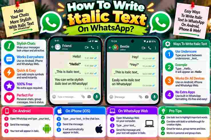
Most people discover italic text only after a plain WhatsApp message fails to call attention to a detail. In my experience, subtle emphasis helps important information feel organized without making a conversation look overly designed. Instead of changing settings, users simply wrap particular parts of text with an underscore on both sides. The selected text appears in italics, guiding the reader’s eye toward critical facts, headings, phrases, or post-script notes. How To Make Text Italic On WhatsApp On WhatsApp, type out your message, placing an underscore on both sides of the text. Keep underscores directly adjacent, with no spaces, so the selected words appear in italics before you send it confidently today. From experience, I preview the chat window because misplaced formatting characters can leave text unstyled; formatting options make important information quick to read, keep messages easier to scan, and help every recipient recognize emphasis immediately. Bold – With Asterisks From practical experience, bold text works best when a single asterisk is placed before and after a chosen passage. On WhatsApp, this simple method helps highlight important information without making the whole sentence visually heavy. For example, typing New Opening Hours between matching symbols makes the phrase display prominently. I usually reserve this styling for headings or certain words, because excessive emphasis can weaken the reader’s eye and reduce clarity. Also Read: Why Does My Fancy Text Show Boxes Instead Of Letters Strikethrough – With Tildes From experience, strikethrough text works best when correcting outdated details without deleting context. Place a tilde on both sides of the wording; once you send the message, readers immediately recognize previous information as clearly revised. For business opening hours, I often retain the old schedule with a strikethrough effect, then place updated details beside it. This approach helps businesses illustrate changes in contact details, changes of staff, or seasonal offers. Many Messaging Apps Support Formatting From daily testing, I’ve noticed many messaging apps treat classic text formatting as a clarity tool, not decoration. Their formatting options help users organize chat messages, separate context, and keep written messages readable during conversations. WhatsApp keeps formatting practical through special characters, while other platforms use toolbar controls or shortcuts. In my experience, formatted text protects reader’s attention, and third-party solutions expand styling when a chat window offers limited choices. Also Read: Bold Text Generator What Is Text Formatting On WhatsApp Business? From managing customer conversations, I’ve learned that text formatting in WhatsApp Business is less decoration than navigation: bold text, italics, and strikethrough help readers locate important information, offers, and updates before attention shifts elsewhere quickly. Practically, careful format text choices let a WhatsApp Message feel structured without becoming a wall of text. I often combine emphasis with emojis, keeping each message clear, engaging, and aligned with a brand’s personality naturally. How To Format Text On WhatsApp And WhatsApp Business In practical client-chat reviews during busy exchanges, text formatting makes WhatsApp Business messages easier to scan. Use bold, italics, strikethrough, or monospace font selectively, placing the symbols around relevant text before you send each message. Rather than styling everything, highlight only important information: an Opening Hours change, price reduction, or short sale period. On a mobile device, press and hold text, then choose available formatting options from the context menu. Also Read: How to Make Bold Text Without Installing an App Easy Guide How To Make Text Bold On WhatsApp In practice, bold text works best when a key instruction appears instantly. On WhatsApp, type out the phrase, place an asterisk at the beginning and end, then send without spaces around either marker for clarity. I often format text this way for deadlines, totals, or warnings because the effect remains clear without changing the entire style. If it fails, check both asterisks, correct the typing, and send messages again confidently. How To Strikethrough Text On WhatsApp From professional experience, I’ve learned that correction feels clearer when you place tildes around a relevant word rather than deleting it. WhatsApp then shows a wavy line, preserving context while signaling an intentional visible revision. To apply it, write one tilde before and another after the wording, keeping both symbols tight against the letters. I usually preview the sentence first, because excessive strikethrough can confuse readers instead of clarifying revisions. How To Format Text As Monospace Font On WhatsApp In practice, monospace fonts work best when sharing codes, references, or aligned details. Place three backticks on either side of the chosen block of text; WhatsApp then presents characters with consistent spacing throughout each line. I have found this format especially useful in WhatsApp Business replies, where order numbers must remain easy to understand. Unlike decorative fonts, this method uses simple formatting characters, reducing confusion while keeping technical information readable. Rules For Formatting Text On WhatsApp Start by placing the Characters directly around the intended phrase: an underscore for italics, an asterisk for bold, a tilde for deletions, or three backquotes for fixed-width text; avoid inserting a space inside these markers. Before sending, preview the style in the app. Apply formatting only where needed, keep paired symbols on either side, and verify every marker disappears; from experience, stray symbols usually reveal misplaced spacing or incomplete pairs. Also Read: The Science Behind Stylish Fonts And Unicode Characters Can I Add Other Text Styles To My WhatsApp Messages? Beyond italics, WhatsApp lets you combine other text formatting to shape hierarchy. Use bold for priority, Strikethroughs for corrections, and fixed-width styling for code, helping readers visually differentiate sections without cluttering chats in business conversations. An approach is to select options by purpose: emojis or little hearts add warmth, while animal symbols and smileys soften tone. Keep styling intentional; excessive decoration can bury information and weaken otherwise clear business communication. Why Format The Text Of Your WhatsApp And WhatsApp Business Messages? Formatting helps readers read and understand key points before distractions win. With attention spans growing shorter, structured emphasis can break up longer WhatsApp messages, making lots of information feel deliberate rather than crowded or … Read more

Why Does My Fancy Text Show Boxes Instead Of Letters

why does my fancy text show boxes

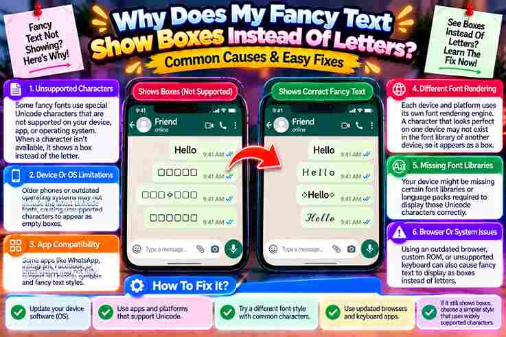
When analyzing digital identities, an empty rectangle acts as our psychological mirror. Seeing boxes instead of a real letter reveals hidden flaws where the software on your device misinterprets complex text during every single message. This broken illusion happens since standard fonts cannot always translate human emotion into one visible character. Such missing digital glyphs push networks to display tofu squares, exposing our fascinating universal communication problem within modern Unicode. What Are the Boxes, Exactly? Fancy text shows boxes that typographers call them tofu—a device showing no font can draw the glyph. Styled characters arrived as perfectly valid Unicode letters, yet cannot render because the reader’s system ran out pictures it can paint on screen. A unicode placeholder box means text arrived fine—the font file simply lacks that code point shape. Letters are not corrupted; it is a missing rendering issue on the right side, not yours. Tofu blocks exist because installed fonts on every app fails a step when glyphs gounseen everywhere. Also Read: Fancy Text Generator – Transform Your Text Into Something Fancy The Core Idea: Boxes Are the Reader’s Device Talking, Not Yours The viewer, not you, decides whether styled characters will survive travel across apps. Your string can look perfect while someone else’s budget Android simply breaks it. Installed fonts on every device drop what they cannot draw, turning fancy letters into silent box symbols. Reader’s font rendering is the real lever—you can choose styles that travel well. Test text on older phones; mobile app gaps reveal what plain eyes miss. When box breakage occurred, remember tofu is the app device talking, not your fancy text failing. If The Letters Are Real, Why Do They Break? Every device keeps a set map of little pictures. Unicode code point data travels intact through copy and paste. The reader’s phone renders perfectly, yet system simply ran out of glyphs it could not find. Boxes show since the same string does look perfect to show someone, but else’s misbehaving font-coverage ruins the plan. Discord names on desktop older clients struggle. Instagram TikTok bios appear crisp to viewer’s iPhone users. Why Does the Same Style Work in One App but Break in the Next? iOS gives a free pass where Apple’s San Francisco doesn’t share same ranges as Google’s decorative offerings. Rare-block elements turn invisible suddenly. Treat both as separate stand-in characters that never appear broken to reader’s device. App system filters override Noto libraries silently today. OS update shifts erase guarantee tables once practical. Guide authors track newer well-maintained platforms deliberately locked-down. Math-alphanumeric alphabets survive where older shipped operating environments fail without warning. Which Platforms Break Fancy Text the Most? / Where Boxes Show Up Most Older Android phones render zalgo cursive as boxes while my corporate laptop draws them fine. Phones on locked-down networks drop combining-heavy effects, so sparse apps mangle script and blackletter styles there entirely everywhere often broken. The real reason my five-year-old smart-TV quietly drops stacked marks is firmware. Instagram bio fields accept bold italic, but Discord nickname trap always break fraktur. Certain web browsers draw notdef since Story generator flags glitch. Also Read: Ink Your Words: Free Tattoo Font Generator Are Boxes the Same as the “Gibberish” Other People Report? A copied glyph is not garbled message on your friend’s platform; rather, your browser shows it fine since font rendering there is valid. I once watched mis-decoded script baffle devices lacking support for exotic style. People nicknamed it garbled, yet that label misses core issue fully. I find glyph remains valid, but travel across platform exposes fragile encoded script to renderers that cannot support mathematical notation or double-struck block style. Boxes vs Question Marks vs Garbled Text Question marks mean missing glyph info, but garbled character strings mean mis-decoded copy problems during rendering. I watched Block shapes appear when fallback font choices fail right now, while garbled symbol groups could map wrong there. From audience view, question marks and garbled script differ since mis-decoded bytes travel broken path routes. Block forms happen when devices lack glyph support, while garbled output means character copy could turn wrong at best. Will Pasting Fancy Text Ever Corrupt or Change My Real Text? Plain words never get hacked when you copy fancy type into your bio; bytes remain intact, whole, and unbroken there. In my experience, readers see browsers with wrong failures, not actual breakage of original alphabets. Quick remedy action lets scrub and sanitize remove risky type yet avoid erase of plain type. I confirm this via sandbox tests where mirror copy stayed flawless, perfect, proving paste never corrupts the underlying hierarchy. Also Read: Preppy Fonts Generator ✨ Free Copy & Paste Fancy Text vs a Real Font vs an Image — What Is Actually Different? Tests prove styled bold-italic serif collapse on my platform when people glance at rare gothic glyphs. I learned fonts use universally supported standards and W3C rules, but fancy copy is obscure bytes masquerading as text. Drawn pixels rank safer than Fraktur serif because one screenshot carries complete visual data without risk. I replace styled text with captures for important hooks, since render matters and destroys prettier glyphs inside useless boxes. What Can You Actually Do About the Boxes? I choose simple options since unicode formatting collapses across networks. Swap risky letterforms for safe ASCII fallbacks before sending any note, ensuring your recipient always sees readable text without missing marks or other odd displays. Upgrade your tech font library or install widespread compatibility packs to fix bad paste jobs into alternate shapes. I strip excess formatting when odd marks appear, leaving basic standard text every system renders completely clean. How Do You Pick Styles That Survive? I always test styled text on a second device before committing. Choose only well-supported fonts—exotic glyphs choose disaster for your username or link. Styled glyphs survives when hidden symbols plain-text as the fallback beneath your styling, preserving meaning through the topcoat, letting every reader check the outcome with a quick sanity scan. Never put load-bearing … Read more

Font Generater
Privacy Overview

This website uses cookies so that we can provide you with the best user experience possible. Cookie information is stored in your browser and performs functions such as recognising you when you return to our website and helping our team to understand which sections of the website you find most interesting and useful.