
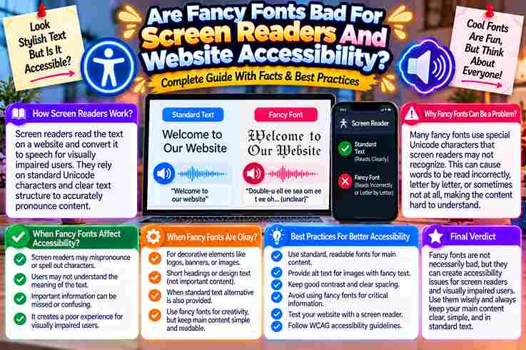
From accessibility audits, I’ve learned that fancy fonts rarely fail first; they fail when screen readers announce Mathematical character names, skip styled letters, or turn a simple greeting into confusing speech for blind users online.
On websites, decorative Unicode may look engaging to sighted users, yet irregular letterforms can render as boxes, silence, or meaningless labels across devices. Accessible design carefully keeps load-bearing text plain while reserving styling for emphasis.
Table of Contents
What Screen Readers Hear And How Fancy Fonts Break Accessibility
In audits, I often hear a reader announce Alphanumeric symbols by formal names instead of intended styling; faux-bold text may sound like capital fragments, become unintelligible, or go silent, turning a bio into real exclusion.
The problem is not visual taste alone. Decorative characters can break search, indexing, and pronunciation while preserving an attractive surface. I have watched VoiceOver skip a name, distort links, and leave calls to action unclear.
A safer practice is the Plain-Core Rule: keep the core message in standard sans-serif text, then reserve decoration for an accent. Test on TalkBack and VoiceOver; if meaning survives deletion, accessibility remains strong for everyone.
Also Read: Fancy Text Generator – Transform Your Text Into Something Fancy
Hidden Costs And Broader Barriers Of Decorative Text
Decorative text rarely fails loudly; it quietly increases time spent decoding content, raises bounce rates, and makes keywords harder to be found. In audits, I often see attractive styles reduce readability before anyone notices exclusion.
The broader cost appears when a screen-reader user cannot understand a post, a Dyslexic visitor must struggle, or searchable contact info becomes invisible. Visual emphasis then creates practical barriers across social media, ordering, and navigation.
My rule keeps the body fully readable, reserves each flourish for a single display word, and treats harm-reduction as design discipline. That choice preserves style while improving access, trust, conversions, and complete sense across platforms.
Accessible Alternatives And The Plain-Core Rule
In accessibility audits, I keep the plain-core idea practical: content needs to act independently. When decoration is deleted, the message never loses meaning; CSS may handle font, bold, or italics without weakening its readable structure.
Accessible design challenges a common assumption: visual restraint equals abstinence. In practice, a clear body can use Arial, Calibri, adequate spacing, contrast, and left alignment while decorative treatments remain optional and safely outside crucial instructions.
On real projects, I test the plain version first: if a screen reader reads it normally, search engines index it, and users with dyslexia or low vision understand it, decoration can become a harmless topcoat.
Also Read: Free Text Art Generator
Key Takeaways
From testing profiles, the honest takeaway is contrarian: decorative Unicode is not bad, yet using it for a full bio can become exclusionary when a screen reader skips words, misannounces names, or leaves essential details behind.
Keep a plain-core structure for role, prices, dates, and calls to action; reserve formatting for a short hook or divider. This choice can improve readability, trust, SEO, and conversions without deleting personality from the page.
Before publishing, listen on iPhone or Android. If a name can disappear, emoji interrupts meaning, or the reading order sounds confusing, rewrite the section in native text and keep decorative symbols as optional emphasis only.
Also Read: Tiny Text Generator – Instantly Stylish
Two Camps, Both Half-Right
One camp says decorative Unicode is always bad; the other insists modern screen readers can read everything. In my testing, both positions miss context: pronunciation varies by platforms, character mapping, device, user Settings, and accessibility.
Yet the cautious camp is right about risk: a tool sometimes announces named code points, skipping letters or producing gibberish. Still, CSS styling usually leaves underlying text trustworthy, selectable, and easier to reliably listen to.
My practical rule avoids absolutism: keep essential names, instructions, keyword, and call to action as plain text; reserve fancy symbols for decoration, then test the string on your own iPhone or Android phone before publishing.
An Inaccessible Bio Vs A Plain-Core Bio
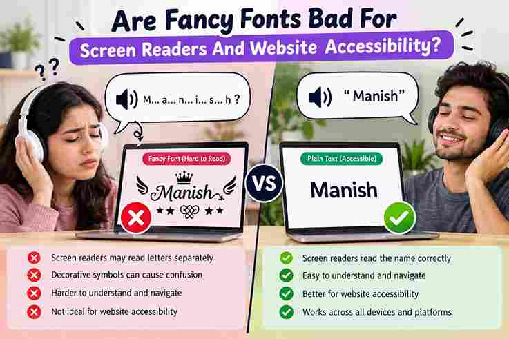
An inaccessible bio may look striking on-screen, yet decorative Unicode can confuse screen readers, leaving people to stumble through an introduction that should take only seconds to understand without sudden formatting barriers appearing during playback.
In testing, I have heard fancy italic and sans-serif symbols announced different ways, sometimes letter by letter. A plain-core bio keeps ordinary writing intact, uses emoji sparingly, and lets assistive technology read the sentence entirely.
The practical divide is not style versus personality; it is access versus uncertainty. Keep essential details in plain text, place emphasized wording beneath a clear header, and test the bio yourself before publishing it everywhere.
Also Read: Bold Font Generator: Transform Your Text Instantly
Hear Your Own Bio In 60 Seconds
Before debating aesthetics, spend 60 seconds listening to your bio through a screen reader. I try this first because the sound exposes decorative Unicode, awkward pauses, and missing words faster than visual inspection ever does.
Start with the plain version, then flip to the styled one and note what changes. If a capital letter becomes a code symbol, combining-mark, or warning, the bio may look polished while sounding completely broken.
This quick process does more than spot errors; it shows whether people can engage, copy profile details, or understand hashtags without workarounds. Keep the plain-core text, reduce over-styling, and test each version carefully before publishing.
Can Screen Readers Read Fancy Unicode Fonts?
In my accessibility audits, fancy Unicode often looks rendered correctly yet becomes difficult for screen readers: some announce character names, others skip symbols, and users must Navigate around text that appears visually easy to readers.
The practical answer is not absolute; use a plain-core version for names, links, and essential activities, then test aloud. Decorative text may work in short accents, but reliance limits digital access and expands harm directly.
Does That Mean I Should Never Use Fancy Fonts?
Mostly, no. I choose decorative styles for a small logo or visual accent, while keeping essential website copy plain. This balance protects reading, preserves the brand, and avoids unreadable navigation for individuals using assistive technology.
From accessibility audits, I have found fancy text is effective when optional, rare, and never carries contact details, prices, instructions, or purchase information. Use real fonts such as Arial or Calibri for clear sentences instead.
What Is The Plain-Core Rule?
The plain-core principle means essential information stands as ordinary text, while decoration may act around it. From audits, this resolves the whole accessibility debate: a generator never needs to handle meaning alone on any site.
Type DM, order instructions plainly. If styling gets deleted, order remains readable. A proven best practice can improve access, lead to good outcomes: lower confusion, higher clarity, increased reach, fewer hard-to-read barriers at 12–14 pixels.
How Do I Test Whether My Text Is Accessible?
In my audits, I paste the bio into a screen reader and compare whether U+1D5D5 is announced differently from U+0042 under the spec. Then I check zoom, text size, alignment, and keyboard order without sight.
Next, I disable styling and compare the plain version with what the generator wrote. I inspect wrapping, contrast, and 200% zoom, then ask dyslexic and older users whether hard-to-read caps, tofu, or invisible symbols appear.
1 thought on “Are Fancy Fonts Bad For Screen Readers And Website Accessibility”