Signature Font Generator – Turn Your Name Into a Stylish Signature
Signature Font Generator

× Size: 36px Color: I Slant B Bold Copied to clipboard! Creating personal branding through a handwritten mark is less about imitation and more about recognizable identity. A signature font generator converts a name into flowing styles, giving social profiles, emails, and bios a personal finish. From my practical testing, copy-paste Unicode is useful for quick identity experiments, while a downloaded font file suits controlled layouts. Choosing cursive, italic, or bold styling depends on legibility, platform, and the intended professional context. What Is A Signature Font Generator A signature font generator can transform a type name into script text, then let you compare 74 styles, curves, and serif details without manual design work, creating a distinct handwritten impression for modern branding today. In practice, I find the useful test is not realism alone; it is whether the generated lettering remains readable across device, email closing, profile, and transparent PNG workflows without losing its intended character in use. How To Use It After entering your typed name, inspect the signature font generator preview and available pick font options. From experience, testing several styles first reveals differences in readability, spacing, and character balance before settling on a design. Next, test the chosen cleaner style in an email signature, social media bio, and digital document. If rendering changes, try a simpler script, compare device support, then keep a matching style for consistent professional use. Also Read: Chinese Font Generator – Make Cool Chinese Text Why Use This Generator Use this generator when ordinary lettering feels too generic. I often see creators need custom lettering, a stronger personal touch, and practical creative branding for profiles, invitations, portfolios, and email identities without installing specialized software. From my experience, the biggest benefit is controlled presentation: choose a script signature, test Unicode rendering, compare professional styles, then copy-paste text into your professional email signature or profile text across platforms while keeping readability. Where To Use Signature fonts fit naturally into email sign-off areas, social bio profiles, profile heading sections, website headers, and signature font for logo projects, especially when a casual signature or professional use needs a polished visual identity. I also use them for wedding invitation drafts, personal letter layouts, sales letter designs, e-book covers, digital signature graphics, and commercial use branding, while keeping elegant script readable across each destination without sacrificing character consistency. Categories Signature font categories become clearer when you examine where style fits: professionalism, portfolio, resume, event invitation, watermark concept, or gamer tag. I usually group choices by purpose before judging appearance, readability, and personality first, carefully. For work, HTML signature, logo concept, wordmark, maker mark, photography watermark, and creator handle need treatments. For personal projects, wedding invitation, dedication line, custom gift, and tattoo reference can favor decorative character and expressive strokes. Also Read: Greek Font Generator – Create Cool Greek Letters Tips For Better Better signature text starts with restraint: choose a graceful cursive signature font, then test spacing, readable text, and overall presence before exporting. I usually compare styles at normal viewing size to avoid visual clutter online. For names with letters, a longer name often needs a refined italic signature text rather than heavy decoration. Use one supporting text element at most, keep symbols restrained, and check device rendering through mobile browser. Signature Fonts Vs. Real/Legal Signatures A signature font can create a polished visual identity, but it is not automatically a legal signing tool. I routinely recommend treating generated text as presentation material, especially beside an official document or financial document. For real transactions, the signer usually follows the required signature method, identity checks, and organization requirement. A visual generator produces appearance only; its output may be not legally binding, even when it closely resembles handwriting. Also Read: Arial Font Generator Conclusion A practical signature font workflow balances personalization, modern style, and professional text signature quality, keeping each handwritten name style usable across digital documents, profiles, correspondence, and copy and paste, and still preserving a polished presentation. From my experience, results come when users treat Unicode text as a design choice, test device rendering, and keep legal boundaries visible; polished output should support brand alignment while staying practical for real-world use consistently.
Chinese Font Generator – Make Cool Chinese Text

Chinese Font Generator

Chinese Font Generator ⛩️ Type Chinese characters or English text to convert into aesthetic Oriental styles & fonts. Chinese Font 12 Characters Clear All Insert Symbols: ⛩️ ☯️ 🐉 🏮 🧧 🉐 🈲 【 】 All Styles Calligraphy (Hanzi) Aesthetic CJK (Latin) Decorative Size: 28px Copied to clipboard! A Chinese-like script can turn ordinary text into stylized lettering, using symbols, Hanzi, strokes, and structures that evoke an Eastern aesthetic. I explore Traditional and Simplified looks to capture beauty without claiming authenticity and interpretations. For practical projects, generators provide unique options to transform regular letters into visually striking designs, while social media, art, and typography benefit from quick results and a distinctive style for modern creators on popular platforms. About Chinese Text Generator / What Is A Chinese Text  In my experience, Chinese text generators deliver results when users test concise input, compare character styles, and consider how simplified or traditional characters help readers understand meaning and visual appeal across digital platforms more consistently. A practical generator can transform plain wording into distinctive Chinese typography without requiring calligraphy expertise, making it useful for Social Media, Graphic Design, Branding, captions, posters, and Personal Projects with flexible options for varied contexts. How It Works / Readability Of Results When the interface receives input, the field should preserve character order before styling. I usually test several styles first, then press Generate and inspect spacing, strokes, and typography rather than judging decoration alone on screens. For readability, use the copy controls and buttons only after checking preview quality. I look for complex shapes, clear meanings, and stable rendering, especially when fonts, colors, or effects move into Social Media and logos. About Chinese Chinese writing has a rich history, yet its visual logic differs from Western alphabets because Chinese characters function as logograms. I find this unique structure especially useful when studying modern digital typography choices and layouts. Traditional Chinese characters, 繁體字, contain complex structures, while simplified characters, 简体字, use fewer forms that can be easier to write. Their aesthetic beauty still depends on spacing, proportion, and deliberate styling across screens and layouts. Also Read: Greek Font Generator – Create Cool Greek Letters Chinese Fonts (Simplified Characters) Simplified Chinese fonts took shape after a reformed system was developed in the mid-20th century, reducing strokes and eliminating some variants. For typography, these changes made character forms quicker to recognize, especially within compact interfaces. In practical design work, official common forms are easier to verify because they are taught widely through education. I also find calligraphy treatments useful when preserving clarity, provided decorative adjustments never obscure the underlying characters. Chinese Text Generator Example A Chinese text generator example can begin with Original Text, then compare Modern Style, Traditional Style, and Artistic Style while checking readability. From experience, this reveals how spacing, strokes, and rhythm affect each rendered phrase. A Chinese example can test calligraphy by selecting an elegant design for social media, then reviewing authentic character presentation. I watch spacing because decorative choices can shift emphasis, balance, and clarity while keeping showcased wording. Why Choose Our Chinese Calligraphy Generator? Our Chinese calligraphy generator combines beautiful forms with practical styling, helping me test calligraphy-style results quickly before placing text into artwork, cards, or branding. I value clear previews because character shape matters when selecting designs. What sets it apart is flexibility: I can explore a wide selection of styles, compare authentic-looking results, and choose an eye-catching treatment without sacrificing readability. That workflow suits designers seeking a distinctive cultural touch today. Popular Chinese Calligraphy Use Cases Chinese calligraphy works beyond traditional writing, especially when teams create projects needing unique language. I use generated characters for logos, artwork, and tattoos, while reviewing cultural context before applying them commercially, strengthening brand identities carefully. Creators add these styles for posts, blog articles, and Content Creation, where visually appealing lettering can stand out. I recommend testing spacing and meaning first, especially for custom Eastern-inspired typography widely used across public-facing media. Also Read: Heart Font Generator – Make Stylish Heart Text How To Use The Chinese Font Generator Enter your Chinese text, then compare different presentation choices while checking the intended meaning. I usually test short phrases first, observe spacing, and refine the result until the visual direction matches my preference more closely. Once a suitable version appears, review multiple options side by side before copying. The Copy All feature saves time when comparing variations, while finished designs can be checked quickly against your final comparison before publishing. Best Practices & Tips For polished Chinese typography, start with a clear purpose, then choose styles matching the project. Test Simplified and Traditional characters, compare fonts, and verify cultural context before publishing across different audiences and platforms online consistently. In my workflow, I keep the tool web-based when possible, test mobile readability, and Copy All results into design software before publishing. Check individual font licenses, spacing, punctuation, and special characters carefully before public release. Understanding Chinese Typography Understanding Chinese typography begins with character structure, spacing, and visual rhythm rather than decorative effects. In practice, I watch how 汉语 characters balance stroke density and readable forms across layouts, written systems, and logographic conventions. A strong Chinese-inspired treatment can still preserve clarity while reflecting historical character traditions. Simplified forms favor streamlined shapes, whereas traditional forms often retain denser, complex details, making proportion, alignment, standardized spacing, and performance especially important. Also Read: Custom Text Generator Conclusion A Chinese font generator becomes most valuable when stylistic choices remain purposeful. From 汉字排印学 to practical design, I find restrained choices help users represent meaning clearly, while innovative formatting adds character without weakening readability online. For real projects, I prioritize accurate visual intent over decorative excess: commercial projects benefit from careful checking, and I recommend a native speaker review when language meaning matters more than appearance, especially across polished experiences.

Greek Font Generator – Create Cool Greek Letters

Greek Font Generator

🏛️ Greek Font Generator Transform your plain text into stylized Greek letters, ancient aesthetic fonts, and Greek symbols instantly. 0 characters Load Sample Clear All Styles Authentic Greek Spartan / Ancient Aesthetic Bio Copied to clipboard! A Greek font generator offers a practical way to explore Greek alphabet forms while testing stylish text for profiles, headings, or designs. I often compare Unicode output because each character behaves differently across platforms today. Rather than treating Greek styling as decoration alone, I use the tool to test copy, paste, and readability before publishing. The generator can create classic or modern results, helping writers choose appropriate lettering without software. How To Use The Generator Start by entering your text, then explore the generator preview rather than choosing a style immediately. I usually compare several Unicode variations first, checking how each Greek result appears across intended platforms before sharing it. Next, use the copy function and test the pasted output where it will appear. This practical check catches unsupported characters, spacing issues, or unexpected rendering before you finalize your chosen design and share confidently online. What Is A Greek Font / Understanding The Unicode Technology A Greek font can describe either a visual style for Greek lettering or Unicode-based characters that resemble typography. In practice, the generator changes letters through symbols, variations, and Greek alphabet forms without installing a typeface. Understanding Unicode characters explains why generated Greek-style text can copy and paste across social media, Discord, and other platforms. Each character has a standardized code, allowing compatible devices to display intended lettering, though support varies. Also Read: Wide Text Generator – Fast & Free Where To Use / Social Media & Platforms For social media, Greek-style text fits Instagram bios, Twitter profiles, and Discord spaces. I test Unicode characters on modern devices, checking compatibility across platforms before using decorative lettering for academic content, names and captions online. Gaming communities use Greek lettering for team names and school text, while Fraternity groups often prefer bold, outlined styles with classical aesthetics. Copy and paste keeps messaging apps practical, and downloads are unnecessary for quick sharing. Key Features / Why Use This Tool The tool helps users explore Greek alphabet forms through quick alphabet lookup, while Unicode text supports copy paste into Instagram Bio, captions, and short text without requiring a download or installed typeface, across platforms daily. From Ancient and Classic Greek to Modern, Fancy, Calligraphy, Bold, Mythology, and Spartan styles, users can preview readable variations, test Greek letters, and choose one phrase suited to practical content creation today for varied uses. Greek Alphabet Copy And Paste The Greek alphabet becomes practical for copy and paste when each letter is presented clearly. I often test alpha, beta, delta, sigma, and omega, checking Unicode output before placing characters into profiles, captions, documents, designs. For reliable results, compare the Greek letters with standard forms, then use Unicode text wherever platform support allows. Approach keeps spelling visible, makes paste simple, and can avoid confusing decorative styles with Greek language writing. Popular Greek Font Styles Classic Greek styles emphasize Greek alphabet forms, balanced proportions, and classical character details. In practice, I often use Bold, outlined, and cursive variations when testing Greek-inspired typography for usernames, headers, and themed graphics needing distinct visual identity. For different projects, Fraktur, monospace, circled, Double-struck hollow styles, and Small caps can create varied results. These options work especially well for academic content, Greek fraternities, sororities, social profiles, and designs requiring noticeable Unicode character styling. Greek Tattoo Font Ideas For tattoo planning, I often test Ancient and Classic Greek lettering beside Modern Greek variations, then compare readable shapes with Bold Greek forms before choosing symbols that remain clear on skin on different body placements. A thoughtful draft can combine Mythology references, elegant names, or team-inspired wording with Calligraphy details. I recommend checking spacing, symbol support, mobile-size previews, and final design work before the artist refines it for lasting clarity. Greek Letters For Fraternity & Sorority Fraternity and sorority names look distinctive when Greek letters replace ordinary lettering. For chapter titles, recruitment graphics, and academic events, Greek font styling adds character while keeping names recognizable, copyable, and suitable for digital use. From experience, the strongest designs balance identity with readability. Unicode characters can support copy paste across platforms, while selective symbols and classical styling create chapter marks, profile names, event headers, ceremonial displays, and branding. Also Read: Double Struck Font Generator – Create Stylish Text Greek Font Vs Normal Font Greek-style text can resemble a font, yet it usually changes characters rather than installing fonts. A normal font preserves standard letters, while Unicode styling creates copyable visual variations across many platforms and devices today online. For practical work, I treat Greek-inspired output as decoration, not translation. Normal text remains clearer for documents and accessibility, while stylized lettering suits bios, names, captions, gaming profiles, and themed designs for social media posts. How To Choose The Right Font With Our Ancient Greek Text Generator? Choosing a font starts with purpose: compare Ancient, Modern, Fancy, Calligraphy, Spartan, and Mythology styles, then observe how each Style affects readability, mood, and emphasis before copying the final result for your project carefully consistently. I usually test Greek-style lettering against the actual destination first. Check academic clarity, social media size, spacing, and device display; then choose a historical treatment that fits your wording without reducing legibility across contexts today. Related Font Tools Related font tools can extend a Greek project beyond a single generator, especially when you need Greek-style lettering for social media, academic titles, or fraternity branding. I often compare Popular Greek Font Styles before choosing. A useful workflow also pairs Unicode characters with Greek letters, then tests the result across modern platforms, Discord, and Instagram. For design work, Greek fonts and Greek alphabet references help refine spacing, readability, and consistency. About Greek Greek language has a long history shaped by ancient Greek and classical Greek traditions. Its Greek alphabet remains central to writing, scholarship, mathematics, science, and many modern academic references worldwide … Read more

D Font Generator – Create Stylish D Fonts

D Font Generator

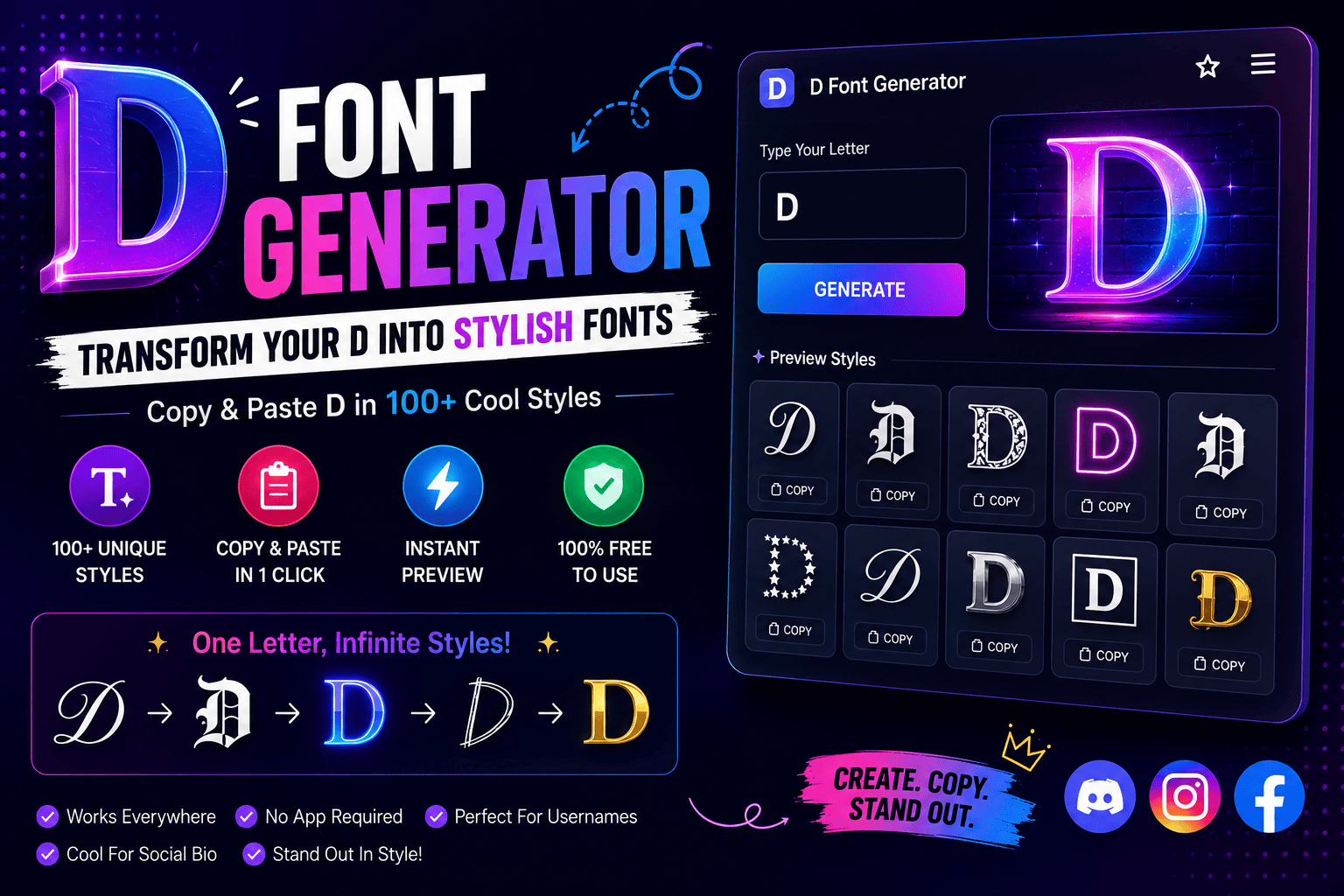
At first glance, a D font generator seems cosmetic, but the practical value is consistency: a text converter transforms ordinary D characters into unicode characters that appear across modern websites, apps, and most smart devices. From my testing, the strongest results come from choosing style for context rather than decoration alone: cursive suits polished identities, gothic adds intensity, bold improves visibility, while monospace gives technical profiles a cleaner, deliberate presence. How The Generator / Unicode Explanation Works Behind every fancy text generator, a normal keyboard letter is mapped to unicode symbols, producing stylish versions without installing fonts. In my testing, live preview makes each style easier to verify before click to copy. What looks like a cool font is actually custom text built from unicode characters. After users copy paste the result, the design can travel into social media, gaming profiles, or business spaces with compatible rendering. Also Read: Fancy Text Generator – Transform Your Text Into Something Fancy Popular/Top D Font Styles Gothic & Blackletter D In my typography practice, blackletter D works when old english, mathematical fraktur capital d, and gothic symbols inform edgy gothic style lettering; the result feels daring, visually dominant, easily recognizable, and suited to streetwear branding. For branding, gothic D delivers power, intimidation, and authority across gaming profiles, music, creative industries, and edgy brands, but I avoid it in corporate, traditional, law, finance, or medicine where readability and professional use matter. Cursive & Script D Cursive and script D styles work best when calligraphy feels purposeful rather than overload. In my experience, their cursive sophistication gives names, digital signatures, and aesthetic bios a polished sense of elegance without sacrificing readability. For softer identities, I favor flowing forms that suggest creative styling and refined beauty. They suit wedding posts or elegant femininity, while subtle elegance keeps each letter distinctive, personal, controlled, and visually graceful across profiles. Bold & Heavy D From practical typographic work, a bold D proves most effective when strong presence matters. Its strength, leadership, and confidence create immediate impact, while careful balance keeps the character legible instead of visually exhausting during scaling. For heavier applications, I favor bold styling when a name requires dominance, commanding energy, or intensity. The added heft sharpens authority and edge, giving the D visual force without depending on ornamental complexity for recognition. Bubble D From my testing, bubble D adds friendly charm without feeling childish. These decorated variations give the letter D softer impact, pairing rounded fonts with an approachable shape that stays distinctive across short names and profiles. I treat stylized versions as choices, not decoration: a casual username can benefit from bubble softness, while gaming personality may need bold D contrast. Keeping the look intentional preserves clarity and gives profiles recognizable character. Monospace D Monospace D works when consistency matters more than decoration. I prefer its fixed-width construction for coding-inspired handles, terminal-themed headers, and minimalist labels because every character occupies equal horizontal space, creating disciplined rhythm without ornamental distraction. Rather than chasing complexity, Monospace D emphasizes geometry and spacing. In practice, it fits developer portfolios, coding communities, terminal interfaces, and software-focused identities, giving the letter a precise, mechanical presence that remains easy to scan. Double-Struck D The mathematical double-struck capital d gives profiles a disciplined visual identity, combining outline structure with distinct form. I often favor it when readable characters matter, because the style feels technical without becoming heavy or decorative. Unlike bold styling, double struck forms create separation through internal geometry rather than weight. Their fancy alternative glyphs suit branding, usernames, or labels, while preserving a recognizable letterform under universal standard rules across digital contexts. Small Caps D Small caps D styling works best when compact styling matters more than spectacle, giving bios, captions, and display names a restrained identity. I use it to keep professional profiles readable, modern, visually and subtly sophisticated. Unlike louder styles, a small caps D can strengthen brand personality through controlled emphasis. It suits business, creative projects, and social media where clean organization, subtle font styles, and standard characters matter across modern platforms. Italic D A slanted D feels most effective when its vertical stem and curved bowl lean with a balanced rhythm. In practice, I prefer this treatment for short texts, where refined styling adds movement without sacrificing recognition. For profiles, the style can create a luxurious chic vibe or a friendly feminine feel without becoming ornate. Keep it for short form videos, greeting cards, or brand presentations, then mobile test version before publishing. Also Read: Tips for Writing Better Discord Nicknames Popular Fonts For Letter D (Unicode Reference Table) From testing, unicode D styles are easiest to compare when each standard letter appears beside its unicode name, visual form, and symbols category, helping readers judge compatibility before copying a decorative character across different devices. A reference can group bold letters, double struck characters, mathematical script, small d, and italic forms without pretending they are installed font files; in practice, they display as is because computers interpret assigned unicode characters. Popular Font Styles (Generic, Not Letter-Specific) From practical typography work, popular font styles succeed when their visual purpose is clear: flowing forms feel elegant, thick strokes appear solid, while rounded, friendly, and playful lettering suits casual identities without sacrificing readability today. For sharper contexts, fixed width characters create a technical impression, whereas slanted forms suggest dynamic motion. Designers often balance clean aesthetics, professional contexts, and distinctive branding, choosing styles by audience rather than decoration alone carefully. How To Use The D Fonts Generator First, type text into the free font generator, then browse the available stylish styles instead of choosing the loudest option immediately. I compare readability first, then click, copy, and paste the version into a profile. For testing, try the result on Instagram, Discord, and gaming platforms before saving it. Because styles rely on unicode blocks rather than real fonts, checking mobile and desktop displays helps prevent square boxes or symbols. Platform Compatibility In practice, D characters can look perfect until question marks appear in … Read more

N in Cursive Font Copy, Paste & Write Beautifully

N in Cursive Font

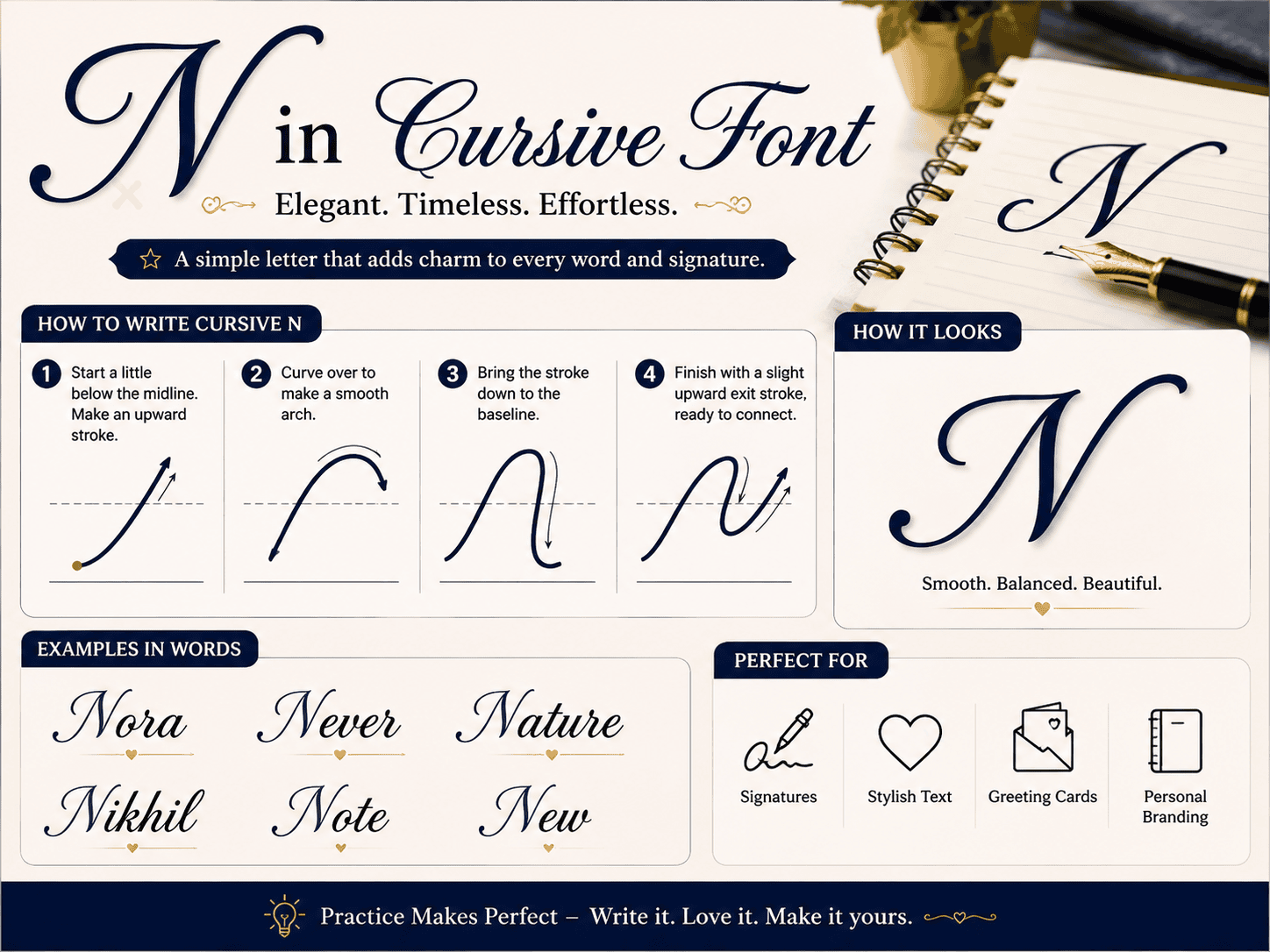
Most learners expect a cursive n to be simple, yet its identity depends on rhythm: a smooth upward stroke, measured arch, and confident return to the baseline create readability without making the letter feel mechanical. In practice, I find consistent x-height matters more than decorative flair. Whether copied as Unicode text or handwritten, the lowercase character should connect naturally, display clearly, and preserve its gentle hump across names and signatures. How To Write Cursive N: Step-By-Step Guide From my handwriting practice, a lowercase cursive N starts on the baseline, rises with a light upstroke, drops smoothly, then forms one rounded shoulder before connecting naturally to the next letters without lifting the pen. For capital N, the line begins with a confident entry stroke, builds the taller form, and keeps both sides balanced. I compare regular script examples, then repeat strokes until the shape looks elegant and consistent. Copy Cursive N Symbols From practical testing, 𝓷 feels softer in bios and captions, while 𝓃 stays cleaner for usernames. For a stronger visual accent, 𝓝 or 𝒩 can make initials, monograms, and short names feel more deliberate online. Instead of chasing one “perfect” form, copy several symbols, paste them into the app, and test how each character renders. I usually keep the lighter version for personal profiles and the bolder option for posts. Also Read: Transform ‘R’: Copy Insane Fonts Now! Understanding Cursive N From practice, I read 𝓷 less as decoration and more as controlled movement: a natural curve begins the start, drops down, forms a small bump, then keeps connecting without disturbing baseline alignment or consistent height. Students often assume an inverted u is enough, yet a well-formed lowercase n needs medium-width arches, balanced slopes, and a rounder, compact profile; on lined paper, I check the end before copying digitally for clarity. Characteristics Of Cursive N Unlike printed forms, cursive N gains identity through a flowing entry stroke, arches, and a balanced exit. In my writing practice, the letter looks most natural when each curve connects without becoming wide or flat. A lowercase form is neither too tall nor narrow; its rhythm stays beside e, i, o, or g. In display work, a heavier capital can stand out beautifully across monograms, cards, labels, and logo designs. Cursive N Style Comparison From practice, 𝓃 feels faster and more handwritten, while 𝓝 creates a bold, formal presence. The lowercase form suits connected words; the capital version works better for a monogram, initials, or a standout title design. Style choice should follow use, not decoration alone: compact forms remain easy in captions and messages, whereas extended strokes appear stronger in a tattoo or embroidery pattern. Always test rendering across each device and platform. Also Read: Fabulous Letter F Fonts You’ll Love Using Cursive N Copy Paste, Writing Practice, And Search Intent Many users simply copy a beautiful cursive N from a generator, but practice reveals whether the characters stay readable across Instagram, TikTok, Discord, and WhatsApp. I test each symbol before saving a final public name. Search intent is broader than instant styling: people want free, copy-paste characters, sheets, or a pro tip for forming lowercase and capital N. In my experience, repeated strokes build a foundation that shortcuts never match. Common Words With Cursive N In classroom practice, I often begin with Natalie, Nathan, Nora, Noah, and Nicole because familiar names make each cursive name easier to recognize, connect, and reproduce across personal notes, labels, invitations, and daily handwriting exercises. Beyond names, learners improve fastest by tracing common words such as “new,” “normal,” and “novelty,” then using them in a short message. This routine strengthens rhythm, spacing, and confidence without turning practice into repetitive drills. Popular Names Starting With N From lettering practice, I notice Nathan, Nicole, and Noah feel especially balanced in cursive because their rounded beginnings support smooth joins. These popular choices suit wedding cards, personalized quotes, and elegant hand-lettered keepsakes for celebrations. Contrary to choosing by popularity alone, test each name using large sizing beforehand. Even one single capital can define the style, while bold strokes make nicknames more readable across an Instagram bio or Facebook profile. Where To Use Cursive N From my experience, choose cursive N for a title, headings, logo drafts, signature phrases, or a short description when designing invitations, profile names, commercial packaging, and pages needing one standout handwritten detail without visual clutter. A generator can place the font instantly on the clipboard; test the result in each app, especially X, Twitter, and social profiles, because devices may render the same type differently before the final page appears. Also Read: Cursive Font Generator Copy & Paste Cursive N For quick styling, I copy the symbol that fits platforms, then test whether it looks similarly clear on Instagram, TikTok, and Discord. This check helps avoid surprises from installed fonts while preserving real cursive feel. A choice stands apart from r: its first stroke extends to the top, returns cleanly, and forms equal arches rather than an upside-down u. From experience, checking the full name before pasting makes readability easier.

Alt Code Generator Copy & Paste

Alt Code Generator

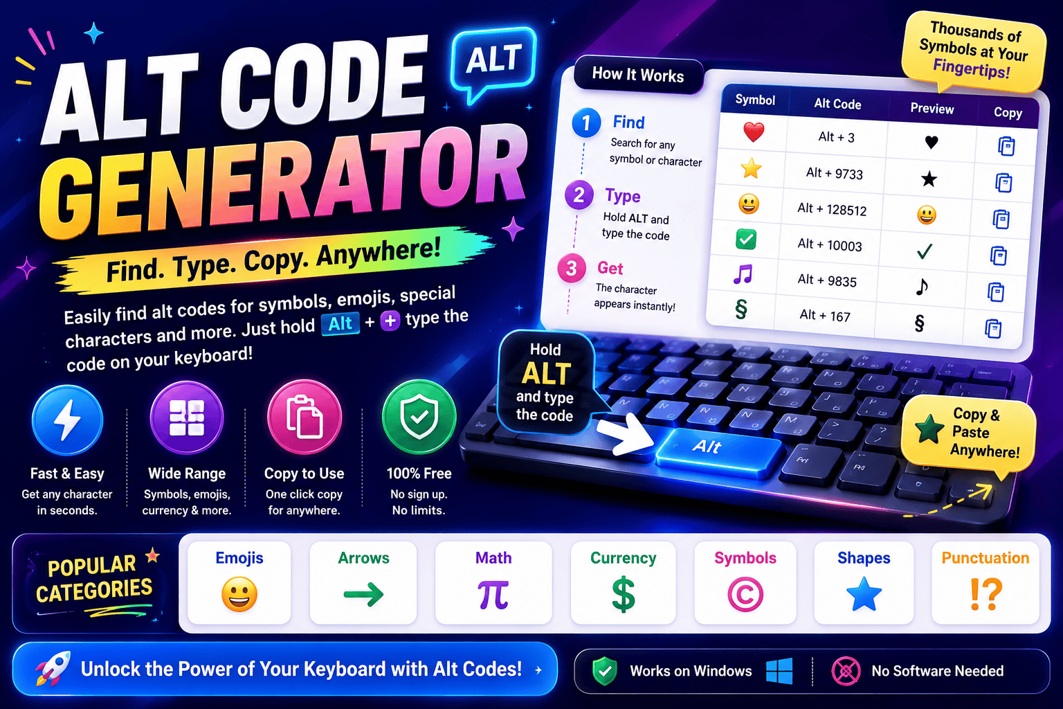
Alt Code Generator Click any card to copy the symbol instantly. Desktop users can hold the Alt key and type the listed code on their number pad. All CategoriesPopular & ShapesMath & FractionsCurrencyArrows & PointersAccents & Letters Symbol copied to clipboard! In my years optimizing workflows, utilizing the classic IBM method remains unmatched. Typing on a modern physical keyboard sometimes requires enabling Num Lock or using the Fn key on compact laptops to access hidden glyphs. We often need diverse symbols, from ancient scripts to math signs. While Microsoft users enjoy native input via Windows-1252, those on macOS often struggle, relying instead on tedious copy paste alternatives for entering characters daily. What Are Alt Codes We often feel restricted by a standard keyboard during daily tasks. I discovered that alt codes unlock hidden pathways, letting us input special characters directly on Windows. By combining keys, we easily summon unreachable glyphs. In my daily professional practice, I often notice people struggle with complex software menus. Simply hold Alt and use your numeric keypad for seamless typing. This elegant system bypasses interfaces to output unique characters instantly. Also Read: Corrupted Text Generator – Corrupt Your Text Instantly About Alt Codes To access rich Unicode symbols without an online generator, these shortcuts are essential. By learning how to type number sequences, you expand your keyboard capability. It is a completely free native computer operating system tool. Writing documents becomes easier when inserting foreign letters or complex math signs. I use the dedicated number pad for rapid text formatting, employing keyboard shortcuts to streamline my creative workflows every single day now. How to Use / How to Type Alt Codes As an operator, I found that executing a precise key sequence requires activating Num Lock first. You must hold Alt key firmly while inputting specific digits on the physical numeric keypad, then simply release Alt. Modern layouts often complicate this process. If you utilize a laptop lacking a dedicated numpad, engaging the functional Fn key bypasses those standard limitations, providing a reliable alternative input method to resolve potential compatibility issues. Common Alt Codes / Examples by Category Injecting a heart symbol or atmospheric music note symbols directly into documentation transforms dry interfaces. As a veteran developer, I often map these custom arrows into hotkeys, bypassing standard layouts for swift, tactile system execution. Adding a sharp registered trademark or a precise degree symbol validates technical data instantly. During audits, we deploy verified check marks to ensure compliance, proving that tiny glyphed outputs anchor professional, robust standard digital assets. Also Read: Preppy Fonts Generator ✨ Free Copy & Paste Tips / Things to Know When typing special characters, remember that the left Alt key paired with your physical numeric pad acts as a direct hardware bridge. Ensure Num Lock is active, or the intended symbol appears only as navigation. Systematically, legacy BIOS and OEM architectures dictate how modern operating systems process these inputs. Always hold Alt while typing the sequence, then release Alt to let Windows codes instantly translate them into beautiful, clean glyphs. Symbol Test Box Evaluating typography layouts is tricky. Testing how an aesthetic string performs saves time. Enter your raw draft inside our container; the instant visual render prevents formatting errors. Rather than raw Plain layout scripts, copy symbols. Developers often struggle when pasting weird characters directly into web frameworks. Without a proper live validator, your HTML rendering might break completely. Paste experimental combinations here first, then search for styling errors before updating Docs. Also Read: Free Text Art Generator Category Sub-pages / Related Symbol Links Navigating dense typographic layouts requires absolute structural clarity. I often group standard punctuation alongside geometric circles and sharp squares to balance spatial interfaces. Adding clean lines helps partition complex math data, keeping nested stars visible. Isolating logical symbols ensures smooth workflow integration. Developers frequently pair directional triangles with precise numbers to organize complex fractions. Enclosing these in custom brackets simplifies data comparison, making ancient greek codices completely legible and clear. Interactive Generator Tool Description Our custom interface bypasses archaic keyboard mapping issues entirely. Users can easily drag and drop complex characters directly into the interactive textbox, allowing a live preview of glyph scales before using click to copy commands. We designed this digital ecosystem to generate unique outputs with no signup required, accelerating modern workflows. Achieving instant conversion means every selected symbol integrates flawlessly across diverse web structures and modern platforms without manual formatting. Also Read: Fancy Text Generator – Transform Your Text Into Something Fancy Symbol Categories List Navigating a vast category of alt code symbols streamlines document design. Through my layout work, grouping greek letters alongside currency symbols improves legibility, ensuring we quickly find vital punctuation marks or intricate chess symbols easily. Organizing distinct sets like playing cards or exotic animal symbols clarifies your creative interface. My practice relies on dividing block shapes from everyday common symbols, ensuring every single trademark symbol remains fully visible and structured.

L in Different Fonts Generator – Stunning Styles!

L in Different Fonts

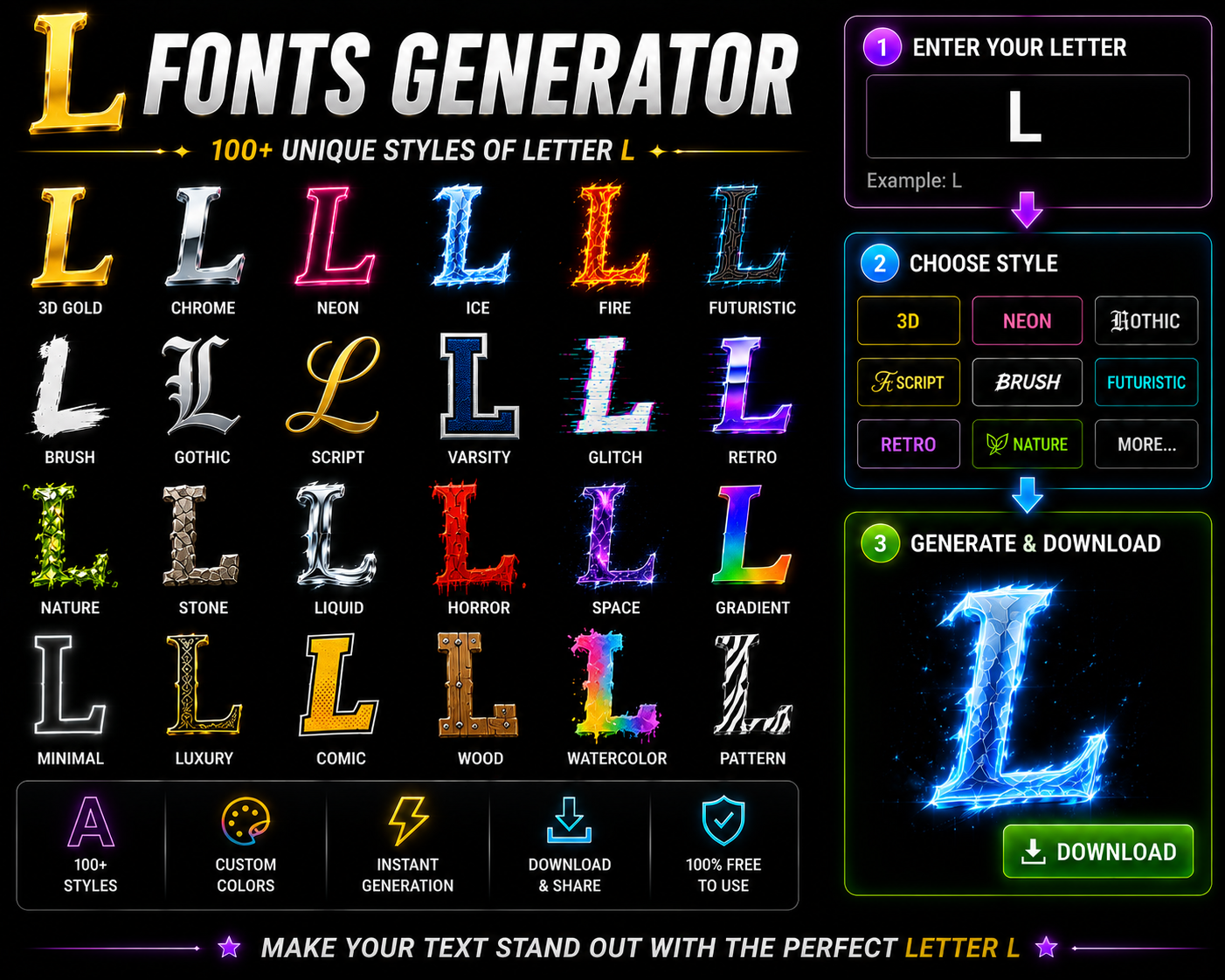
Copied to clipboard! The letter L is more than a vertical letter on a regular keyboard—it represents Legend itself. From plain text to stylish L variations, right styling communicates personality and creates strong visual presence with elegance. Names like Lily, Lucas, and Luna that start with L need demanding styling. A Bold L for gaming legends or Cursive L for Instagram aesthetics can transform basic text into something powerful that establishes identity. Why Letter ‘L’ Defines Legends Gaming culture didn’t invent the legend — but L did. From FPS games to MOBAs and battle royale culture, mythic players with L-led names achieve highest tier status, leaving opponents remembered forever across multiple matches worldwide. Across streaming platforms and YouTube montages, branding aesthetic shaped around L triggers battle mythology. Gothic L drives spectator follows because memorable plays tied to a legendary claim carry achievement far beyond any ordinary gaming names. Top L Font Styles (Copy & Paste Ready) After testing dozens of generators, I’ve found Gothic styling lends genuine medieval weight to gaming handles, flowing Cursive brings graceful loops to wedding branding, while Bold Heavy L instantly commands attention across Professional profiles today. Bubble L’s playful circles suit kids’ channels, Monospace L signals Technical precision for tech bios, Italic L adds forward momentum to launches, while Small Caps L and Double-Struck L deliver unique, compact Unicode styling too. Gothic & Blackletter L (𝕷 𝔏) Scroll through gaming handles and a Gothic L instantly signals weight, the kind medieval blackletter shapes carried for centuries. Lord, Lucifer, and Legion lean into that strong character, while Mathematical Fraktur Capital L sharpens it. Medieval Gothic styling isn’t only for fantasy avatars. Bold Fraktur Font variations give a Powerful Gothic L genuine presence. A dark angel or Lurker handle feels sharper instantly, while medieval aesthetics lend a legendary edge. Cursive & Script L (𝓛 ℒ) From years of testing letter styles, I’ve found cursive shapes carry instant warmth. A Cursive Font turns a flat bio into something with flowing style, while cursive classic curves whisper Romantic Cursive elegance without shouting. Real names gain personality too. Cursive sophisticated strokes suit polished brands, cursive celestial swirls fit moon pages, and a double cursive L creates consistent cursive identity. Cursive L for Positivity spreads elegant flow everywhere online. Bold & Heavy L (𝐋 𝗟) Deploying a thick glyph establishes immediate leadership presence across digital platforms. This specific visual thickness commands attention seamlessly, ensuring visual identity remains unforgettable. Practitioners leverage this style when an established authority requires undeniable bold dominance. For entrepreneurs navigating competitive markets, adopting this layout secures a lasting legacy. Incorporating heavy characters reinforces modern leadership branding, driving corporate platforms toward peak performance while maintaining clear, expert communication throughout your entire digital project. Bubble L (Ⓛ ⓛ) Deploying a rounded style transformed my branding projects completely. Choosing Bubble L characters instantly provides an approachable, friendly aesthetic perfect for Kids digital spaces. Audiences crave these playful versions over corporate fonts for Family layouts. In my experience, generating a circled bubble glyph offers unmatched fun across busy social media platforms. Characters must stand out immediately on modern mobile devices, proving that unique typography reshapes digital interface user interaction strategies. Monospace L (𝙻 𝚕) Deploying a technical glyph requires strict pixel alignment. Within an input box, rendering a clean grid configuration always matters. Experienced developers Match L to Message when selecting distinct font styles for professional coding software environments. Integrating Monospace L structural elements changes how blocks appear. On a standard keyboard, typing this text provides a simple layout. For Linux command terminals, ensuring characters remain highly readable optimizes foundational digital spatial geometry efficiently. Italic L (𝘓 𝐿) Deploying an aesthetic L transforms digital branding instantly. My experience with a font generator proves that shifting the Letter L into an Italic Font provides a dynamic tilt for Business or Tech platforms successfully today. Choosing a Sleek Font alters traditional styling rules completely. Integrating a Bold Italic Font breaks standard layouts, blending cursive fluidity with sharp gothic elements effortlessly, allowing serious practitioners to showcase nuanced structural variations across interfaces. Small Caps L (ʟ) Deploying a Small Capital Font across Instagram profiles creates immediate memorable contrast. These specific Unicode characters offer an uncommon visual balance, transforming standard usernames into an Elegant Font layout without disrupting digital platform user readability. Absolutely mastering this glyph relies on its inherent Simplicity. It alters traditional lowercase versions while anchoring the design Foundation, mimicking a miniature capital L that elevates text architecture seamlessly across diverse corporate bio network ecosystems. Double-Struck L (𝕃 𝕝) Observing digital typography reveals that the Mathematical Double-Struck Capital L yields unprecedented layout stability. My coding practice proves this particular Double Struck Font architecture instantly bypasses classic rendering bugs while maintaining crisp, clean geometric visibility. Deploying a Cool Double Struck style transforms minimal text layouts into elite art. My experience shows this Double Struck Font variation always succeeds because negative space cleanly carves through busy feeds with clear, professional clarity. Popular Names & Words Starting with L Selecting a bold modern aesthetic for Liam or Levi immediately elevates digital presence. Strategic typography anchors Layla gracefully, shifting standard visual cues to bypass rigid name gender boundaries, directly redefining core personality expectations expertly online. Deploying a Luminous glyph changes how audiences experience spiritual content platforms. When raw Lightning styles strike a layout, immediate transformation occurs. It channels clean positive energy directly into UI components, ensuring exceptional user engagement safely. Real Names (Strategic Styling) Clients like Logan often demand instant branding power. In my experience, tweaking corporate identity requires an authentic footprint. We unlock true leadership positioning by abandoning standard layouts, ensuring every identity commands immediate respect and premium status. When consulting for Lucy, executing stylized typography redefined her public image entirely. I observe that Business coaches mistake typography for mere decoration, but capturing raw authority requires isolating specific glyphs to achieve maximum visual impact. Gaming Names (Legend & Lightning Theme) Deploying tactical Gaming names alters competitive psychology. Utilizing a distinct Legend Name Strategy guarantees recognition across crowded … Read more

Transform ‘R’: Copy Insane Fonts Now!

R in Different Fonts

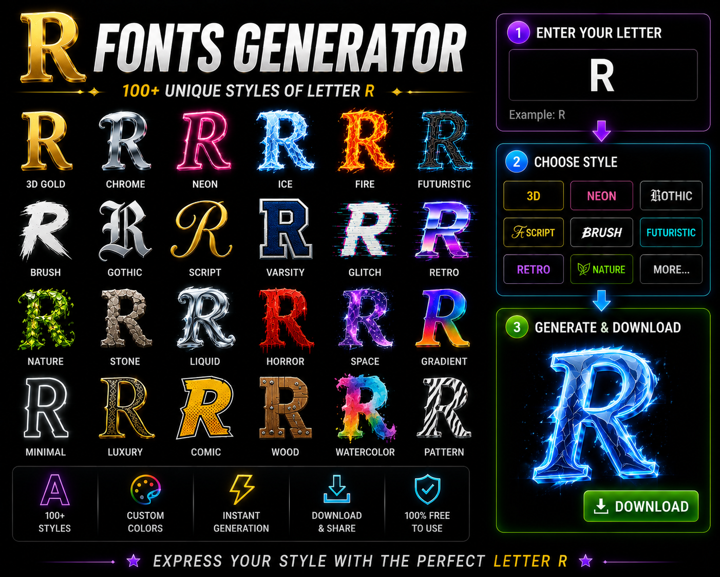
Standalone ‘R’ Symbols Stylized ‘R’ Fonts Copied to clipboard! alongside sharp aggression. Whether styled as cursive R, gothic R, or bold R, its distinctive visual form always demands attention. Few characters in typography match R’s commanding presence. Its vertical stem, curved bowl, and diagonal leg create instantly recognizable visual energy. From regal authority to rebellious independence, this font generator unlocks 100+ R variations effortlessly. Capital Letter ‘R’ Fonts Not every letter R earns visual authority — its uppercase form genuinely does. The distinctive curved top, angular leg, and extending diagonal position capital R as a powerful letter in bold, cursive, and monospace Unicode designs. From Mathematical Script Capital R to fraktur and double-struck styles, fancy characters fully transform the copy and paste experience. Blackletter R delivers medieval commanding power, while Mathematical Monospace Capital R brings technical precision in styling. Small Letter ‘r’ Fonts Most overlook the lowercase r’s depth. A font generator reveals the Unicode Mathematical Script Small r — showing how r in different fonts carries unique styles beyond any standard keyboard, transforming stylish writing and identity alike. Across social media platforms — Instagram, TikTok, Discord — popular fancy fonts for small r deliver impactful styles as fancy text. These cool text styles truly paste anywhere, letting stylish letter r designs build real presence effortlessly. Popular Fonts for the Letter R Digital authority shifts when a hollow design triggers subculture recognition. Selecting an aggressive angular leg instead of an enclosed circle optimizes dark aesthetic profiles, proving typography dictates user psychology via unconventional strategies and pure medieval power. My direct experience tracking measurable outcomes across interfaces reveals that a miniature uppercase anatomy creates unexpected structural friction. Truly embracing forward motion requires a precise geometric form, allowing a sweeping leg to establish bold authority. Gothic & Blackletter R (𝕽 ℜ) Choosing aggressive gothic typography subverts traditional expectation, projecting anti-establishment excellence through historic structures. This medieval blackletter glyph acts as an individual shield, channeling independent power where tactical gothic styling conveys opposite messages of dark autonomy. Cursive & Script R (𝓡 ℛ) Digital elegance rejects standard utility, proving cursive styling commands premium branding niches today. Beyond simple love aesthetic choices, this fluid typography builds glowing beauty, always anchoring an elegant nobility within modern user interfaces quite effortlessly. Bold & Heavy R (𝐑 𝗥) Deploying heavy styles in my creative layouts always commands immediate attention. I actively use this bold authority for business branding because these thick vectors deliver an undeniable, noticeable bold impact that ordinary lettering completely lacks. Bubble R (Ⓡ ⓡ) Deploying a bubble R creates an enclosed circle of friendly energy, perfect for playful content. My experience with kids styling shows this casual R subverts rigid typography, offering safe energy for rainbow content design frameworks. Monospace R (𝚁 𝚛) Perfected developer layouts remain completely aligned when a uniform R in monospace syntax is utilized during intricate Ruby script reviews. This precise monospace R elevates terminal coding expertise across advanced, modern tech infrastructure engineering operations. Italic R (𝘙 𝑅) The italic R harnesses both directional energy and dynamic flow, presenting a sophisticated rightward lean for creatives. Its elegant flowing curve makes Rose-themed profiles and romance branding feel inherently refined through every stylish R application. Small Caps R (ʀ) Small caps R (ʀ) serves academic content and professional organization with rebellious yet refined character. This Latin letter small capital R elevates lowercase r fonts, giving styled R Discord channels and highlight covers unexpected typographic authority. Double-Struck R (ℝ 𝕣) Mathematical double-struck capital R isn’t merely a Unicode curiosity — this rare variant commands elite status through structural duality. Where standard font styles offer weight, ℝ builds professional identity across aesthetic profiles with bold, refined precision. Why Font ‘R’ Represents Rebellion The letter R carries an unmistakable rebellious charge — its angular rebellion lives inside the stem, bowl, and distinctive leg, projecting raw independence through movement that actively defies every passive, overly static letter built around it. Rebel, Rogue, Revolution, Rage — heavy rebellious R-words are never just accidents. R in bold and medieval weight gothic styles amplify raw rule breaker energy, making every styled R feel powerful, dangerous, and unstoppable by design. Popular Names & Words Starting With R Tracking gaming identity updates proves how strategic styling shifts human interest. Enhancing male names containing Ryan or female names featuring Rachel demands specific artistic execution. Configuring separate glyphs assists current operators manifesting an unprecedented demeanor. My familiarity with Reaper motifs uncovers a lone wolf philosophy hidden beneath every dark omen moniker. Surprisingly, blending this shadow against gentle floral romance concepts subverts conventional marketing expectations, establishing profound cross-industry thematic graphic connection. Real Names (Strategic Styling) Identity transformation yields instant authority when abandoning plain text alternatives. Utilizing strategic styling completely alters how audiences perceive popular names, instantly shifting mundane digital presence far away from a standard, boring regular keyboard R layout. My consulting experience proves that deploying rebellious names crafted through custom typography maximizes professional recognition. Curating powerful names with specialized visual accents effectively anchors huge corporate ventures, establishing commanding personal brands that effortlessly dominate marketplaces. Gaming Names (Rogue & Reaper Theme) In my years mastering solo gaming, navigating the competitive meta requires raw mechanical mastery. Executing unconventional plays during intense ranked matches completely redefines modern gaming culture, ensuring a high KDA and delivering a grim victory. Embracing a lone wolf mentality within the stealth assassin class across legendary titles like WoW, Diablo, or Skyrim feels uniquely powerful. For elite sniper mains, securing that inevitable lethal shot defines their own dark legacy. Rose & Romance (Love Theme) As a professional designer, I realize romantic aesthetics require specific typography. Utilizing a unique, flowing script R creates an elegant flow for wedding branding. This custom cursive styling evokes pure, authentic romantic energy instantly today. Capturing a soft romantic aesthetic transforms modern platforms. When managing rose garden photography, digital creators must choose a graceful loop over aggressive fonts, ensuring their curated love content resonates deeply with an appreciative global audience. Results & Revenue (Business Theme) Deploying a … Read more

Transform Your Text with G Fonts Generator

G Fonts Generator

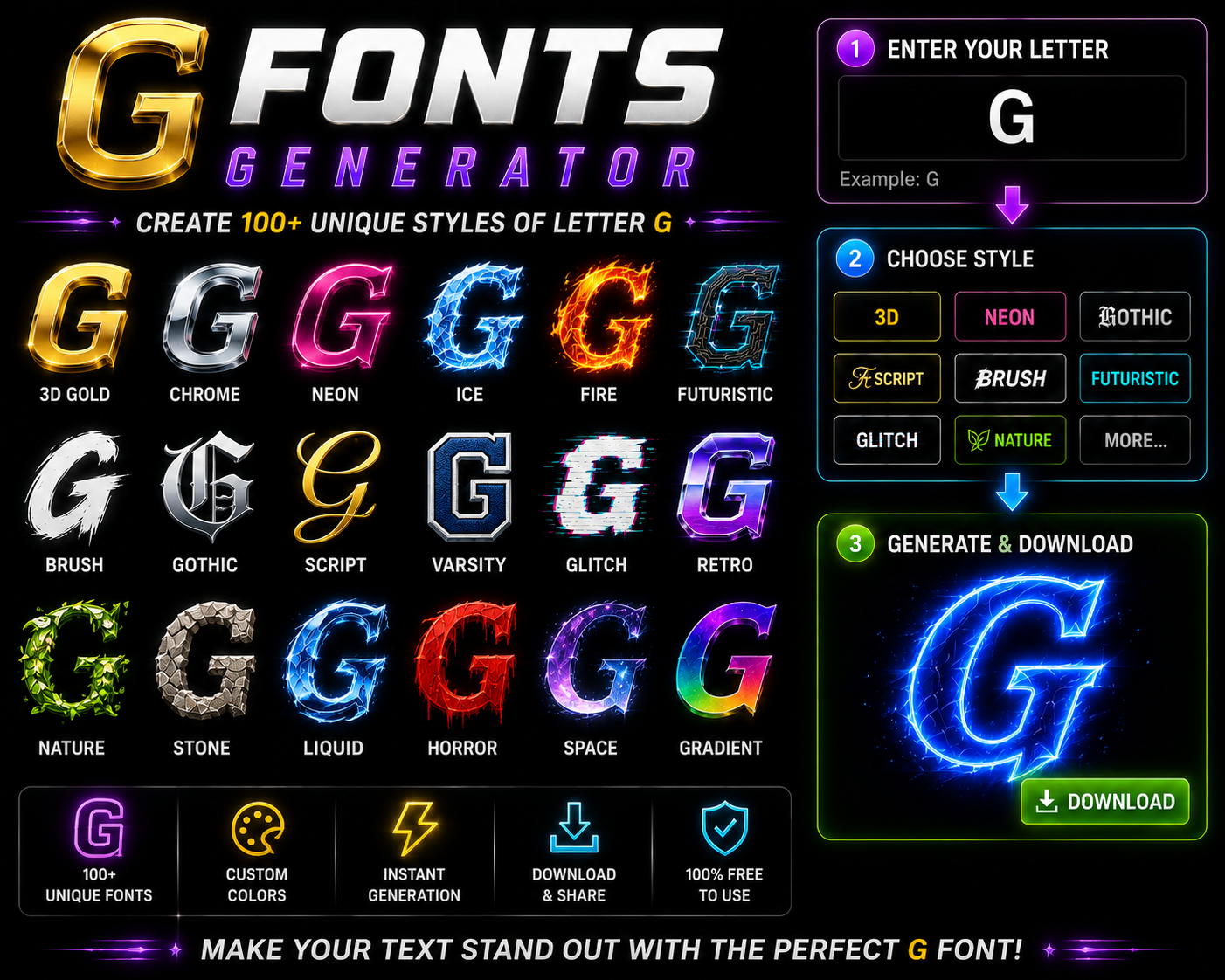
G Font Generator Type your text below to instantly convert it into stylish, modern Unicode fonts perfect for social media, bio profiles, and formatting. Input Your Text Font Size: 20px The G Fonts Generator turns a single basic letter g into 100+ stylized variations — gothic, cursive, bold, bubble, and more. Each becomes a unique unicode character, copy paste ready for gaming profiles and luxury branding. Few letters carry as much cultural weight as the stylish letter g — from goat declarations to glamour in fashion. In competitive gaming, gg signals dominance, while grace among female names quietly delivers elegance and status. Modern typography tools have genuinely made this entire creative process surprisingly effortless. Simply browse your g variations, click any favorite g style, auto-copy, then paste across instagram, discord, tiktok, or gaming platforms in 15 seconds. Popular Styles for the Letter G Deploying a gothic g redefines digital branding. My experience with streetwear typography proves that a sharp, aggressive layout instantly hooks a gamer. This blackletter typography gives ordinary usernames an authentic, intimidating tactical online visual presence. Conversely, switching to a cursive g injects an elegant aura into lifestyle brands. When curating instagram bios, incorporating a flowing, handwritten fluid calligraphy style establishes a highly sophisticated and premium aesthetic yielding modern digital glory. For corporate dominance, maximizing visual weight with a bold g or heavy g builds immediate credibility. Conversely, a bubble g character provides friendly, rounded contours perfect for engaging casual gaming audiences and global communities seamlessly. Top G Font Styles (Copy & Paste Ready) Embracing a monospace g reveals a structured, systematic approach ideal for programming platforms. When I slant characters into an italic g, that forward motion conveys continuous progress and intense athletic growth-focused content across channels beautifully. Utilizing a small caps g optimizes restricted character space on instagram highlight covers. Meanwhile, a double-struck g creates distinctive branding that helps online readers instantly copy paste fonts via a single unicode system click effortlessly. To customize standalone logos, authors often download tailored options like birds of paradise or chopin script. This unlocks god-tier visual greatness, transforming a standard keyboard entry into an authoritative status symbol for elite creators everywhere. Gothic & Blackletter G Historical researchers often observe how medieval scribes in western europe during the 12th century and 13th century meticulously crafted religious manuscripts, including bibles and prayer books, using dense, angular, and dark historical typography strokes. These intricate blackletter textures eventually transitioned into official documents and legal texts, evolving into german typography staples like the fraktur style. Today, prominent newspaper mastheads such as the new york times still maintain fraktur. Modern digital environments showcase a massive modern gaming adoption of medieval fonts, especially where rpg influence defines the intimidation factor. Titles like world of warcraft, skyrim, and dark souls utilize these sharp angles. Gothic G In my professional experience, the heavy weight of blackletter tradition creates a unique crossover between ancient history and modern tattoo culture. This specific gothic g aesthetic dominates because it provides immediate visual authority. I have noticed that enthusiasts frequently shuffle through various centuries of design to find that perfect blackletter look. Using a gothic g adds a layer of heritage that standard digital characters simply cannot replicate. Choosing these styles requires a delicate balance between artistic expression and blackletter legibility. While the sharp angles look impressive, the heavy weight must be managed carefully to ensure the character remains recognizable as a G. Cursive G Observing digital typography reveals how a cursive g introduces timeless elegance into modern interfaces. My design agency frequently pairs this style with names like gabriella to establish a highly sophisticated and luxurious visual identity system. Integrating an italian flair utilizing fluid typography transforms standard branding layout projects completely. Selecting letters for gianna manifests an elite modern chic vibe, while applying structural variations to genesis invokes deep psychological consumer brand appeal. A unique biblical essence surfaces when managing delicate text styling parameters on interfaces. Designing assets for georgia channels a classic southern aesthetic beautifully, whereas sculpting the curves for gemma offers distinct digital layout design advantages. Script G Crafting a jewel-like geometric layout requires precise font rendering knowledge across digital applications. When formatting typography for giselle, embodying pure french elegance elevates the entire screen presence, establishing immediate artistic authority without losing user engagement. A distinctly feminine touch highlights natural beauty markers within specialized interface design. From my experience, online wellness portfolios benefit immensely from a customized script font execution that breaks traditional, rigid layout blocks quite effortlessly today. Employing highly decorative flourishes offers a refreshing counter-perspective to minimalism. Integrating these fancy letters into headers ensures maximum user interaction metrics, demonstrating how strategic glyph alterations reshape the psychological perception of standard web digital content. Bold & Heavy G In my typography experience, utilizing male names or commanding brand designs requires serious structural weight. When design audiences witness a bold g, they instantly recognize an underlying, deep sense of structural authority and grand positioning. This specific aesthetic style does the heavy lifting when generating internet content. It shapes how digital creators project maximum power, ensuring that online platforms emit a dominant vibe usually reserved for competitive champions and real winners. Thick lettering emphasizes pure achievement, subverting standard layout choices completely. I often employ these blocky formats within competitive fitness branding because the dense layout signals immediate corporate growth while establishing unmistakable, solid marketplace presence effectively. Bubble G Deploying a rounded bubble g aesthetic instantly shifts user perception. In my design consulting, choosing this format softens intense interfaces, making digital layouts feel approachably casual for kids while projecting an inviting, friendly brand identity. When monitoring standard live chat environments, a customized bubble gg introduces an unexpected psychological warmth. This subverts rigid typography, injecting unique personality into interactions, establishing a relaxed, lighthearted communication tone that traditional fonts lack completely. Optimizing diverse digital content platforms requires tactile visibility. Strategically applying soft, rounded letterforms across competitive usernames and engaging stream titles ensures immediate differentiation, effectively capturing fleeting viewer attention spans within crowded, highly saturated … Read more

Transform Your Text with O Fonts Generator

O Fonts Generator

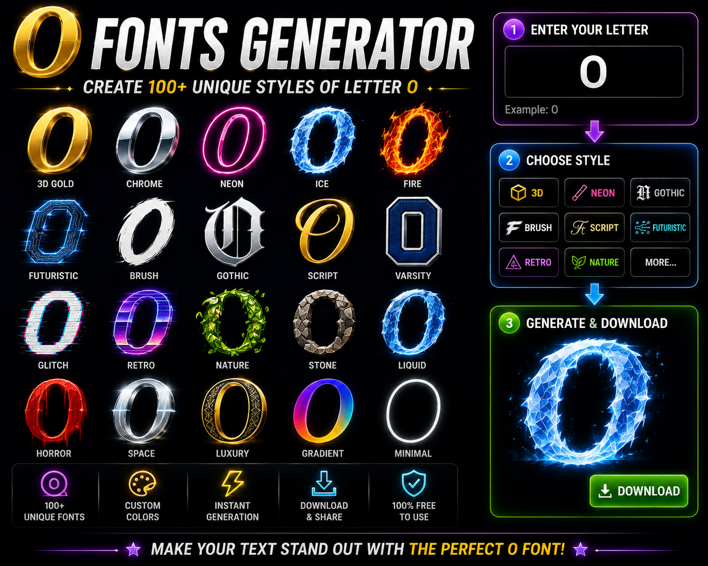
Fancy ‘O’ Generator Type any word or phrase. Only the letter ‘O’ will transform! Digital design often ignores how wholeness anchors our perception. Through a unicode platform, an online application transforms basic characters into a stylized representation. This structural unity creates a unique visual authority for modern personal branding. Choosing a gothic or cursive aesthetic alters your digital energy. Instead of standard alignment, humans unconsciously crave symmetry. A commanding, dominant text style evokes an absolute, powerful presence that instantly redefines gaming usernames and profiles. Escaping boring typography grants creators immense creative freedom. This shortcut works seamlessly across major platforms, turning everyday words into eye-catching designs within seconds. Never settle for less today when your digital profile must truly shine. What is a Font Generator & How Does It Work? Years spent managing digital platforms taught me how an online tool can convert your normal text into stylish fonts instantly. This generator mechanism alters native system encoding, letting you choose a unique style for messaging. When you type or paste character data inside the input box, multiple decorative styles appear through Unicode mapping. The backend lets you copy these outputs for social media, gaming profiles, or diverse creative design projects. Navigating the website requires zero technical expertise. Step 1 involves inserting text, step 2 provides choices, step 3 lets you click to save, and step 4 means pasting like a pro anywhere you see fit. How to Use the Font Generator (Step-by-Step Guide) Practitioners bypass traditional menus. You simply input your regular text into the interface. The digital tool acts immediately, showing live previews. Copying the unique output is the next logical step for modern font design workflows. Ultimate expression occurs when these custom glyphs generate psychological resonance across digital systems. Audiences engage deeply because the underlying structural architecture functions seamlessly across multiple personal devices, transforming standard unicode within targeted corporate communications software. Simply from an execution standpoint, creators click to copy their newly styled configurations. This aesthetic layer instantly fits into prominent digital profiles, elevating mundane bios, short video captions, or unique usernames where visual styling dominates. Best Font Styles & Live Previews Observing digital typography reveals how dynamic aesthetic choices alter user interaction. Our tool instantly transforms mundane input using an expansive unicode symbols library. Immediate preview functionality empowers designers to refine complex designs, ensuring artistic elegance. Evaluating interface architecture shifts traditional perspective regarding strategic branding. Selecting a gothic glyph or raw graffiti alignment subverts standard expectations. This specific psychology projects structural dominance and elite status, embedding raw power via flawless symmetry. Practitioners recognize how distinct options like ornate calligraphy elevate interactive social posts or digital user messages. Crucially, maintaining high text readability across legacy devices ensures that your custom titles and structural captions render beautifully everywhere. Platform Integration When deploying unicode styling, digital apps often fail. Systems cannot always display advanced characters correctly because older devices lack deep font libraries. True universal platforms integration demands robust rendering, bypassing standard software restriction boundaries completely. Our optimization tools change how custom typography works inside web environments. Since everything executes directly inside your desktop browser, users escape tedious local installations. No external software downloads are ever required for their seamless execution. Instead of traditional exporting, this text generator copies outputs onto your system clipboard. Once copied, this stylized typography behaves like regular or plain data, maintaining its distinct visual formatting across various global digital networks completely. Where to Use Custom Fonts In my professional experience, standard layouts look dull. Transforming digital assets like interactive comments, media captions, and personal names elevates visibility. Adding styled text to daily updates or standard posts guarantees immediate audience online engagement. Curating unique social media bios is the perfect strategy for modern personal branding. When you modify your network profile status, these specialized symbols build an unforgettable aesthetic identity that cuts through the digital online noise. Beyond screens, crafting wedding invitations requires distinct artistic flair. Infusing gothic typography or urban graffiti options injects raw personality, transforming mundane text into bespoke designs that instantly captivate every single recipient who views them clearly. Why Letter ‘O’ Represents Wholeness Observing glyph geometry reveals how a simple circle anchors design. This ancient pattern provides absolute completion, defying digital linear bounds. My typography experience proves this shape mirrors wholeness, giving any layout a structurally profound depth. We instinctively crave cosmic evolution within stylized text interfaces. This specific glyph channels historical wisdom, serving as the ultimate form where beginnings seamlessly meet ends. Its round architecture represents an uninterrupted psychological loop of total harmony. In real screen environments, branding requires definitive finality rather than endless open lines. When crafting letters, perfecting these continuous loops remains vital. This singular geometry naturally balances modern screens, embodying an unbroken, eternal corporate universe. Popular Names & Words Starting with O Digital identity design begins backward. Choosing distinct usernames like Oliver or mystical tags like Oracle demands immediate psychological weight. Selecting an unconventional, stylized typographic vibe establishes instant, powerful user differentiation across highly competitive online platforms. When rendering elegant signatures like Olivia or sharp terms like Owen, standard layouts collapse. Modern interfaces require fluid cursive scripts or fractured glitch formats. Manipulating these glyphs creates a deeply fascinating, completely customized visual aesthetic. Historically, the circular geometry found in terms like Ocean, Ophelia, or the majestic Omega carries ancient power. This structural symmetry naturally symbolizes absolute cosmic completeness, instantly commanding human attention whenever displayed across digital text networks. Accessibility and Compatibility Tips Screen readers frequently fail because these custom symbols are technically not traditional letters. While they mimic rich typography, assistive applications see zero linguistic data. Do not assume all digital systems fully support these stylized images. When pasting text into another platform, layouts often break completely. An old operating system or a rare browser cannot translate the advanced character maps. Test your output before publishing since rendering will look different everywhere. Relying on stylized text frequently creates severe compatibility glitches across modern applications. For instance, certain mainstream social messaging apps refuse to show unusual characters properly. Always check … Read more

Font Generater
Privacy Overview

This website uses cookies so that we can provide you with the best user experience possible. Cookie information is stored in your browser and performs functions such as recognising you when you return to our website and helping our team to understand which sections of the website you find most interesting and useful.