
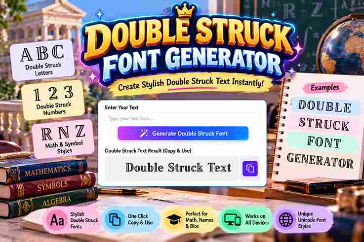
Double Struck Font Generator
Convert your text into 𝕓𝕝𝕒𝕔𝕜𝕓𝕠𝕒𝕣𝕕 𝕓𝕠𝕝𝕕 instantly.
A generator based on Mathematical Alphanumeric Symbols creates real Unicode text, producing a styled alphabet suited to formulas, identities, and number sets. This approach avoids font installation, while making copy and paste straightforward.
In practice, ℝ, ℂ, ℤ, and ℚ can remain recognizable as characters, and readability becomes more consistent when specialized notation needs a distinct visual identity across plain text workflows today.
Table of Contents
What It Is / How It Works
A Double Struck real Unicode generator creates letterforms without an installed font, letting you copy-paste into Instagram bios, Discord, and tech handles. Hollow letters can sharpen math notation, while a tool manages rendering across chat apps.
Each character uses a double-struck equivalent. The generator maps letters and digits into Unicode characters, producing clean results for ℕ, ℤ, and ℚ. This works well for LaTeX, crypto, and Roblox names, subject to device coverage.
Also Read: Typewriter Font Generator
Where To Use Double Struck Text
Double-struck text fits social profiles, Gaming communities, and technical posts when a distinct format helps separate number sets, variables, or identifiers. I often use it for short labels where visual emphasis matters without adding images.
A practical choice is shared Unicode content for copyable names, categories, and brief labels across digital spaces. It works best when audiences recognize stylized digits and glyphs, while readability, accessibility, and modern platforms remain priorities.
Tips & Best Practices
Use minimalist choices when double-struck text supports profile aesthetics rather than replacing readable type. In my testing, a clean accent works best for usernames, short labels, compact visual emphasis, and reference pages in profile layouts.
For practical work, keep number sets distinct and treat typography as functional structure. Technical documentation benefits from consistent spacing, while presentations need restraint, especially when the same stylized text appears repeatedly across shared workflows daily.
Compatibility & Support
In practice, compatibility depends less on the generator and more on the destination. platforms with Unicode-friendly surfaces usually preserve characters, while fallback glyphs can appear on older devices, changing how double-struck text looks.
I test outputs across browsers and common apps because screen readers, non-Latin characters, and accented characters can behave differently. A reliable workflow checks character coverage before publishing, especially when mixed text requires fallback support.
Common Math Symbols Ready To Copy
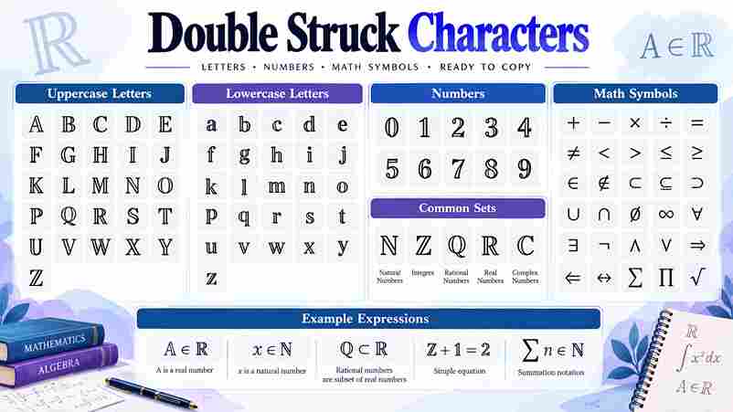
Common symbols become especially useful when a double-struck result needs immediate reuse. I regularly check the math register for familiar set notation, then verify character mapping before copying letters, digits, number sets, or examples today.
For practical work, copyable output should survive ordinary text fields without substitution. I test render characters across platforms, watch for fallback, and prefer Unicode-supported characters when sharing formulas, labels, examples, or compact mathematical expressions today.
What It Costs To Paste
Pasting double-struck text costs nothing for most users because Unicode style travels as plain text, not a font. The main cost is occasional conversion, compatibility checks, or replacing characters when font coverage is limited there.
For everyday profiles, notes, and technical references, there is rarely a monetary fee. The practical expense is attention: checking accessibility, searchable text, modern browsers, and Unicode-friendly surfaces before relying on a pasted character set.
Is It Free, And Can I Use It Commercially?
Using double-struck text is generally free because the generator creates Unicode characters rather than licensed artwork. For ordinary publishing, social posts, or business notes, there is usually no added fee beyond byte counts and storage.
Commercial use deserves a closer check: generated characters may pass through surrogate pairs, unit counts, UTF-8 filters, or new-block characters. In practice, the main issue is encoding-length, not typography licensing, especially with legacy-block characters and UTF-16.
Hollow Letters: Which Style Do You Actually Want?
Hollow letters often trigger naming confusion because users expect a double strike effect, while generators may produce outlined glyphs. In practice, compare style comparison carefully: true double-struck characters carry mathematical identity, not merely visual hollowness.
For polished results, use readability comparison before choosing an outline, especially where a plain-text label matters. My workflow checks character reference, interactive previews, and click-to-copy behavior, then verifies image rendering when hollow styling is decorative.
Blackboard Bold Is Not The Same As Double Strike
Blackboard bold and double strike often overlap visually, but they are not identical systems. blackboard bold is a typographic convention, while double-struck equivalent describes Unicode characters designed for direct type text and copy workflows online.
In practice, I check the actual character rather than trusting appearance: mathematical sets such as ℝ, ℂ, ℕ, and ℤ belong to established notation, whereas styled text may simply imitate that look without matching notation.
Which Toolbar Options Work With Double Struck
In a real editor, I test smart toolbar controls before styling text: ALL CAPS, single letters, initials, and punctuation usually preserve copy-ready behavior, while tiny UI fields can clip unusual characters on compact editor screens.
When working with identifiers, constants, or labels, I prefer toolbar actions that leave Unicode characters intact. A clean look matters, but long lines and visual noise can expose missing glyphs or inconsistent rendering across editors.
More Mathematical Typography Styles
Beyond double-struck characters, LaTeX mathbb offers a formal reference style, while Monospace provides fixed-width contrast. In practice, I compare uppercase, lowercase, and digit sets first, because each changes mathematical readability on screen across interfaces.
For display work, Outline, Script, circled letters, and boxed letters create distinct layers without replacing mathematical meaning. I usually choose math semantics first, then test Unicode blocks across editors before publishing on mobile and desktop.
Group 1 – What Is It / Definition
Definition
A double-struck generator creates characters resembling mathematical blackboard notation, using a lookup table rather than a conventional real font. Each supported character receives a value inside a Unicode supported range, making results pasteable across platforms.
In practice, I treat it as character substitution: the tool checks a standardized symbol inventory and maps letters such as capitals to available forms. This explains why lowercase support can differ by supported ranges.
Group 2 – Where Can I Paste/Use It
Where To Use Double Struck Text
In brand-name mockups, GitHub READMEs, Overleaf, math notes, and technical documentation, I use double struck text selectively. Type signatures and technical references benefit when special notation needs emphasis without changing the surrounding layout today carefully.
For gaming tags, Slack, Twitter/X, Notion, TikTok, Instagram, Teams, and usernames, test readability first. Profile aesthetics, clean accent, typography, and number sets work best when the characters remain immediately recognizable across common platforms consistently online.
Group 3 – Lowercase & Digit Support
Double-struck text is not limited to capitals: generators can pair lowercase characters with digit support, while the numeric set 𝟘–𝟡 gives labels a mathematical appearance. I find this useful for notation, handles, and numbered markers.
One practical distinction matters: stylized digits are often more reliable than rare letter forms across platforms. A one-to-one conversion works cleanly when the needed characters exist, but legacy block differences can make lowercase display unevenly.
Group 4 – Comparison To Other Notation/Styles
bold and italic differ sharply from double-struck notation because emphasis does not create mathematical identity. I compare vectors, matrices, and identifiers first, then check whether each symbol stays distinct during plain-text use reliably.
Bubble, cursive, and decorative forms mainly alter appearance, while disambiguates describes a practical advantage of double-struck notation. For technical work, mathbb styling suits formal journal submissions and authentic math typesetting, where established notation matters.
Group 5 – Accessibility / Screen Readers
Accessibility problems often appear after visual success: screen readers may announce Unicode mathematical characters unexpectedly, while pasted Unicode can render inconsistently. I test output across Windows, macOS, and Android before recommending publication or sharing carefully.
A check is to watch for misread symbols, empty boxes, and characters that require normalize strategies. For iOS, accessibility depends on the font stack; Basic Multilingual Plane characters are more reliable than fragile platform-specific rendering.
Final Thoughts
In practice, I judge a Double Struck Font Generator by whether its output survives workflows, not appearance alone. digit support, letter recognition, and servers matter when text moves between academic tools, profiles, or notes.
From my testing, output feels less about decorative impact and more about continuity. Check mathematical contexts before trusting a style, especially when old devices or stripped fonts enter the chain.
When Should I Use Double Struck Instead Of Bold Or Italic?
Use matrices when symbolic clarity matters more than emphasis, especially in technical notes where bold can imply importance. Choose identifiers in examples when distinguishing mathematical objects, not simply adding visual weight to prose alone consistently.
Why Do Some Capital Letters Look Slightly Different From The Rest?
Some capital characters differ because Unicode assigns separate mathematical forms, and not every letter has identical double-struck glyph design. In practice, I’ve seen legacy capitals appear narrower, simpler, or differently shaped across browsers and platforms.
Why Does Part Of My Text Stay Normal When I Use Double-Struck?
Part of text can stay normal when a generator lacks a matching Unicode character or treats unsupported characters differently. In practice, I check half-works output against universal support before relying on it for publication today.
Does Double Struck Font Work On Mobile Phones?
On mobile phones, TikTok, Instagram, production pipelines, and stripped-down fonts can reveal differences in Unicode rendering. In my testing, the generator itself remains consistent; browsers, fallback fonts, and app support determine how reliably characters appear.
2 thoughts on “Double Struck Font Generator – Create Stylish Text”