
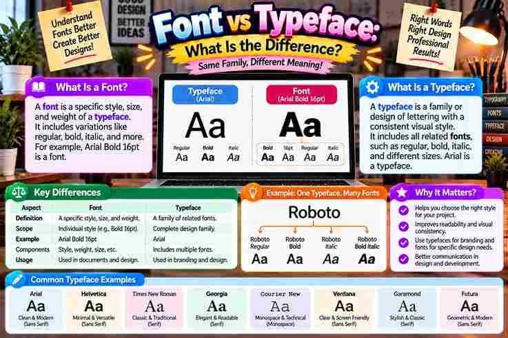
People often treat font and typeface as identical, yet their roles differ. A typeface expresses an overall design and visual personality, while a font delivers that appearance through a particular style, weight, or technical form.
In practical typography, this distinction becomes useful when choosing headings, body text, or branding elements. Understanding the terminology helps designers make informed design choices, maintain brand consistency, and communicate a project’s intended tone more clearly.
Table of Contents
What Is A Typeface?
A typeface is the overall design system behind a coordinated collection of characters, letters, numbers, and symbols. In practice, I treat it as the visual family that defines shared aesthetics, structure, and recognizable personality today.
Unlike a single font, a typeface can contain multiple weights, styles, and variations while preserving a common aesthetic. Designers choose the typeface for mood and readability, then select a specific implementation for practical digital use.
Also Read: Twitter Font Generator: Bold Magic
What Is A Font?
A font is a specific font design prepared for practical use, carrying stylistic parameters through variations in stroke density and angle within a character collection. I view it as the working form designers select daily.
Behind that visible choice, a font may exist as a digital file with a particular font format, while its font representation must behave correctly inside an operating system. That technical layer separates appearance from implementation.
What Is A Font Family?
A font family is a coordinated type family built around one shared aesthetic, while its individual font styles vary through weights, widths, and other controlled adjustments without losing the recognizable visual identity of the design.
In practice, I treat a font family as a system containing a regular version, bold version, and other specific variations such as slant, helping designers maintain cohesive typography across different character sets, scripts, and layouts.
What Is Type?
In typography, type is the broader general concept behind arranging and reproducing letters as a united system, not merely one file. Its historical roots connect movable type, printing text, and evolving physical letterforms visually together.
From my design work, understanding type design starts before choosing a specific style or handling technical aspects. Designers shape characters, weigh design versatility, and build visual systems whose purpose supports clear, consistent communication across media.
Typeface Types / Classifications
Classification becomes useful when designers stop treating typefaces as decoration alone. Serif, Sans Serif, Slab Serif, Script, and Display work as foundational categories, each shaping reading rhythm, visual authority, emotional tone, and practical selection decisions.
In practice, I classify typefaces further through font weights, slope degree, width, and contrast. A roman, italic, or slanted form can noticeably shift personality, while thin, regular, and bold decisions refine ordering and textual prominence.
Also Read: Tips for Writing Better Discord Nicknames
Font Types
In practical typography, selection goes beyond a simple label. Font styles may include Regular, Bold, Italic, and DemiBold, allowing designers to establish hierarchy, contrast, and readability while matching different publishing situations with deliberate visual control.
Experienced typographers often examine type families that extend into specialized gradations, including a Hairline font style. This broader font classification gives studios greater control over hierarchy while keeping related members visually coherent across varied applications.
What Kinds Of Fonts (Font Styles) Exist?
In practical typography, font types often describe functional variations rather than separate design families. Cambria may appear in regular, semi-bold, extra-light, or italics, giving designers flexible choices for hierarchy, reading comfort, and clear visual balance.
For a website, headers and callouts often need stronger emphasis, while long-form body text benefits from restrained styling. A slanted design can make quotes or subtext stand out without disrupting readability or overall design consistency.
History Of Typeface Vs Font
Long before digital typography, the word font grew from Old French fonte, linked to casting and fondre, meaning melt. Printers worked with physical metal letters, so a font described one practical assortment for printing work.
Later, especially by the mid-19th century, typeface emerged as a compound of type and face, describing the design impressed from each metal block onto paper. Digital systems kept the distinction, although everyday usage blurred it.
Real-World Examples Of Typeface Vs Font
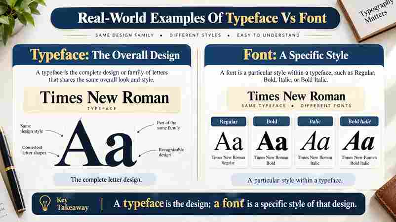
In a branding review, I treat Arial as the broader design system, while Arial Bold is a specific weight delivered as a file. That distinction helps developers reproduce the hierarchy across interfaces reliably and consistently.
For editorial work, Times New Roman can describe the typeface, while a chosen bold or italic implementation becomes one of its specific fonts. Likewise, Nexa Pro Bold may serve a headline without redefining Nexa Pro.
Why The Difference Matters / Practical Importance
In practice, the distinction strengthens design expertise throughout a design project because teams can separate visual intent from implementation. Strong brand guidelines, accurate licensing, and a precise grasp of terminology prevent avoidable production confusion early.
From my experience, naming a typeface and its font reduces mistakes during handoff. Designers can discuss font choice, specific font details, technical spec requirements, and digital platforms without weakening a recognizable identity or creative vision.
Also Read: How to Curve Text On An Instagram Story (iPhone, Android & iOS)
Clarifying The Font And Typeface Distinction
In casual conversation, font and typeface often behave like synonyms, yet design work benefits from precision and specs. A typeface carries the design DNA and artistic style, while a font delivers one usable, defined expression.
When I organize typography choices, the overarching design establishes visual character first; the digital file then provides its technical delivery mechanism. That separation prevents naming confusion and keeps typography decisions understandable across collaborative projects consistently.
How Do I Use The Terms Correctly?
In everyday casual talk, people often use the terms font and typeface interchangeably, but professionals benefit from precision: use typeface for the broader design family, and font for a specific style, weight, or particular variant.
In my work, when speaking with a client, I state the typeface name first, then specify the font needed. In a style guide, license, or professional contract, this distinction keeps files, variants, and expectations clear.
What Is The Difference Between A Font And A Typeface?
In practice, a design style defines the visual system shared across letters, creating visual consistency, while a font is one realization of that system, often distinguished by weight, width, or font style in production workflows.
The distinction becomes clearer across media: digital fonts adapt through technology for screens, whereas printed fonts once depended on physical carriers. The typeface remains the broader identity; each font expresses its nuances in specific settings.
Also Read: Glitch Text Generator
Conclusion
In practice, the distinction supports precise language, spec clarity, and handoff. It turns terminology into a working tool, helping teams align design elements, hierarchy, and user experience while preventing confusion during project development and reviews.
From experience, great design depends less on labels than disciplined vocabulary knowledge. Knowing the distinction strengthens effective text communication, protects the intended visual result, supports licensing compliance, and reduces misunderstandings across a complex professional environment.
What Is The Difference Between A Font And A Typeface?
Practically, a typeface defines the design style behind a font family, while a font is one usable member with specific thickness or settings. Type designers build the system; users select individual styles for layout needs.
Can Typeface And Font Be Used Interchangeably?
Everyday conversation often treats typeface and font as interchangeable, but designers benefit from precise vocabulary: a typeface describes the broader visual system, while a font identifies a single style, weight, format, or digital file instance.
Is Arial A Font Or A Typeface?
Arial is best understood as a typeface: the overarching design, not one font style. Each Arial variation supplies a specific set of characters with defined weight or slant, reflecting practical designing letters decisions for use.
What Are Some Examples Of Fonts Vs Typefaces?
Futura works as a typeface, while Arial Bold Italic represents a particular font instance. I treat CoFo Sans Bold similarly: the broader design identity can contain related fonts, each carrying distinct styles for practical use.
Why Do Designers Care About The Difference Between Font And Typeface?
Designers care because the distinction sharpens graphic design decisions: a typeface establishes a brand personality, while font selection preserves visual consistency. In practice, clearer terminology also guides stylistic choices across layouts, teams, and production workflows.