
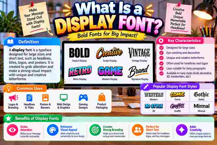
A display font earns its place by making visual impressions immediate, not by behaving like text. In my studio work, the strongest choices sharpen a brand’s voice, direct the viewer’s focus, and establish memorable presence.
Historically, mass printing pushed lettering toward visual territory; today, creative freedom expands that role. I evaluate unconventional shapes as a communication tool, checking whether they create a lasting impression without sacrificing clarity, purpose, or adaptability.
Table of Contents
Definition And Importance In Design And Branding
A typeface built for short bursts of text prioritizes visual impact over comfort during long reads. In practice, I judge its presence by how confidently a single word becomes a bold statement without losing purpose.
Display lettering shapes brand personality instantly. I use it across brand logotypes, editorial headlines, and social content headers to sharpen key messages, strengthen brand expression, and create visually striking designs for the target audience effectively.
Also Read: Fancy Text Generator – Transform Your Text Into Something Fancy
How Display Fonts Differ From Body/Text Fonts
From practice, I treat display faces as short-form tools: large sizes, headlines, logos, and posters reward boldness, personality, high contrast, and decorative elements, whereas body text fonts prioritize legibility, readability, and calm repetition for impact.
Text families survive smaller sizes through regular weight, clean lines, and restrained detail. Display designs push exaggerated shapes, intricate details, strong contrasts, expressive styles, distinctive styles, and visual interest because attention matters more than reading.
Key Characteristics Of Display Fonts
From practice, the strongest display faces succeed through thick strokes, stylised letterforms, and deliberate quirky proportions. Their presence becomes obvious in oversized settings, where high-impact glyphs create visual statements without needing long explanatory text nearby.
I judge a display font by how confidently it handles headline usage and scale. Strong designs often favor sharp serifs, bold weights, or ornamental alternates, while preserving legibility for branding uses and real-world layouts today.
Also Read: Glitch Text Generator
Types Of Display Fonts
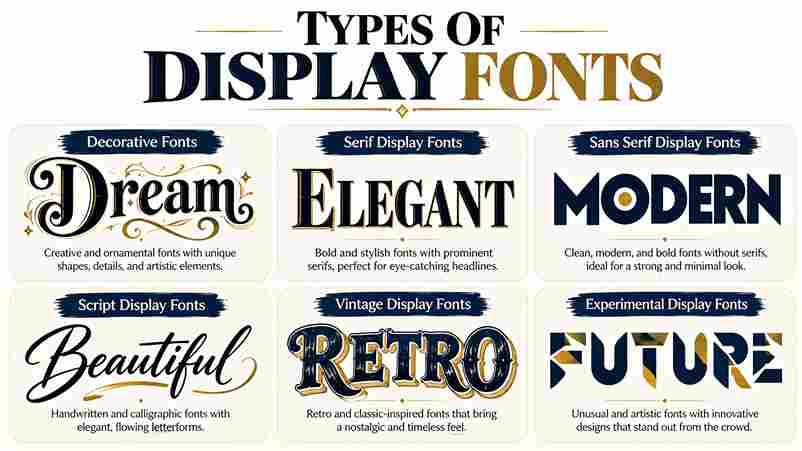
In practice, display categories work best when chosen by behavior rather than labels. geometric sans-serifs feel controlled, vintage-inspired scripts add warmth, while slab serif and didone approaches create different levels of authority and theatrical tension.
I often separate display choices by energy: decorative, restrained, or experimental. hand-lettered scripts suit expressive identity work, sans serif options sharpen contemporary arrangements, and decorative features or unique ligatures can give prominent lettering a personality.
What Display Fonts Are Used For
In practice, display fonts earn their place where attention matters most: headlines, logo creation, advertisements, packaging, and book covers. I use them to establish focus, especially when large-format applications demand personality before close reading begins.
They also strengthen branding materials, social headers, merch graphics, and web headers, where compact messaging needs energy. Used selectively, a distinctive face can shape visual hierarchy, reinforce brand recognition, and make brief messaging feel deliberate.
Also Read: ASCII Generator Made Easy
Brief History Of Display Fonts
Display lettering began as a practical response to visibility: wood type and letterpress printing gave posters scale, while early advertising typography transformed oversized letters into commercial signals. In practice, those constraints encouraged expressive, memorable forms.
Later, mid-century commercial lettering and hand-painted signage widened the visual vocabulary, especially across American delis and grocery stores. By the sixties and seventies, display styles became cultural markers, feeding retro revivals and contemporary experimentation today.
Display Font Examples Worth Knowing
In practice, memorable examples often reveal a category faster than definitions: a reverse-contrast retro face feels theatrical, while a bubble display font feels playful; geometric sans-serif designs instead deliver modern appeal, bold headlines, and branding.
I also watch how context changes perception: a rugged, textured typeface suggests handcrafted feel, while soft rounded serifs suit editorial design; modern sans-serif font family options with unique styles create standout logos and compelling headlines.
Choosing The Right Display Font For The Job
Choosing well starts with the job, not the font. I judge tone, intended size, and medium first, then test whether bold, stylized letterforms strengthen the message without sacrificing usability or distracting from the brand identity.
For projects, I compare the display face against body copy, visual hierarchy, and context. A strong choice balances character, contrast, readability, and flexibility, avoiding trendy details that weaken long-lasting impact across print and web use.
Also Read: What Is Typography and Why Does It Matter?
Pairing Display Fonts
From experience, pairing works best when a bold display font carries personality while clean sans-serif typography handles supporting information. Contrast protects readability, gives hierarchy, and keeps the harmonious composition expressive without making elements compete visually.
I usually judge pairing against the environment, medium of use, and intended message rather than fashion alone. A restrained companion face can support distinctive brand identity, strengthen visual element hierarchy, and keep fast-scrolling environments readable.
Are Display Fonts Better For Logos?
In practice, display typeface choices can make logos more distinctive, but better depends on identity goals. Strong wordmark work benefits from custom character connections, controlled visual experimentation, and intentional personality without sacrificing legible instant recognition.
Are Display Fonts Good For Online Reading?
In practice, display fonts rarely suit long runs of text on screens; personality can create visual noise and eye fatigue. I reserve them for digital interfaces, while UX copy, fine print, and paragraphs need restraint.
When Should I Use Display Fonts?
I use display fonts when a headline needs maximum presence, a brand name demands unique typography, or packaging needs strong presence; in practice, larger sizes work best, while body text requires simplicity, rhythm, and consistency.