
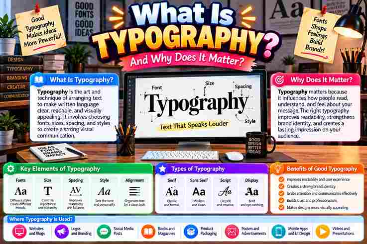
This craft is not a computer-age invention; it is an art form shaped across centuries. From Johannes Gutenberg and the movable printing press onward, arranging text keeps language readable, supports visual impact, and serves readers.
In practice, I judge lettering by whether individual characters feel intentional and text remains enjoyable. A kerned serif font, consistent spacing, and white space preserve brand integrity across screen sizes, resolutions, and high-quality print materials.
Table of Contents
What Is Typography?
In practice, typography is the technique of arranging type so written language becomes readable, legible, and aesthetically appealing. Thoughtful font choices, spacing, and layout shape clarity, guide the reader, and strengthen each specific message clearly.
I treat typeface, font, alignment, hierarchy, style, and color as practical controls rather than decoration. Together, these design elements organize text, establish visual impact, influence tone and mood, improve comprehension, and support consistent brand identity.
Why Is Typography Important? 6 Reasons
Typography matters because visual hierarchy guides the viewer eye before reading begins. Strong contrast, deliberate line spacing, and thoughtful font style support accessibility design guidelines, helping a wider audience process essential information more easily today.
Beyond legibility, I have seen brand personality become clearer when consistent typography supports brand recognition. Meanwhile, bold colors, deliberate placement, and a primary heading can build consumer confidence while directing viewer attention without visual noise.
Increases Accessibility
Accessibility improves when designers treat readability as a practical requirement, not decoration. In my experience, clearer font size, thoughtful spacing, strong contrast, and disciplined alignment help diverse readers process information comfortably across different devices consistently.
Good digital typography also supports users navigating challenging lighting conditions, varied environments, or dense content. I have found that legible typefaces, balanced color, sensible letter spacing, and predictable hierarchy reduce friction without weakening character unnecessarily.
Also Read: Serif vs Sans Serif Fonts: Key Differences
Draws Attention
In client layouts, I’ve found a bold yellow heading can outperform decorative clutter: it gives visitors an immediate focal point, while typographic hierarchy quietly directs the eye toward critical details before secondary content enters consideration.
Emphasis also depends on restraint. An attention-grabbing headline, paired with a bold all-capital font or chosen call-to-action button, can sharpen readers attention, provided surrounding content stays calm enough for the emphasized priority to remain unmistakable.
Establishes Hierarchy
Hierarchy often works before readers consciously notice it. I use font sizes, weights, and headings to guide the reader eye toward key information, while quieter body text preserves rhythm, clarity, and deliberate reading momentum smoothly.
Rather than making everything louder, strong typography creates selective emphasis. Thoughtful subheadings shape transition between sections, helping essential points surface naturally while visual harmony keeps each composition readable, confident, and purposeful across varied formats overall.
Shows Personality
Typography can announce character before meaning fully lands. In client work, I’ve watched typeface selection and font styles turn identical copy from formal to friendly, while playful identity choices make young brands feel unmistakably human.
Personality becomes stronger through repetition. Pairing font families with aesthetic elements, visual identity, and polished appeal gives a recognizable attitude; even subtle shifts in confidence or refinement can quickly change how readers interpret its voice.
Sets The Tone
Tone emerges before readers evaluate wording. From client work, I’ve watched personality shift through restrained letter choices alone; the delicate typeface used by Wabimento, a funeral services provider, communicates quiet care without decorative excess immediately.
That effect becomes clearer when context is emotionally charged. Roem, a Webflow designer, paired gentle forms with soothing images for people grieving a loved one, proving restraint can establish warmth before detailed information is read.
Promotes Brand Recognition
From client projects, I’ve learned that brand identity becomes recognizable when typography repeats with discipline. A consistent brand presence gives every touchpoint a unified look, so customers identify the company before consciously processing its name.
Recognition grows through subtle repetition, not louder design. Thoughtful typography choices create a polished look, while each visual representation reinforces the same personality. Over time, this consistency strengthens the brand image across familiar customer encounters.
What Is The Purpose Of Typography?
Typography turns creating text into communication, helping visual communicators shape written messages with clarity. In practice, selecting fonts, adjusting spacing, and structuring content guide attention, improve understanding, and make information feel intentional rather than accidental.
Its purpose reaches beyond appearance: typography influences reader perception, supports target audiences, and strengthens writing quality across print materials and digital platforms. I have found balanced choices make information easier to scan, trust, and remember.
Enhances Online Text And Other Writing
Strong online content often succeeds before readers notice its typography. In my experience, thoughtful web design can enhance readability, guiding focus through words while preserving rhythm, clarity, confidence across screens, interfaces, and the reading experience.
Typography also strengthens written communication beyond websites. Careful hierarchy, spacing, and structure help writers organize words, while typography tools support consistent presentation. This makes prose feel intentional, accessible, and easier to scan without becoming predictable.
Makes Writing More Artistic And Interesting
From practice, I’ve learned the written word becomes more expressive when type design, letter designs, and aesthetics work together, giving ordinary writing a distinctive voice while preserving readability, purpose, and memorable visual character across formats.
Instead of decorating every line, I balance visual appeal, font designs, negative space, italic, and bold type selectively; this keeps the presentation process controlled while creative design elements make text feel lively, intentional, and human.
Creates Brand Messages Without The Need For Images
Strong typography can carry a brand story before any illustration appears. In my design work, a distinctive logotype, deliberate layout, and expressive printed words often transform copy into memorable brand messages with personality and recognition.
An image-free identity succeeds when typographic design becomes the visual voice. A focused webpage heading, controlled spacing, and purposeful letterforms can sharpen a design message, giving brands persuasive print communication that feels recognizable without imagery.
Emphasizes Messages And Text
In practice, typography emphasizes text by directing the eye toward important words before readers process supporting detail. Strategic bolding, contrasting fonts, and whitespace create visual hierarchy, making urgent messages feel immediate without overcrowding the composition.
I have found that emphasis works best when typography controls attention rather than decoration. A typeface, weight, spacing, and alignment can emphasize phrases, clarify critical information, and strengthen communication while preserving readability across printed materials.
Elements Of Typography
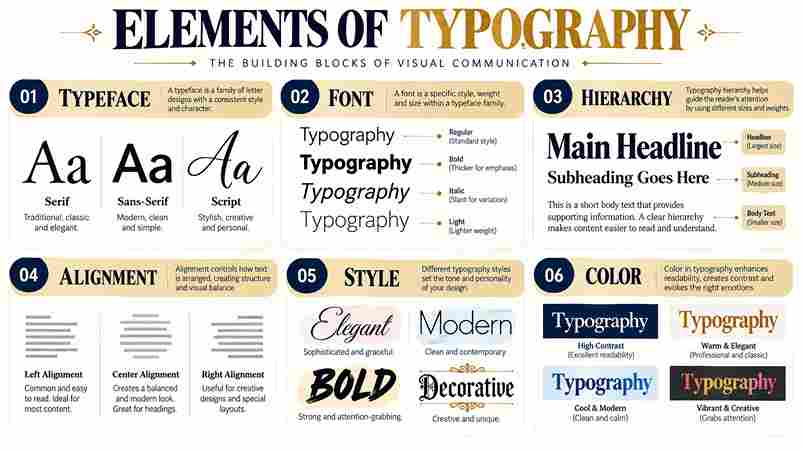
Typography works best when its key elements behave as one system: organizing text, symbols, styles, formatting, italics, and strikethroughs shape emphasis, while spacing and alignment quietly control rhythm, helping readers scan information without visual friction.
From my design experience, Arial, Times, and digital fonts reveal how print vs digital media changes decisions; accessibility, decorative fonts, bold typeface, and artistic elements matter only when deliberate techniques preserve clarity, proportion, and consistency.
Typeface
Choosing a typeface is less about fashion than controlled voice. In client work, I test serif typefaces beside sans-serif typefaces, judging rhythm and readability before deciding whether letterforms should feel historically grounded, neutral, or contemporary.
Practical selection changes with context: Johnston Sans font proves identity can emerge from disciplined shapes, while a decorative font may add character but weaken long reading. I compare proportions, spacing, and reproduction on textured papers.
Font
From practice, a font succeeds when its personality supports reading before decoration. Helvetica feels controlled, Verdana stays open on screens, while Georgia adds warmth; each choice changes rhythm, emphasis, and confidence without altering message itself.
Historically, typography proves that one family can carry radically different voices. Times New Roman suggests formality, Comic Sans informality, and a sans serif typeface modern restraint; I test weight, spacing, and scale before judging appearance.
Hierarchy
Strong hierarchy rarely begins with size alone; I usually establish order through contrast, spacing, and placement, letting headers signal priority while important snippets pull attention before readers commit to the full article or supporting detail.
In practice, I treat hierarchy as a navigation method, not decoration: a news journal may emphasize headlines differently from an online magazine, while paragraphs and clear navigation page cues keep scanning intuitive and purposeful throughout.
Alignment
In practical graphic design, alignment often decides whether a web page feels intentional before anyone notices the typeface. I use center alignment sparingly, mainly when short quotes need emphasis without disrupting the surrounding reading rhythm.
For projects, I prefer predictable anchors over symmetry. Using right alignment can sharpen labels or footers, but consistent edges matter more because readers scan structure, making typographic relationships feel calmer, faster, and easier to trust.
Style
In practice, typography style emerges through choices that shape aesthetic character before readers notice them. I often balance colorful fonts, animated fonts, and restraint so visual personality feels intentional rather than decorative, noisy, or forced.
Historical references can sharpen modern decisions: Victorian calligraphy suggests ornament, while minimalist systems favor restraint. Used carefully, sans-serifs, stylish detailing, and fashionable influences help typography express context without sacrificing readability, consistency, or practical usability daily.
Color
Color often decides whether typography feels intentional before readers process meaning. In practice, I test blue web page background combinations against type weight, because contrast can improve readability while preserving calmness, credibility, and visual consistency.
A typographer should treat color as hierarchy, not decoration. When a client request favors stronger tones, I compare emotion, mood, and accessibility first; controlled contrast can create excitement without sacrificing legibility, coherence, balance, or restraint.
Rules Of Typography
Typography starts where taste ends: a typography rule should guide judgment, not replace it. In practice, I balance professional fonts, reading comprehension, kerning, and proportionate spacing before considering decoration, because disciplined restraint creates stronger communication.
Rules matter when they protect structure. I check print hierarchy, left alignment, content space, and readable text first, then review breathing room, color principles, and necessary components so each layout feels intentional rather than standardized.
Follow Proper Grammar Rules
From editing real client layouts, I’ve learned that grammar is one of typography’s quietest rules: accurate punctuation strengthens content design, while typographic elements should support meaning. This guideline keeps visual choices from disguising weak sentences.
Different applications demand different voices, yet sound principles remain consistent: edit writing before styling it. I treat grammar as part of design principles, because best practices improve clarity, while thoughtful uses of typography preserve meaning.
Keep Fonts Limited
Limiting type choices strengthens a layout because every font pair gains a clearer role. In my experience, restrained systems help main text and supporting details feel intentional, preventing visual competition while preserving clarity across applications.
A rule is choosing one family and one companion rather than collecting alternatives. This keeps communication coherent, supports reader-friendly design, and lets a flowing script-type font appear selectively without weakening consistency or distracting readers overall.
Use Fonts Appropriate To The Audience
I have found that effective typography begins with understanding audience questions before choosing type. Focus groups can reveal whether sans serif fonts feel approachable, while serif font choices may consistently communicate tradition, refinement, or trust.
For marketing materials, I match typography to context rather than personal taste. Considering the reader perspective, audience expectations, and visual components helps designers select letterforms that remain easy to read, credible, appropriate, visually, and purposeful.
Learn The Basics Of Kerning
Kerning matters most when small spacing errors interrupt visual rhythm. I assess each pair rather than the whole word first, because tightly packed letters reduce visibility and make otherwise polished typography feel tense and unrefined.
From experience, the opposite problem deserves equal attention: excessive spacing can fracture a word’s shape and slow reading flow. Strong kerning keeps character relationships intentional, especially where diagonal forms, curves, or capitals create deceptive gaps.
Apply Proper Alignment
In practice, alignment rarely means forcing every element into symmetry. I first establish a clear direction, then test whether titles, body copy, and spacing create a readable rhythm that guides attention naturally throughout the composition.
For layouts, center alignment can create controlled emphasis, while right alignment works best when the surrounding structure supports it. I judge each choice by readability, visual balance, and how quickly readers understand relationships between elements.
Implement Print Hierarchy
In print, hierarchy works best when headlines create immediate attention, while subheadings guide scanning and support reader engagement. I prioritize organized structure before decoration, because professional layouts help readers understand information quickly without visual competition.
From experience, I adjust sizes, margins, and blocks of text according to their relationship with surrounding components. Strong print hierarchy depends on balanced design, clear headings, and intentional design components that make navigation feel effortless.
Work With Design Grids
I treat design grids as quiet structure: a defined margin, measured columns, and aligned anchors keep typography disciplined without making layouts feel mechanical. Strong grids let large text blocks breathe while preserving purposeful relationships clearly.
On print projects, I build grids before styling headings, subheadings, and captions. That habit turns design projects into adaptable systems, where templates, guidelines, and overall typography remain consistent even when content changes across changing formats.
Pair Fonts Appropriately
Pairing typefaces works best when contrast supports purpose, not decoration. In my design practice, a font pair feels cohesive when one style family establishes structure and another supplies measured contrast without clearly competing for attention.
I judge combinations through creative work, not isolated specimens. Strong pairing follows typography principles, respects the niche, and avoids unnecessary embellishment; even classic serifs can complement contemporary lettering when proportions, weight, and rhythm stay compatible.
Measure The Letters And Ensure Proportionality
In practice, I measure letters by comparing stroke width, counters, and curves, because proportionality is perceptual before mathematical. A well-shaped letter stays visually stable when centered, without forcing identical dimensions across naturally different printed characters.
When adjustments are necessary, avoid distorting or widening forms merely to fill space. Careful resizing preserves sharpness, while checking electronic letters beside print samples exposes proportional faults before enlarging letter spacing masks them in production.
Address Readability
Readability fails before readers notice quality. In practice, I test low-contrast color combinations, font, leading, and text formatting first, because subtle friction can burden visual impairments, dyslexia, and ordinary reading across printed or digital layouts.
A polished page can seem illegible. I compare inconsistently spaced script against an evenly spaced serif font, checking black font color on off-white background while limiting italicizing and underlining so readers process text without interruption.
Choose Appealing Font Colors
I assess text design by contrast: black on white stabilizes print text, while a bright background, bright colors, gradient, or colored logo can create a striking effect. Within a web page, low-contrast combinations weaken clarity.
I test background color with plain black fonts, light gray, white, and grayscale. A pale tone, light tone, pale gray, or lighter style font supports a subtle aesthetic, while refined aesthetic choices vary across formats.
Ensure The Type Is Undistorted
In practice, undistorted typography protects text appearance before styling. A misaligned font or stretched lettering immediately exposes weak technical skills, because readers notice unnatural character proportions even when they cannot explain precisely what feels wrong.
I preserve original shapes, then refine large and small settings through spacing rather than scaling letters unevenly. Strategic placements and printing test samples reveal deformation early, helping each composition stay stable and deliver high-quality results.
Retain Some Negative Space
In typography, negative space prevents a cluttered, overwhelming page before decoration begins. I’ve found a white background gives cluttered text breathing room, strengthens cohesion, and keeps small text blocks visually balanced during practical print work.
Rather than filling every gap, I preserve space around headlines and body copy so print typography stays easy to read. This avoids disorganized composition, improves engagement, strengthens material impact, and remains visually appealing at distance.
Also Read: Font vs Typeface: What Is the Difference?
Take Advantage Of Typography Tools
In practice, typography becomes easier when software programs serve judgment rather than replace it. I use tools to test spacing, compare proportions, and inspect computer knowledge, helping every decision stay intentional, readable, consistent, and adaptable.
Modern word processing programs can expose issues before production, especially when enlarging or manipulating type. Combining previews with digital printing techniques also reveals practical limits, turning routine checking into stronger craft and reliable screen decisions.
Why Is Typography Important In Print Design?
Typography on paper succeeds through restraint: thoughtful font selection and high-contrast typography guide the reader eye toward key information without crowding the surface. In my experience, that discipline consistently protects message clarity across extended content.
It also influences commercial outcomes: stronger hierarchy creates digestible sections, while careful pre-print testing preserves typography precision and text sharpness. On physical products, these decisions improve product differentiation and support confident purchasing decisions during production.
Enhances Readability And Communication
In production work, legibility succeeds when communication feels effortless rather than decorative. I have found that structured printed materials guide the eye naturally, helping an audience absorb meaning quickly without struggling through distracting typographic choices.
Strong typography also protects engagement by making information easier to scan, understand, and remember. In practical production work, deliberate spacing and contrast matter most when every printed element supports comprehension instead of competing for notice.
Strengthens Brand Identity
Strong typography turns a company name into a familiar wordmark, where consistent fonts, color schemes, and visual elements create recognizable brand design. In practice, this consistency strengthens market presence and helps audiences remember identity quickly.
Rather than relying on a logo alone, brands gain distinction when typefaces, packaging, marketing channels, and different touch points repeat a coherent personality. I have seen disciplined typography make brand messages feel impactful and memorable.
Creates Visual Hierarchy And Impact
Visual hierarchy is not simply about making a heading larger; I’ve found that spacing elements, color contrast, and prominent location guide reader attention effectively in practice, shaping emphasis even before conscious interpretation of content begins.
A strong composition can feel immediate without becoming loud. Pairing a design grid with large font, bold effect, and letter height creates visual interest, while important information gains presence without sacrificing structure, restraint, or readability.
Influences Audience Perception
Audience judgment often forms before meaning is fully processed. In my print work, serif fonts can suggest elegance, tradition, and professionalism, while sans-serif fonts often signal modern thinking, simplicity, and innovation through restrained visual choices.
That perception shifts with context: colors, font pairing, tracking, and visual design influence trust, energy, and clarity. I have seen a brand message feel inconsistent when typography conflicts with expected emotions, weakening brand impact immediately.
Elicits Emotional Responses
Typography can trigger an emotional response before readers consciously process a message. In practice, I have seen warm hues create energy and warmth, while cool tones introduce calm, sophistication, and a more measured reading mood.
That influence depends on more than color: font colors, background, contrasting colors, size, and letter spacing can make text feel urgent, elegant, playful, or restrained, shaping audience perception without altering its literal meaning for readers.
6 Typography Best Practices For Effective Print Design
Effective typography succeeds before decoration begins: selecting complementary fonts for a cohesive look, refining kerning, word spacing, and leading, then arranging text elements deliberately creates hierarchy while consistent brand guidelines prevent font variation across materials.
I test each composition by checking font legibility on physical materials, comparing paper type and print resolution, then balancing high-contrast text with color psychology so a restrained color scheme stays readable under varied printing conditions.
Choose The Right Typeface For The Message
Choosing type begins with intent, not fashion. I match a font family to target audiences, testing whether formal fonts support authority or informal fonts create approachability while preserving clarity, credibility, and the message’s emotional direction.
In practice, I compare specific style, width, and height before judging personality. Garamond can suggest tradition, while sans-serif typefaces feel cleaner; shifting tones carefully keeps the type expressive without visually overpowering content or confusing readers.
Prioritize Readability With Proper Spacing
In production work, I prioritize line spacing measurements before stylistic choices. Controlled letter width and content alignment prevent crowding, while thoughtful reading flow helps readers move through dense copy comfortably without losing emphasis or meaning.
I usually review spacing at final size, because previews hide minor faults. Keeping content proportionately measured, preserving text legibility, and allowing blank space creates calmer pages where focus settles naturally instead of fighting compressed typography.
Establish A Clear Hierarchy
From practice, graphic designers often clarify textual elements by letting body text recede while a subheading signals direction. On a homepage, this ordering helps visitors understand the company, its services, and priorities immediately for readers.
Consider Vlow, a Dutch events company, whose design agency, Mediaploeg, uses a pop culture theme, vibrant video, event space, and split screen treatment. The video supports hierarchy without competing with essential reading cues during navigation.
Ensure Consistency Across Materials
Consistency matters when typography moves between channels. I’ve found that matching style formats, layout styles, and cohesive fonts helps a written design piece feel connected, whether audiences encounter it through business cards or broader campaigns.
Rather than forcing identical layouts everywhere, preserve recognizable decisions. Maintaining overall structure, a harmonious look, and design grids keeps print and digital executions aligned, while organized print supports dependable hierarchy without flattening practical differences unnecessarily.
Test Typography Before Printing
Before approving a job, I compare on-screen typography with a physical proof, because screen to paper shifts can expose weak text clarity or unexpected changes in ink quality that digital previews often conceal in print.
I inspect small type at actual size, checking spacing and alignment rules under normal lighting. This practical habit catches cramped details, distorted forms, and weak visibility early, protecting design requirements before final production becomes expensive.
Use Color Strategically
Color should guide emphasis before decoration. In physical typography, I often build a color palette around contrast, pairing black or darker blue glyphs with restrained backgrounds so hierarchy remains legible, deliberate, and visually coherent throughout.
Used selectively, color can distinguish section markers, cues, and priority notices without overwhelming composition. An overall design should balance aesthetic appeal with legibility, carefully testing white, orange, or yellow accents against surrounding typography before production.
Also Read: Fancy Text Generator
Case Studies
In case studies, I have seen typography succeed when historical restraint meets testing: the Gutenberg Bible demonstrates disciplined structure, while modern glossy papers reveal how production surfaces can unexpectedly alter clarity, weight, and perceived authority.
A useful contrast appears in identity projects: a graffiti font may strengthen a rebellious character, while thoughtful packaging shapes trust. I often review emotional response alongside content marketing strategies before recommending typographic changes to clients.
How Has Typography Changed From Traditional Printing To Digital Media?
Typography has evolved from 15th century printing process methods and mass-produced books to modern digital printing and online platforms. Despite changing technology, designers still balance readability, visual appeal, and communication across different medium formats.
Can Typography Affect How Customers Feel About A Business?
Yes. Typography can influence consumers minds by shaping perception, trust, and emotional reactions. Suitable lettering can communicate elegance, approachability, or professionalism, helping businesses develop a distinctive brand personality that customers recognize across different touchpoints.
Does Typography Work Differently On Screens And Printed Materials?
Typography behaves differently across screen sizes, paper surfaces, and printing conditions. Designers must consider resolution, spacing, contrast, and paper texture so text remains clear on websites, brochures, magazines, signage, and other physical or digital applications.
Can Typography Communicate Emotion Without Using Pictures?
Yes. Typography can act as an influential tool and storytelling tool without relying on images, graphics, or pictures. A script font, carefully selected colors, and expressive letterforms can create fun, urgency, sophistication, or a hopeful tone.
What Tools Can Designers Use To Improve Typography?
Designers can use software, Adobe, word processing software, and other software tools to refine spacing, alignment, and presentation. These tools provide useful recommendations, tips, and opportunities for improvement while helping teams create consistent digital and print content.
2 thoughts on “What Is Typography and Why Does It Matter?”