
How Typography Affects Readability
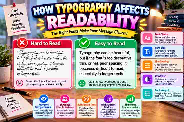
Typography shapes how readers encounter content before meaning fully settles. In my work, the right typeface, font size, spacing, and contrast can reduce visual effort, helping the reader move through text with greater clarity and confidence. Readability is not about attractive letters; it depends on how legibility, line length, line spacing, and text alignment cooperate. Good typography creates an intuitive rhythm, so people can understand words without unnecessary pauses, clutter, or strain. Typefaces For Body Copy Choosing a typeface for body copy is less about fashion than reading. In practice, I favor readable forms with clear character shapes, moderate font size, and enough line spacing to keep attention steady across longer passages. For web and print, I test font families, letter spacing, line length, text alignment, and contrast together, because typographic changes can disrupt reading rhythm. This broader check often reveals weaknesses that choosing a typeface alone misses. Legibility Vs. Readability Legibility concerns whether characters remain distinct, while readability describes how comfortably a reader can process text. I assess typeface, spacing, contrast, and line length together, because character-level clarity does not guarantee effortless reading on screen. Readability can remain when letters look clear: longer paragraphs, line spacing, weak text alignment, or blocks increase eye fatigue. Comprehension depends on rhythm, so typography work balances character recognition with sustained attention across the page. Also Read: Corrupted Text Generator – Corrupt Your Text Instantly Font Size Choosing the right font size supports legibility because larger font sizes help readers distinguish individual characters quickly. In practice, I adjust size according to viewing distance, screen conditions, and the density of surrounding text content. However, excessively large fonts can disrupt reading flow and reduce readability when pages become fragmented. I usually reserve larger sizes for headings, while body text stays clear enough to sustain comfortable reading and focused attention. Letter Spacing And Word Spacing Careful character spacing prevents nearby letters from blending, while adequate character spacing keeps words distinguishable. I evaluate spacing beside lines of text, because local fixes can look polished yet create uneven rhythm across the paragraph. I also test appropriate line spacing alongside word spacing; even strong letterforms can feel cramped when vertical and horizontal gaps compete. In my layouts, restrained spacing supports smooth reading without making the page visually fragmented. Color / Contrast Strong contrast between text color and background color improves visibility, while bright colors preserve hierarchy without tiring readers. I routinely test combinations at reading size, checking legibility, clarity, and comfort before approving a screen carefully. Low contrast looks, yet it can weaken readability when text and background become distinguishable. I avoid harsh contrasts that introduce strain or discomfort for passages, so the reader perceives color as support, not an obstacle. Text Alignment In practice, left-aligned text gives readers a consistent starting point, which steadies reading flow across paragraphs. I find this especially useful when structure matters, because predictable edges reduce visual searching and keep attention moving smoothly. Centered text can look elegant, but frequent alignment changes may disrupt reading rhythm. Justified text can create uneven spacing, while short lines complicate scanning; for passages, I prefer stable alignment that supports clarity and comprehension. Lowercase And All Caps Lowercase usually creates a reading flow because letterforms retain varied shapes and recognizable patterns. In my practice, continuous body text feels less tiring when lowercase supports quick word recognition, especially across longer passages and screens. All caps can strengthen emphasis, but passages often slow reading because uniform letter height reduces visual variation. A font choice that reserves capitals for headings, labels, or short phrases usually preserves readability, hierarchy, and attention. Examples Of Different Fonts And Capitalization In Practice Comparing serif and sans-serif examples reveals how capitalization changes texture. Times New Roman can feel formal, while Helvetica appears modern; lowercase generally supports paragraphs, whereas capitals create stronger visual signals for brief section headings today. On a classroom page, lowercase body text can remain approachable, while all caps may clarify labels or compact titles. I often test both with actual readers, checking clarity, spacing, and reading rhythm before finalizing typography. Also Read: Pls Donate Text Generator (Copy & Paste) | Fast & Free Typography’s Role In Brand Identity / Perception In brand work, I have learned that typography establishes an initial connection before audiences process the message. A carefully chosen font can make a brand feel professional, while subtle styles shape how users perceive its identity. I also test typography against emotions and engagement: a restrained face can signal seriousness, whereas playful forms invite happiness without sacrificing readable structure. In practice, these choices influence users’ experience, websites, and even bounce rates. Reverse Type And Light Or Heavy Weights Reverse type often reduces reading comfort because white text loses edge definition against a dark field. In my testing, this treatment works best for brief emphasis, while longer passages need stronger contrast and extra restraint. Light and heavy weights change visual balance quickly. A very thin face can weaken legibility, while excessive weight creates harsh contrasts. I usually pair moderate weights with clear spacing so readers maintain speed without fatigue. What Does Typography Influence In The Classroom? In classrooms, typography influences how students approach reading tasks, sustained reading, and notetaking. A readable body text, distinct headings, and orderly sections reduce visual effort, helping learners follow instruction without unnecessary hesitation throughout lessons today. I have found that visual structure can change classroom participation: cleaner type supports scanning, while cramped, busy, or inconsistent materials can overwhelm students. Thoughtful layout helps learners interact with content more confidently during ordinary lessons. Why Does Typography Affect Learning? Typography affects learning because the page can reduce or increase mental effort before instruction begins. When students face clear text design, they can focus, read, and process information without spending attention on deciphering visual structure. In practice, I find that thoughtful typography improves comprehension by making headings easier to follow and important information easier to locate. Students spend less effort navigating the page, leaving more attention available for the task. What Parts Of Typography … Read more