
What Is Font Pairing?
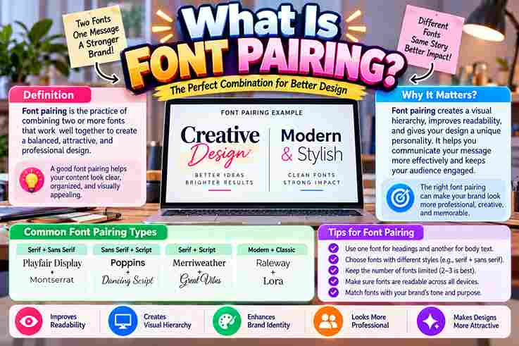
Strong font pairing is less about decoration than directing attention. In client projects, I first test readability, tone, and content hierarchy, because these choices quietly shape visitor experience, trust, and perceived professionalism across every website. A reliable system combines contrast, balance, and hierarchy: a distinctive headline, restrained body copy, and occasional accent font. From experience, thoughtfully chosen complementary fonts help a reader skim and navigate without noticing the design itself. Why It Matters Pairing matters because typography directs attention before language is processed. Clear hierarchy separates headings, body text, and calls to action, strengthening readability while helping each message reach people with less mental effort during every visit. A well-judged pairing also protects brand identity: it signals tone and personality consistently across print, web, and mobile interfaces. In client work, this restraint often produces more professional, memorable communication than decorative excess alone achieves. Also Read: What Are Script Fonts? How To Choose / Tips For Pairing Fonts Begin by assigning each typeface a defined role, then judge font size, visual weight, and legibility on smaller screens. In my projects, this practical test exposes any contrast issue faster than chasing fashionable pairing suggestions. Choose serif fonts and sans serif fonts for complementary functions, not novelty; reserve script fonts for design highlights. Compare logo text, website body copy, and navigation menus together, ensuring clean contrast without sacrificing aesthetic appeal. Common Mistakes To Avoid From client audits, I have learned that a decorative headline font paired with a minimal body font can still fail when creators ignore context. Excessive novelty may overwhelm, confuse visitors, and turn clashing into friction. The overlooked error is choosing typefaces that appear too similar. I recommend a contrast-based approach: vary font weights, inspect copy across screen sizes, and test choices for legibility before visual habits become a design oversight. Tools For Font Pairing Start with predefined font pairings from trusted sources, then inspect each option rather than accepting recommendations blindly. In client work, I compare typographic scales, font size, and visual hierarchy before saving combinations for practical use. Browser testers help me preview typography choices across screen widths, while specimen generators expose spacing problems and weak visual flow. Testing actual headings, paragraphs, and buttons reveals mobile usability issues before designers approve a combination. Also Read: Bold Text Generator Examples Of Font Pairings In practice, Playfair Display beside DM Sans creates visual appeal without sacrificing scannability: the serif gives headlines a classic voice, while the sans serif keeps longer content blocks comfortable to read across screens and devices. For a softer editorial pairing, Cormorant Garamond with Lato and Lora regular-weight italics can guide the eye. I use this combination sparingly for quotes, subheadings, and lowercase body text, preserving content hierarchy across readable pages. How Font Pairing Supports SEO And Content From audits, I’ve found typography supports SEO indirectly: headlines help visitors scan content, improve comprehension, and strengthen user engagement. Search engines do not rank font pairs themselves; they reward accessible pages people can navigate confidently. For practical results, pair a bold headline font with clean readable body copy, then preserve consistency across pages. This reduces friction, clarifies topic structure, supports mobile reading, and keeps articles engaging without sacrificing performance. Also Read: What Is a Monospace Font? Key Takeaways Strong font pairing begins with visual clarity, not novelty. In practice, I limit to two or three fonts, avoid lack of contrast, and keep pairings consistent, keeping hierarchy recognizable across web, mobile interfaces, and content. My results come from trial and error: evaluate, tweak, repeat, then judge whether each combination feels intentional, remains easy to read, and can guide reader’s eye. Combinations support user engagement, strengthen SEO, and reduce bounce. The Bottom Line The bottom line? Effective pairing succeeds when hierarchy feels clear at a glance, not merely fashionable. In projects, I assess headings, paragraphs, labels, and mobile screens together, because a coherent rhythm matters more than novelty. Contrary to advice, combinations need not stand apart dramatically; they need purpose. I favor measured contrast, then tune proportion until every choice supports the intended aesthetic, protects readability, and leaves enough room for controlled creativity. The Rule Of Three / 3-Font Formula The Rule Of Three approach uses a three-font formula where designers combine primary, secondary, and accent roles with purpose rather than random selection. A balanced system creates hierarchy through font choices while maintaining visual harmony. I have found this method effective because the three-font formula supports flexible decisions across websites and branding projects. Each typeface receives a role that improves readability and prevents clutter during the overall design process today. Style Your Fonts Like A Pro A designer explores font pairing through balanced choices, testing contrast, mood, and readability before finalizing a design system. Professional workflows combine hierarchy, spacing, and font styles to create polished digital experiences across platforms and devices. Advanced font styling requires understanding how combinations influence perception rather than following fixed rules alone. I often evaluate pairings by reviewing visual balance, brand expression, and user response while adjusting typography choices for clear communication. Create Contrast With Font Size And Weight Effective font pairing often begins when designers create contrast through bold and light choices rather than decoration. A visual hierarchy guides readers while typography keeps the layout professional and creates a varied look across screens. From my practice with websites, I find that different weights can shape attention without making interfaces overwhelming. Combining serif font and sans-serif font approaches thoughtfully adds structure because each style serves a role in design. Also Read: D Font Generator – Create Stylish D Fonts Font Pairing Checklist / Conclusion Building a reliable checklist starts with successful font combinations that balance readability, hierarchy, and style decisions through a thoughtful design process. My experience shows that reviewing spacing, contrast, and purpose creates stronger visual pairing outcomes. Advanced pairing reviews examine how selected typefaces support audience needs while maintaining consistency across layouts. I often test combinations before launch because practical feedback reveals subtle issues in visual execution and improves the final result.