
What Is a Monospace Font?
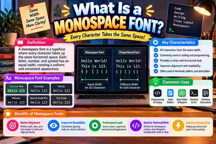
A monospace font is a typeface where characters receive equal width across horizontal space, creating a fixed-width system. I observe this design improves clarity because each character follows planned spacing and supports organized text creation. Unlike proportional fonts, this format uses uniform alignment through letter shapes, letters, numbers, and symbols with predictable layout. Its fixed-pitch nature helps maintain text structure while wide characters and narrow characters appear balanced visually today. Also Read: Powerful WhatsApp About Text Generator Monospace Fonts Vs Proportional Fonts I compare monospace fonts and proportional fonts where character widths define different layouts. Varying widths follow letter shapes, while W and I show why narrow characters and wide characters behave differently in digital text design. From my typography practice, equal spacing creates consistent width and supports text alignment. Fixed spacing improves readability through a clear spacing system and visual structure, yet some projects need natural spacing for balanced text flow. History Of Monospace Fonts The Courier era revealed how typewriter-style designs shaped early monospace fonts through character alignment and structured information needs. These fixed-width approaches supported computer terminals before modern digital typography expanded, showing why consistent spacing became valuable in technical workflows and early computing systems. I have observed that monospace fonts evolved with programming environments where source code required alignment and syntax clarity. Their role expanded through coding tools, developers, and software interfaces while maintaining structured text, predictable format, and visual organization across many evolving digital systems today. Characteristics Of Monospace Fonts Monospace fonts create a distinct visual system where characters maintain equal spacing and consistent layouts. I often notice their precision during coding tasks because numbers, symbols, and sequences remain organized across technical interfaces and displays. Beyond appearance, these fonts support character alignment through fixed-width design and horizontal positioning. My experience with type systems shows how letter spacing influences readability while structured data and text processing benefit from predictable formatting today. Popular Monospace Font Examples Popular monospace fonts include classic and modern choices used across coding and design fields. Courier remains widely recognized from typewriter traditions, while Consolas supports developers needing clear character spacing and structured layouts for professional digital. Other examples like monospace fonts appear in graphic design projects where typography and visual style create distinct identities. I have observed these fonts provide consistent positioning for technical content and support digital artwork with alignment. Why Are Monospace Fonts Used For Coding? I use monospace fonts for coding because programming environments need predictable spacing where source code elements remain aligned. My experience shows code editors benefit from clear syntax highlighting, helping developers inspect symbols and characters quickly. Beyond visual preference, monospace fonts support development workflow across programming languages by maintaining equal spacing, improving alignment of symbols and characters while creating readable interfaces for software teams that manage complex coding projects with accuracy. Common Uses Of Monospace Fonts Monospace fonts support software interfaces where programming tasks, code structures, and text editors require stable placement. I often observe data alignment benefits in systems handling numerical data because uniform characters simplify technical workflows and checks. Beyond coding, ASCII art and ANSI art use fixed-width fonts for digital artwork. Scripts, screenplays, and professional documents also retain spacing discipline, while OCR applications use predictable characters for accurate machine processing in modern workflows. Also Read: What Is a Display Font? Monospace Fonts In Programming Environments In my experience, programming environments rely on IDEs where default coding fonts improve code structure through clear spacing and alignment during software development tasks. These tools support many programming languages while maintaining visual consistency daily. Beyond editors, I observe command-line interfaces and technical documentation benefit from structured layouts because developers can scan complex instructions faster with predictable designs. This practical approach connects typography choices with efficient coding workflows across systems. Monospace Fonts In Data Alignment In data alignment, I observe how tabular figures organize numbers through columns where equal spacing supports precise financial data and clearer calculations during complex reviews using tables with reliable visual balance and organized data flow. Beyond basic layouts, my experience shows monospace fonts create stable data visualization because each symbol receives uniform room for comparison and typography features improve alignment in technical records while challenging assumptions about ordinary text presentation. Monospace Fonts In Scripts And Screenplays In my experience, screenplays and scripts often rely on monospace fonts because writers need stable character placement while reviewing dialogue blocks and formatted pages where every line maintains visual balance through predictable spacing across scenes. I have noticed that this approach connects with digital interfaces and ASCII art when creators compare layouts across production drafts because equal spacing improves visual control and supports clear review of scenes without unexpected shifts in character alignment. Monospace Fonts In OCR Applications Monospace fonts improve OCR workflows by preserving character spacing during scanning, where equal width characters support alignment and reduce recognition errors. Their fixed layout helps systems process text formats with clearer visual organization across documents. OCR systems often rely on consistent positioning to interpret characters, especially when documents contain structured data. Monospace typography provides predictable patterns, helping automated tools analyze symbols, rows, and machine-readable content with improved accuracy during extraction tasks. Tabular Figures And Numerical Alignment Fonts improve tables where columns remain balanced during calculations. In my design work, I observe that tabular figures gain clarity because fixed spacing supports precise information display across numerical records and reports with consistency today. Many interfaces use numerical layouts to organize digits and structured information, while sequences stay visually stable. This approach helps engineers review values through a clear grid without shifting positions and preserves accurate data presentation always. ASCII And ANSI Art Usage I often study ANSI art layouts where scripts and tabulated data benefit from fixed character placement. The approach keeps symbols aligned across terminals and preserves visual balance when creating detailed patterns through classic computer displays. In practice, I notice ASCII and ANSI art workflows depend on consistent spacing because artists arrange marks precisely. Early communities used these methods for interactive visuals and text-based creations using organized … Read more