
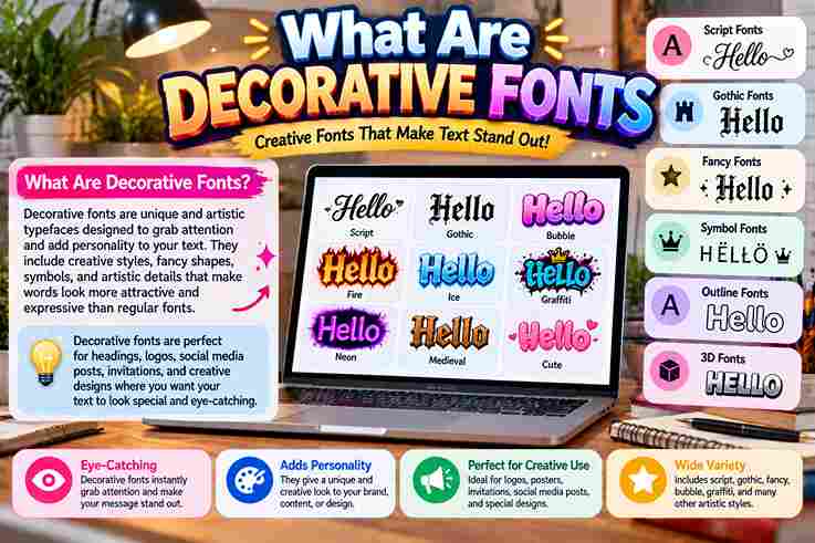
In practice, decorative fonts succeed less through ornament alone than through controlled visual impact. Their distinctive stylistic features, irregular letterforms, and thematic motifs give short headlines, logos, or packaging an immediate, memorable personality with purpose.
From designing campaigns, I learned a decorative typeface works best sparingly: it establishes a specific mood, draws focus, and guides perception, while simpler fonts prevent legibility issues across body text and long passages of text.
Table of Contents
Characteristics / Fundamentals Of Decorative Fonts
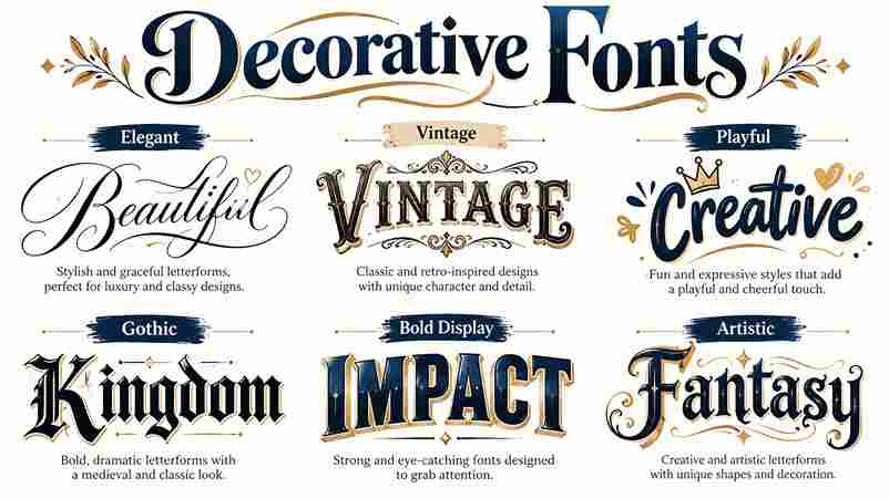
In practice, decorative fonts succeed when personality traits outweigh neutrality: exaggerated shapes, unusual proportions, and crafted details turn typography into a powerful tool. Their distinct look creates impressions, yet demands limited use for readable hierarchy.
I assess visual style before novelty: ornamental fonts, vibrant colors, and intricate designs can attract attention, but clarity governs selection. Strong display fonts fit logos, posters, or book titles; restrained pairing protects the message.
History / Case Studies (Traditional To Modern Examples)
Modern decorative lettering did not replace earlier craft; it repackaged it. In archival projects, I have watched Old Style structures evolve through ornamental elements, elaborate strokes, and display fonts into memorable posters, packaging, and identities.
Case studies reveal a different pattern: Victorian ornament, psychedelic posters, and digital campaigns succeed when cultural cues support the brand identity. Today, dynamic font rendering enables responsive expression, yet restraint still protects legibility and recognition.
Also Read: FB Font Generator: Stand Out Now!
How / Where To Use Decorative Fonts
In practice, I reserve decorative typefaces for a poster, book titles, wedding stationery, text-only logos, and branding projects, where minimal text lets expressive forms stand out without making essential information difficult to read at small sizes.
For websites, I pair a decorative font with a readable font, applying it to a logo, holiday promotion, gaming interfaces, or curated font inspiration; restrained pairing fonts preserves mood, hierarchy, trust, and overall design clarity.
The Psychology Behind Font Perception
From observing redesign tests, I find that familiar fonts establish credibility before readers examine content. Their subconscious influence shapes message tone, decision confidence, and user judgments, while unfamiliar forms may trigger curiosity or quiet uncertainty.
In practice, color schemes and visual elements alter how ornate lettering feels: restrained combinations suggest sophistication, whereas excessive detail weakens authority. Effective font choices align aesthetic appeal with context, encouraging positive responses without deliberate manipulation.
Decorative Fonts And Decision-Making Processes
In practice, I have seen ornate fonts shape immediate context, steering emotional responses before conscious awareness. Their visual cues can create excitement, yet hard to read lettering slows comparison and weakens decision-making during online purchases.
A contrarian lesson is that visual attractiveness does not guarantee better choices. When font styles conflict with cultural context, interpretations shift; responsible designers protect user trust through transparency, restrained stylistic choices, and legible supporting text.
Specific Examples Of Decorative Fonts Impacting Perception In Gaming
From hands-on interface reviews, I have seen gothic style lettering deepen mystery in horror games, while a wild west style signals frontier conflict; both shape player perceptions before gameplay mechanics establish tone, trust, or credibility.
Conversely, whimsical font choices make family titles feel approachable, whereas thematic fonts in online gambling games may amplify luxury, entertainment value, and willingness to pay, showing how typography quietly steers early expectations and commercial judgments.
Non-Obvious Factors Influencing Perception Through Fonts
In packaging audits, I have found familiarity can outweigh beauty: novel decorative fonts may appear inventive locally yet feel inappropriate elsewhere, because each region attaches different memories, status cues, and expectations to letterforms during judgment.
Designers often blame ornate lettering alone, but subtle factors matter: muted tones can make a festive font seem old-fashioned, while competing imagery leaves minimalist fonts feeling inconsistent, changing their emotional impact across contexts and audiences.
Also Read: Ink Your Words: Free Tattoo Font Generator
Ethical Considerations And Responsible Design
Responsible decorative typography begins by questioning cultural associations, stereotypes, and perceived biases before selecting expressive letterforms. In my design audits, a powerful style often becomes inappropriate when it misrepresents specific cultures or manipulates audience expectations.
Ethical choices also protect readability: pair ornate headings with legible fonts, avoid large blocks of text, and test user interfaces. A unique touch should support visual communication, not create an overwhelming design that excludes readers.
Future Trends: The Evolution Of Decorative Fonts And User Perception
From my recent typography audits, minimalist fonts are not replacing ornament; instead, novel decorative fonts are becoming responsive, adapting their design complexity to context while emerging technologies quietly reshape accessibility, identity, and lasting user impressions.
Looking ahead, I expect subconscious associations, consumer preferences, and regional familiarity to guide development more than novelty alone. Responsible innovation will pair expressive unique styles with adaptive screens, preserving personality without sacrificing clarity or trust.
Where To Find Decorative Fonts
Designers often discover decorative fonts through online resources where creative communities share a wide range of fonts. I usually review FontSpace and YouWorkForThem before selecting styles that match a project’s visual direction and brand personality.
Many artists explore Envato Elements for premium choices, while others prefer free fonts for experiments. My workflow combines research, testing, and careful comparison to find suitable lettering options without limiting creative possibilities during design projects.
Also Read: Bubble Font Generator
Conclusion
Decorative fonts turn aesthetic elements into signals, but value depends on context. In my practice, I treat design element as functional: unique letterforms can create emotional response, reinforce brand, and shape perception without overwhelming readability.
Decorative typefaces balance creativity with legibility across website, merch designs, and promotional materials. I have found that specific moods, branding, and creative intent work best when typography supports content rather than competing with it directly.
What Is The Significance Of Using Decorative Typefaces In Design?
Decorative typefaces shape perceptions before readers process meaning, giving a design project distinctive emotions and characteristics. In practice, I use them to attract attention, establish atmosphere, and support expressive design when restrained strokes strengthen context.
Can I Use Multiple Decorative Typefaces In One Design?
I often pair distinct design cues only when their roles differ: one typeface can establish mood, while another handles accents. Yet message consistency matters, because competing styles may weaken hierarchy and impact readability in practice.
Are There Any Rules For Using Decorative Typefaces?
There are no universal rules, but balance matters: avoid multiple decorative typefaces when they become cluttered or confusing. Match style, readability, and message consistency, choosing a simpler font when ornament competes with meaning too much.
Where Can I Find Decorative Typefaces?
In my searches, Adobe Fonts, Google Fonts, MyFonts, and Creative Market offer dependable font options, while Pinterest and Typewolf reveal current typeface discoveries; Font Squirrel adds useful free fonts for experimentation and comparison before selection.
Can I Create My Own Decorative Typeface?
Yes, you can build a creative type of font through experimentation, sketching distinctive forms, testing varied legibility, and refining spacing. Treat your work as a specific category only after repeated testing and consistent font classification.
Can Decorative Typefaces Be Used For Body Text?
Decorative typefaces can work in body text, but only when cleaner forms protect readability. In my design reviews, formality, modern contrast, and restrained curls help readers sustain attention without visual fatigue across longer passages too.
1 thought on “What Are Decorative Fonts”