
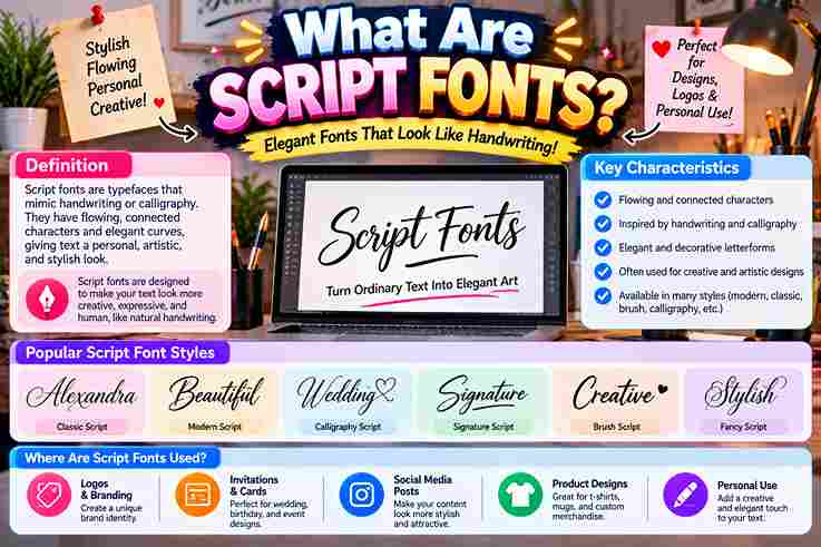
From practical design work, I find script fonts most convincing when flowing letterforms preserve a personal touch without sacrificing readability. Their handwriting character can feel elegant, playful, or deliberately expressive across modern branding identity systems.
Rather than treating them as decoration alone, I evaluate script typefaces through fluidity, accessibility, and context. Connected letterforms, decorative curls, and varying stroke widths create personality, while careful spacing keeps expressive typography usable in practice.
Table of Contents
History of Script Fonts
Modern typefaces emerged from classical calligraphy, yet their roots lie in European manuscripts, chancery hand, and trade printing. In typographic practice, metal type revealed why joined forms required careful design and controlled spacing for clarity.
Technology later loosened those constraints: phototypesetting, then digital type, enabled overlap of characters, contextual ligature insertion, alternate characters, and expressive swashes. Today, Unicode, Google Fonts, and Adobe Fonts preserve evolution across print and web design.
Types/Classification Of Script Fonts
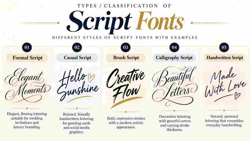
In practice, I classify script families by behavior rather than decoration: formal script fonts follow classical calligraphy, complex penmanship, and controlled ligatures, while casual scripts favor a handwritten feel, freer strokes, and approachable personality overall.
Second, useful classification examines construction: connected faces create visual flow through continuous joins, whereas unconnected designs preserve separate forms. Brush Script adds a lively font character; roundhand favors refinement, and display typeface categories prioritize impact.
Also Read: What Is a Monospace Font?
Characteristics Of Script Fonts
Script fonts gain their warmth from a fluid stroke, varying connectedness, and smooth curves. In my design work, their thick-to-thin strokes create dynamic movement, while character combinations and ligatures add controlled individuality without sacrificing identity.
Unlike uniform type, script forms rely on exaggerated loops, distinctive glyphs, and subtle imperfections to suggest human authorship. In practice, I reserve them for stylized text blocks, since large chunks of text create readability challenges.
Pros And Cons Of Script Fonts
From practical design work, script fonts add emotional resonance, a human touch, and strong visual appeal. Their flowing appearance, graceful curves, and artistic flair give brand names a personalized touch and sophisticated appearance online.
Yet the strengths become weaknesses when overly ornate scripts, complex letterforms, or a cluttered look reduce clarity. Across screen sizes, they can be hard to read for users with visual impairments and may overpower design.
How To Pair Script Fonts Effectively
Begin with visual balance, not similarity: pair expressive writing fonts with restrained companions that create contrast. In my typography work, checking headlines beside main text reveals whether both faces complement each other without competing visually.
Next, test the pairing at various sizes and on different devices; adjust kerning until letters flow smoothly. I usually reserve intricate scripts for short phrases, which protects legibility, hierarchy, and a coherent composition across formats.
Tips For Using Script Fonts Effectively / Best Practices When Using Script Fonts
In practice, I reserve script fonts for headings, short phrases, or important words, then test legibility at smaller sizes. Clear visual hierarchy protects body text, improves accessibility, and leaves a strong impression without cluttering layouts.
Contrary to popular advice, one carefully chosen typeface usually outperforms multiple script fonts. Pair a formal script with a clean sans-serif font, maintain sufficient contrast, test fallback fonts, and iterate across email clients before publishing.
Where Are Script Fonts Typically Used
In client work, I reserve script lettering for luxury branding, certificates, social media graphics, and children’s books, where authentic hand-lettered styles add personality without forcing readers through elaborate flourishes or longer blocks of text unnecessarily.
Historically, signpainters favored shop frontages, while current teams use these faces for creative branding, digital illustrations, greeting cards, and personal branding. I find bigger size and a readable fallback font protect legibility across devices today.
Also Read: What Is Typography and Why Does It Matter?
Popular Script Fonts
In my design work, Lobster and Pacifico often suit friendly branding, while Bickham Script and Snell Roundhand create refined invitations. Great Vibes offers expressive elegance, but careful sizing prevents its flourishes from overpowering supporting text.
For contrasting moods, Brush Script MT feels practical and familiar; Edwardian Script signals ceremony, whereas Dancing Script adds movement. I usually reserve Zapfino for short display lines because its intricate forms demand space and restraint.
Script Typefaces In Unicode / Mathematical Use
Unlike ordinary cursive fonts, Unicode mathematical script characters are not decorative type choices; they are encoded symbols. In practice, I use them to distinguish variables while preserving meaning across documents, browsers, and scholarly publishing systems.
Coverage includes styled letters from the Latin alphabet and Greek alphabet, yet Unicode supplies code points rather than handwriting behavior. My typesetting checks still prioritize character set, semantic intent, fallback support, and consistent mathematical notation.
Printing/Production Technology Challenges
In production, script lettering often fails where elegance meets machinery. I have seen thin strokes disappear through ink spread, while overhanging parts collide during casting, making metal type, sorts, and paper choices unexpectedly critical today.
Digital workflows solved some constraints but introduced others: poor kerning, the overlap of characters, and unreliable contextual ligature insertion can break output. In my print checks, InDesign and OpenType format testing prevents costly gaps later.
Also Read: Number Font Generator
Conclusion
From years of reviewing display work, I have found script typefaces succeed when legibility, hierarchy, and visual balance guide selection. Their personality matters, yet disciplined spacing preserves meaning across branding, invitations, and restrained digital interfaces.
Contrary to fashion cycles, strong choices are rarely the most ornate; purpose, tone, and target audience determine value. I recommend testing real sizes and keeping expressive letterforms where authenticity strengthens communication without weakening clarity overall.
What’s The Difference Between Script And Cursive Fonts?
From my typography work, cursive describes connected handwriting, while script is a broader formal type category encompassing calligraphic, brush, and non-connecting designs. Both may join up, yet script prioritizes expressive cursive letterforms over handwriting rules.
Are Script Fonts Good For SEO?
From audits, I’ve found web-safe fonts do not improve rankings; legible design, load times, responsiveness, and accessibility tools matter. Use decorative lettering selectively in header text, while keeping content readable for users and search engines.
Can I Use Script Fonts In Emails Or Marketing Materials?
Yes, but I use script fonts sparingly in email headlines, promotional advertising, and selected branding materials. Keeping them legible, easy to read, and supported by fallback fonts protects accessibility, rendering consistency, and user experience overall.
How Do Script Fonts Impact Accessibility?
From accessibility audits, I’ve found script fonts can create low readability for readers with visual impairments, especially at smaller sizes. Reserve them for brief accents, pair them with clear fonts, and ensure legibility through testing.
Can I Use Multiple Script Fonts On The Same Website?
Yes, but in my design audits, a limited number works best: pair one expressive script with a readable font, preserve consistency, and test different sizes; competing styles often create a disjointed look and weaken hierarchy.
1 thought on “What Are Script Fonts?”