
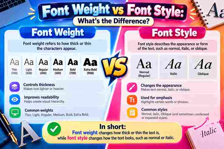
I often examine font-weight choices before adjusting font-style because their differences shape typography decisions. A designer’s font selection changes visual appearance through thickness and italic effects while creating balanced design systems with clear emphasis and hierarchy.
My workflow explores how CSS property behavior connects characters and values across a typeface family. I have seen bold or normal options influence readability when building layouts, where font variations reveal subtle formatting choices.
Table of Contents
What Is Font Weight?
I define font-weight through typography as a way to control thickness in letters rather than changing their shape. My design practice shows weight choices create hierarchy using light or bold levels for clear text structure.
Unlike font-style changes, font-weight focuses on stroke density and visual presence. I analyze numeric values, from normal to bold, because each choice affects readability, emphasis, contrast, and presentation across digital typography projects with practical insight.
What Is Font Style?
In practical typography work, font style changes how characters are presented rather than how thick they appear. Italic, oblique, and normal forms reshape visual characteristics, helping designers signal emphasis, tone, or distinction without changing weight.
I usually treat font style as a presentation choice controlled through CSS, while HTML can preserve semantic meaning. Used carefully, styling supports readability, hierarchy, and design intent by giving a typeface purposeful variation across content.
Also Read: What Are Decorative Fonts
Font Weight Values And Classifications
In practice, font weight works best as a spectrum: 100 signals thin, while 400 often represents regular text and 700 commonly appears bold. Higher numerical values increase perceived thickness, creating clearer visual prominence across layouts.
I usually classify intermediate font weights by purpose rather than classifications alone: light, medium, semi bold, extra bold, and black can vary by font family. Variable fonts add ranges, letting developers choose precise emphasis efficiently.
Font Weight Vs Font Style: Main Difference
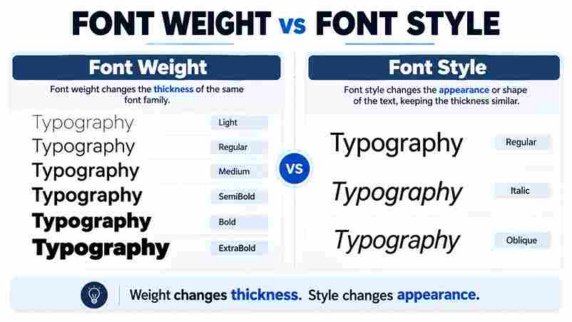
Font weight defines the thickness and visual density of letter strokes, while font style changes the character shape through italic or oblique forms. In practice, I examine both properties together because they influence appearance, readability, and design balance.
A common misconception is that weight and style create identical effects. Font-weight controls boldness levels, whereas font-style introduces angled variations. Designers use these differences to create contrast, hierarchy, and personality while maintaining consistent typography across digital interfaces.
HTML Tags Vs CSS Properties
HTML tags communicate meaning and structure, while CSS properties control presentation. In practice, I use strong, em, and other semantic tags for purpose, then apply font-weight or font-style for visual refinement.
A property changes appearance without replacing structure. Thus, font-weight adjusts boldness, whereas font-style creates italic or oblique presentation; HTML preserves meaning, supporting clearer maintenance, responsive styling, and dependable accessibility across interfaces.
Using Font Weight For Design Hierarchy
Headings gain authority through font weight, while supporting copy stays restrained for text clarity. In practice, I test weight variations beside spacing, because contrast should organize information without making the page feel visually crowded or aggressive.
A useful contrarian approach is reserving thin weights for large display text and choosing heavier weights only where scanning matters. Under varied design conditions, I adjust the font-weight value after checking visual comfort, size, and background contrast.
Also Read: How Typography Affects Readability
Variable Fonts And Flexible Weight Control
A variable font lets designers adjust weight variations continuously, so multiple weights become responsive settings rather than fixed files. This supports precise text clarity, smoother hierarchy, and consistent visual comfort across interfaces.
In practice, I tune font-weight by context, testing each value against screen size, color contrast, and accessibility needs. Variable axes can preserve appearance while changing density, helping users read comfortably under changing conditions.
Why Font Weight Matters In Typography
In my typography work, font weight is not decoration; it controls reading rhythm. Subtle boldness strengthens visual hierarchy, while measured contrast separates information without disrupting structure or comfortable reading across screens.
A thoughtful font family offers multiple weights that guide attention: lighter weights can support quiet body text, while heavier weights emphasize headlines and important elements, improving organization, scanning, and text clarity.
How Browsers Handle Missing Font Weights
Browsers first search the declared font-family for the requested font-weight. If unavailable, they select the nearest available weights, often approximating heavier or lighter text rather than synthesizing an exact font variation.
From experience, a browser’s selection can change perceived appearance across systems. A variable font may interpolate smoothly, while traditional files jump between weights; therefore, test fallback behavior alongside accessibility and visual comfort requirements.
Accessibility Considerations For Font Weight
Accessibility testing shows that font weight alone cannot communicate importance. I check visual appearance, spacing, and contrast together, because thin weights may disappear on low-quality displays, while overly heavy text can reduce reading comfort.
For body text, I usually choose a moderate weight and verify it across screens, zoom levels, and themes. Colors should not carry meaning alone; clear structure, labels, and consistent organization help readers with varied vision and cognition.
Accessibility Considerations For Font Weight
Users with low vision may struggle when light lettering reduces clarity, especially beside small text or busy backgrounds. Test color contrast alongside weight, because thicker strokes cannot compensate for insufficient contrast in every interface.
In practical accessibility reviews, avoid treating heavy text as universally safer. Evaluate design conditions, screen size, typeface quality, spacing, and zoom behavior; excessive weight can blur counters, reduce readability, and weaken scanning for some readers.
Also Read: Tattoo Font Generator
Conclusion
In practice, font-weight changes stroke thickness, while font-style changes letter direction. I have found that separating these controls prevents accidental emphasis, preserves hierarchy, and keeps typography readable across responsive layouts, browsers, and devices consistently.
Choose weight to signal priority, style to add distinction, and test both within each font family. Their roles may overlap visually, but purposeful use creates clearer interfaces, stronger accessibility, and more dependable communication for every reader.
Is Font Weight The Same As Bold?
Bold describes a visible result, while font-weight specifies the requested thickness numerically or through keywords. A bold face may use 700, yet typefaces differ; inspect actual strokes, spacing, and appearance before assuming equivalence.
What Is The Difference Between Strong And Font-Weight Bold?
In HTML, strong communicates importance, while font-weight bold changes appearance through CSS; I use the former for meaningful content and the latter for presentation, ensuring structure, accessibility, and visual emphasis remain separate.
What Is The Difference Between Em And Font-Style Italic?
In HTML, em conveys semantic emphasis, while CSS font-style italic changes only visual presentation. I use em when meaning matters and italic styling when appearance alone should shift for emphasis.
How Does Font Weight Affect Website Readability?
Font-weight influences readability by controlling stroke density: body text usually benefits from regular or medium weight variations, while headlines can use heavier weights for attention. Excessive darkness reduces contrast comfort, especially on smaller screens or for readers with visual sensitivities.
Which Font Weight Is Best For Body Text?
For body text, I usually choose regular or 400, then test appearance, contrast, and accessibility at realistic sizes. body text needs comfortable reading, while heavier weights can fatigue readers and reduce clarity across longer paragraphs.