
Fraktur Font Generator – Create Gothic Text Online
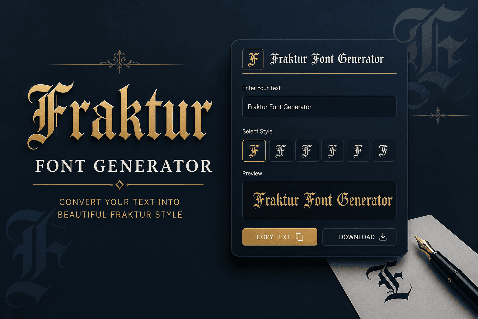
Fraktur Font Generator Convert your normal text into stylish Fraktur and Gothic-style Unicode text. Fraktur Fraktur Bold Enter Your Text Example 0 characters 0 words Generated Fraktur Text Copy Text Download Share Clear How to use the Fraktur Font Generator Enter your text above and the generator will automatically convert it into a Fraktur-style Unicode text. Use the generated text in social media bios, usernames, gaming names, posts, designs and other places that support Unicode characters. Fraktur gives ordinary text a historic weight through angular letterforms, dense Fraktur shapes, and the visual character of blackletter. I use a Fraktur text converter when a name, title, or short message needs distinctive presence. Modern generators make that style practical because Unicode preserves Fraktur characters as real text, allowing easy copy, paste, and sharing across social media. The result adds atmosphere without requiring traditional font installation or specialized software. How To Use Enter your text in the tool, then convert it into Fraktur text. I usually preview the output first, checking Unicode characters for accurate display before copy-paste into a platform, document, or social media. For practical use, compare the result with your favorite fonts and test different styles before posting. Fraktur output can suit usernames, headers, messages, captions, and academic themes, while readability guides where each generated version belongs. Why Use / What Is Fraktur Fraktur offers a distinctive historic feel through broken strokes and angular forms, making text appear more authentic. I use it when a project needs German heritage, academic character, or a Gothic atmosphere without installing fonts. Fraktur developed in 16th-century Germany as a blackletter typeface, balancing ornamentation with readability. Today, a Fraktur font generator converts typed characters into Unicode styles, useful for usernames, headers, posts, and experimental design across digital contexts. Also Read: Big Text Generator: Make Words POP! Skip The Copy-Paste On Social Media When I work with Fraktur, I avoid treating social media as a simple copy-paste channel. Unicode characters let styled text travel across platforms, while concise formatting preserves atmosphere without installing a custom font cleanly. For profile names, comments, posts, or captions, I prefer short Fraktur text because heavy styling can hurt readability. Test the output first, then paste finished characters into Facebook, Instagram, TikTok, or Discord before publishing carefully. Best Fraktur Styles The strongest Fraktur styles balance historic weight with legibility; Gothic variants can feel formal, while Bold Fraktur adds heavier blackletter presence. For names, titles, and compact designs, this approach keeps shapes recognizable and visually distinct. In practice, I compare 𝔉𝔯𝔞𝔨𝔱𝔲𝔯 against 𝕱𝖗𝖆𝖐𝖙𝖚𝖗 before choosing a look. Single-word layouts suit atmospheric branding, while small sizes favor the sturdier option, especially when letters must remain readable across social posts, logos, or headings. Also Read: Powerful WhatsApp About Text Generator Fraktur Keyboard (Page-Specific Tool Feature — Historical Styles By Century) On a Fraktur keyboard, I prefer treating style selection as a compact history lesson: 16th century forms can feel dense and angular, while later 20th century variants usually appear cleaner for contemporary typing and display. A useful historical control lets users compare Unifraktur, Old English, and other styles beside Fraktur letters without changing meaning. In practice, this makes the keyboard a research-friendly tool for testing authentic appearances across real projects. Also Read: PUBG Fonts Conclusion This typeface remains valuable when design, use cases, and historical Fraktur matter more than novelty. In practice, I find Blackletter Classic especially reliable for heritage branding, while Gothic Bold suits display contexts needing stronger presence. A final check is whether the chosen style preserves clarity alongside character. Double Struck Gothic can add formal precision, but a restrained historical approach often gives lettering the most convincing result for practical publishing today.