
Stacked Text Generator – Copy & Paste Stylish Text
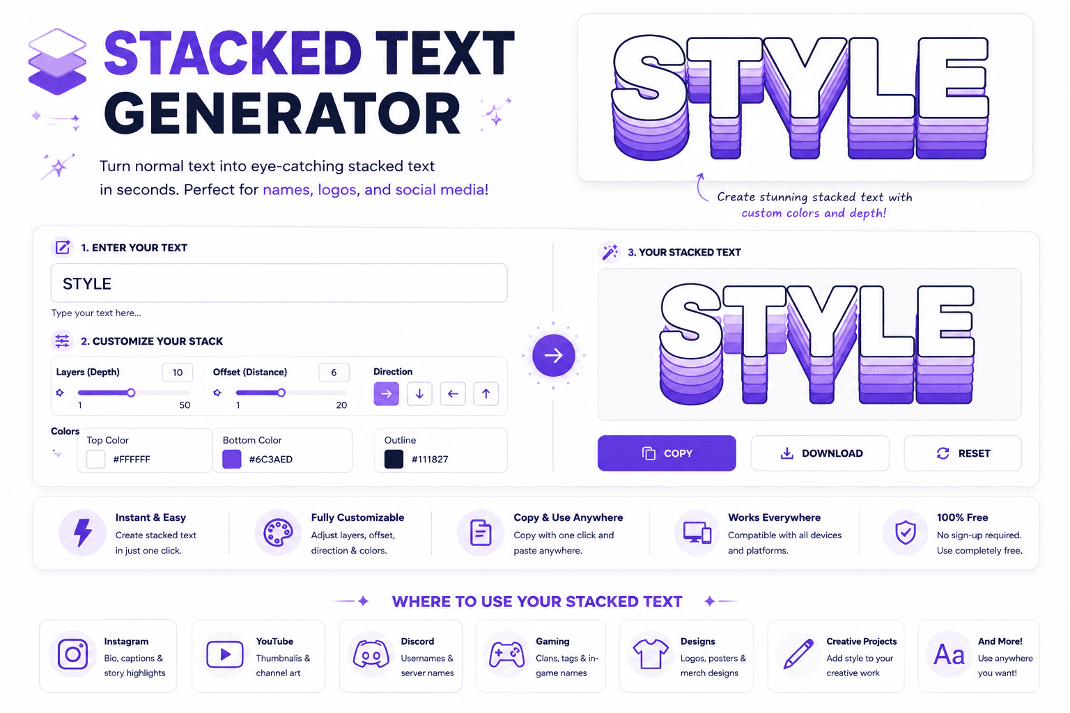
Stacked Text Generator Enter your text and instantly turn it into a stacked, vertical, or line-by-line style. Your Text 0 chars · 0 words Stacking Mode One Character Per LineCharacters With SpacingOne Word Per LineLetters With SpacesKeep Original Lines Text Case NormalUPPERCASElowercaseCapitalize Words Separator Extra Spacing Font Size 28px Remove Spaces Remove Punctuation Trim Empty Lines Stacked Result 0 characters Your stacked text will appear here. Copy Text Download Clear Tip: Try short words or phrases for cleaner stacked results. Maximum 5,000 characters A stacked text generator turns text into a unique visual effect by arranging characters vertically. This technique helps typography stand out without design skills, making it useful for social media, digital art, and creative projects. It combines two text layers, placing a top layer above a bottom layer for an eye-catching design. Using Unicode special characters, the output stays compatible with platforms and applications; this online tool supports names and logos. What Is Stacked Text? Stacked text turns ordinary digital projects into a visual layer, where characters sit above line. The generator gives creators and designers a unique touch, helping transform a word vertically, bold vertical design styles with sharp. In practice, multi-layered top-layer characters can merge with Unicode combining marks, creating an eye-catching social media style for bios, usernames, and creative projects. The bottom-layer single line stays custom fonts, format, words, headers, graphics, signs. How The Stacked Text Generator Works A stacked layout begins with text fields, yet the key is controlled placement rather than noise. The generator uses Unicode combining characters to position an overlay above a base word, creating a compact visual effect. In practice, I check the preview before copying because rendering can vary by device or application. The tool builds the upper layer character by character, while the lower line remains readable, preserving spacing and usability. Also Read: Calligraphy Font Generator: Unleash Your Magic Using Stacked Text Generator Start by entering a short word in the first field and a supporting word below. Keep top text shorter, then inspect proper alignment in the preview. Adjust wording when awkward spacing makes the stack uneven. For using stacked text generator, I recommend testing word combinations rather than forcing a result. A visual impact can come from one upper layer, while the bottom text carries identity, making composition easy to scan. How To Use This Tool The stacked text generator works best when treated as a layout utility, not a font replacement. Enter, preview, and copy the result, then test the real field where the name lives before publishing carefully. When I build stacked names, I favor short phrases and cleanest structures. Avoid long runs when platforms render marks differently; a restrained stack stays sharper, especially where filters or character support alter the final appearance. Pre-Use Information Before using a stacked text generator, decide whether your short tag or name needs clean vertical layout. I usually check top text and bottom text together because spacing and alignment affect readability more than effects. Remember that Unicode rendering varies across platforms, games, and applications. Test the stacked result before publishing, especially for Discord usernames or gaming profiles, and keep a plain base clearly available when combining marks disappear visually. Who Should Use This Tool Casual users can explore stacked names, while graphic creators can build custom stacked name logos without installing an app. It suits anyone needing quick stacked signs, social identities, or visually compact lettering for creative projects. From Discord usernames to gaming profiles, the tool helps people who value readable styling and fast experimentation. Newcomers gain simplicity, while designers can test layouts, preview output, and choose a clean, purposeful visual treatment today. Tips For Best Results For best results, build around a short overlay, especially when short headers, labels, or usernames need emphasis. I test each variation in live preview, then adjust spacing until the stack stays readable and balanced across field. On platforms, verify most platforms behavior rather than trusting the preview alone. Copy clipboard output into the target app, keep the top treatment restrained, and favor stacked fonts when filters or rendering differences threaten readability. Making Leͥgeͣnͫd Text Making legend text works best when a short overlay sits above a base word, creating a controlled double line instead of decoration. I test 2 to 6 letters first because forms stay readable and align. Type a name into two fields, preview the stack, then use the result for social media or a design tool. Keep the lower text dominant, while upper letters add restrained emphasis without sacrificing readability anywhere. Features Of Our Tool Our tool keeps creation fast and simple, with full control over spacing and placement. There is no login or setup required, so users can enter letters, test combinations, and produce polished stacks immediately on devices. From custom layouts to multiple export options, the workflow supports practical projects without clutter. Users can copy clipboard results, download a text file, or combine stacks with Unicode fonts and Superscript effects for distinctive compositions. Also Read: Discord Fonts: Rule Every Server Why Use Our Stacked Font Generator? Our instant output makes experimentation practical: enter a short identity string, compare the top line and bottom line, then use the adjustable preview size to refine proportion. In testing, live update matters because small spacing changes can alter readability across screens. The dual-line input keeps the workflow focused, while copy clipboard supports quick reuse. A browser-based tool means any device can handle designs without setup, making stacked names easier to test before publishing online. Stacked — Airy Letter-By-Letter Spacing For Tidy Emphasis For tidy emphasis, I favor a narrow space added around every character, creating a steady visual rhythm without turning short names into clutter. This treatment keeps the stack readable while giving letters breathing room visually. In practice, cadence matters more than decoration: spacing should feel deliberate, especially when a compact stacked text design carries a name or accent. I test several character combinations, then keep the cleanest arrangement for emphasis. Same Overline Trap As 3D … Read more