
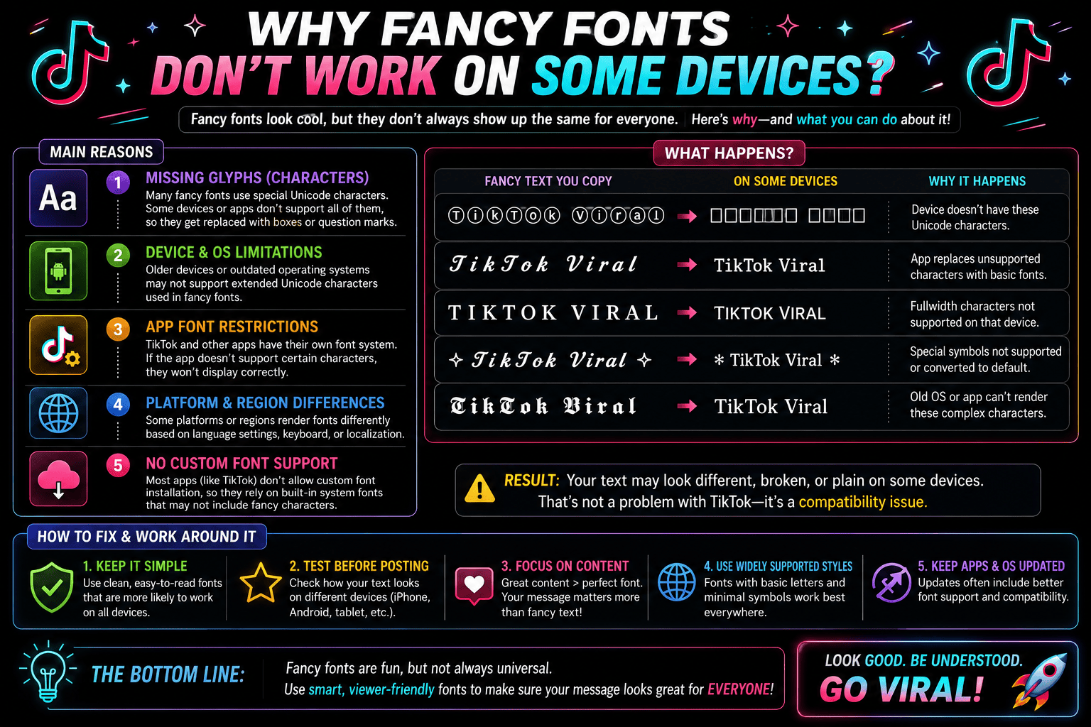
I’ve spent months testing decorative styles across different platforms, and here’s what surprised me: a fancy fonts choice that renders perfectly on one device often collapses into boxes somewhere else entirely, breaking the layout completely.
Here’s a common misconception: people blame their phone, but the real culprit is whether an app can recognize certain Unicode characters. When it can’t, text falls back to plain, compatible substitute glyphs every platform supports.
Table of Contents
What “Fancy” / Unicode Fonts Actually Are & Why They Break
A fancy font isn’t a real font installed on your phone—it’s a custom font built from special characters pulled from a massive character set, then styled to mimic a stylish font using a generator.
When apps can’t render rare Unicode symbols, they silently substitutes them with question marks or empty boxes, since most devices rely on limited built-in fonts rather than truly universally-supported systems, causing display inconsistency on screen.
Also Read: Unicode Text ConverterApps Control Which Fonts Display — Not the Device / OS
Your flagship Android smartphone or premium iOS hardware doesn’t dictate layout rendering. Modern apps intentionally bypass the default system font entirely. Software ecosystems prioritize an internal, consistent design architecture to safeguard platform performance metrics completely.
When pasting customized typography inside Instagram, the platform forces native app fonts to avoid broken interfaces. Consequently, selected client devices ignore system settings entirely, blocking external inputs to avoid unexpected text display layout issues completely.
Why the Same Font Looks Different Across Devices / OS Versions
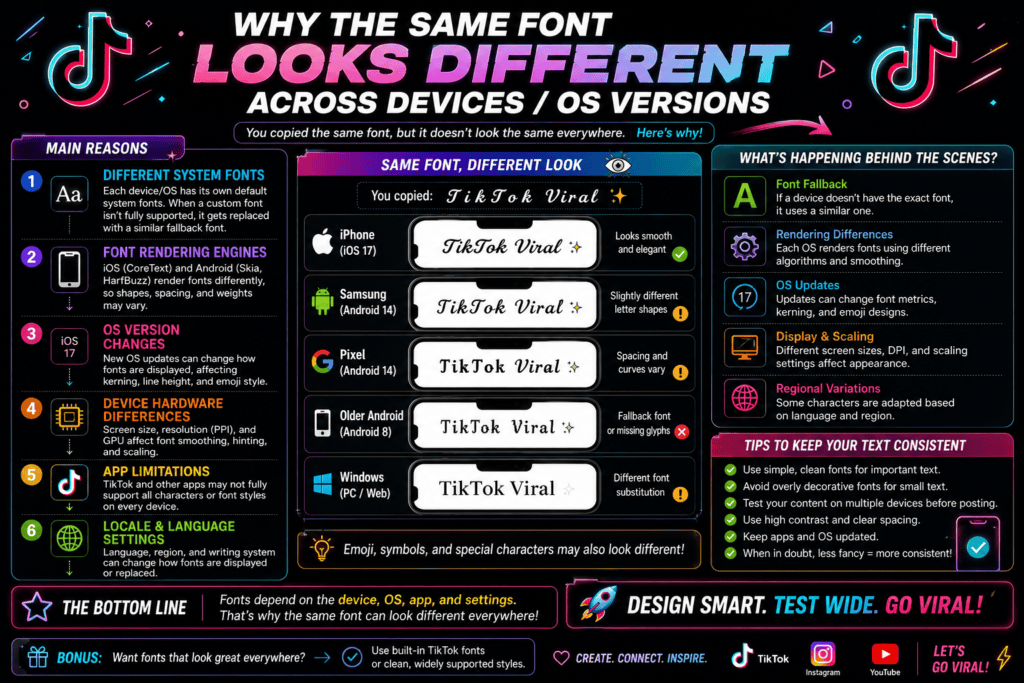
In my engineering experience, unexpected layout shifts happen because operating systems process type rendering uniquely. An identical device might display crisp lines, while older platforms crash. Your fallback font triggers automatically when devices block assets.
Deploying typography across Windows versus macOS highlights deep architectural fragmentation. Testing reveals common problems where iOS renders clean vectors but Android completely malfunctions. This platform disparity destroys visual design consistency instantly during live screen interactions.
Desktop vs. Mobile Support Levels
In my engineering experience, desktop systems handle typography differently than mobile environments. Broad operating systems accommodate diverse character layouts, but handheld devices sacrifice beautiful cross-device compatibility. Deploying layouts across Android or iOS exposes severe rendering bugs.
When a standard browser renders stylized text, legacy workstations succeed, but modern social apps frequently fail. This variance can cause crashes because restrictive mobile frameworks lack proper Unicode support, leaving custom text layouts completely broken.
System Fonts vs. App Fonts vs. Web Fonts / Web-Safe Fonts
In my design experience, native operating systems rely on embedded assets like San Francisco or Roboto to maintain local functionality. Yet, individual apps frequently bypass these defaults entirely to preserve their own independent internal layout.
When rendering digital interfaces across various modern devices, developers often integrate external libraries like Google Fonts. This ensures that different standard web browsers display matching typographic aesthetics regardless of the host site configuration styles perfectly.
When Fancy Fonts Are Okay to Use
In my expert design career, casual use of decorative fonts works beautifully for brief social bios. When exotic styles are swapped for standard text, rendering succeeds if platforms choose to accept font variations completely today.
Deploying a stylized Script inside apps like WhatsApp or Discord rarely stems from user error. These specific, casual environments safely permit creative expression because clean, custom aesthetics work everywhere modern messaging systems allow internal flair.
Can You Fix Fancy Font Problems?
As an expert, achieving a quick fix for rendering issues requires using a plain text editor like Notepad to completely strip formatting. Simply copy again, then press Ctrl+Shift+V to paste without formatting inside the platform.
If glitches persist, you should update device OS settings immediately or test another device for verification. Alternatively, capturing a screenshot before contacting email support helps diagnose unique mobile bugs from a contrarian perspective very effectively.
Also Read: Pls Donate Text Generator (Copy & Paste) | Fast & Free
The Simple Truth About Fancy Fonts
Digital typography scales poorly when systems misinterpret raw data. What users mistake for true fonts are often merely remapped letters. When this pasted text hits rigid architectures, it completely fails, displaying broken question marks instead.
As an experienced engineer, I daily witness how a custom generator transforms standard input into heavy Unicode symbols. These aesthetic masks behave differently than standard letters, completely breaking native device app rendering layouts without warning.
Custom Fonts from Online
As a developer, I notice that downloading a custom font often yields rendering errors across platforms. The raw file format typically encounters platform restrictions, meaning your chosen third-party font gets completely blocked by strict applications.
My daily experience shows that uploading unchecked assets triggers immediate layout breakage. Hidden licensing conflicts or a corrupted file will silently break the user experience because mobile systems cannot safely parse external font files properly.
Most Reliable Fonts (99.9% compatibility list)
Years of system testing taught me that standard typography avoids display bugs. I always deploy native Helvetica or basic serif options because these traditional fonts load instantly, keeping mobile layouts clean on any digital screen.
When building responsive websites, utilizing a safe monospace style guarantees absolute readability. These universally compatible typefaces never trigger sudden rendering errors, establishing a reliable bedrock of text stability that ensures flawless global user access everywhere.
Quick Troubleshooting Checklist
From my consulting experience, typographic bugs disrupt layouts unexpectedly. To fix rendering errors within your target app, simply refresh page design assets or try a different browser to bypass aggressive local system restrictions completely now.
If glyphs still fail, analyze the specific device type involved. An outdated OS version frequently triggers critical compatibility issues, causing stylized text elements to display as blank squares across old, unsupported devices everywhere right now.
Platform-Specific Known Issues
My corporate testing reveals how modern layouts crumble. When deploying stylized text, older versions of core software frequently fail entirely. Systems will stubbornly substitute default font configurations, turning elegant designs into broken, unreadable blank boxes.
Furthermore, ecosystems restrict fonts differently across platforms. An application’s internal formatting engine will deliberately block fonts to prevent unreadable text glitches. Ultimately, the app decides rendering outcomes, overriding every single native user system preference.
When All Else Fails
Experiencing digital chaos forces immediate action. If a stylish font causes a visual error, achieving cross-device consistency requires simplifying font choice. Embracing a plain style preserves your core technical usability across every targeted platform seamlessly.
Since no universal fix exists for custom typography, bypassing a structural conflict means deploying universally compatible assets. Utilizing standard system fonts guarantees layout stability, proving that text performance remains ultimately fixable when prioritizing clear communication.
Font Style Variations
In my rendering architecture audits, implementing a Double Struck layout instantly shatters interface cohesion. Many decorative fonts lack underlying character sets, forcing a chaotic fall back to unreadable Monospace blocks when rendered across legacy frameworks.
We mistakenly assume a Bold Sans or heavy Bold Serif variation behaves safely. Instead, the application strips the stylized Unicode symbol, replacing it with invisible blank characters that trigger unexpected, highly catastrophic user layout breaks.
Older Fonts
Legacy typography struggles with older hardware environments. My engineering team often observes that an outdated mobile OS cannot recognize symbol structures properly, creating a severe stability risk when parsing contemporary, complex decorative text styling elements.
We notice older devices frequently default to primitive renderings. Standard text fields fail because older games or obsolete web browsers lack the internal frameworks required to process modern Unicode layers without breaking baseline visual alignment.
Common Fancy Font Problems & Solutions
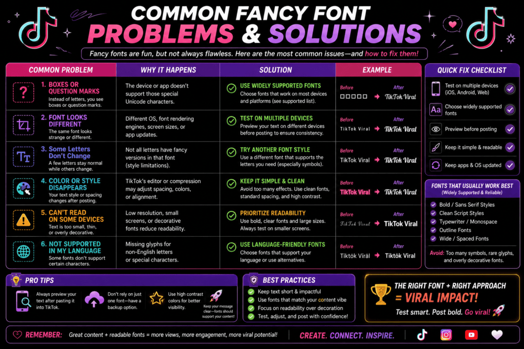
Problem 3: Font Works in Preview but Not After Pasting
As a developer, I often see rendering inconsistency during the final output stage. You click the copy button, but when you paste the different font elsewhere, it breaks within seconds because apps reject custom styles.
Previews load perfectly inside generators, but symbols change or completely disappear post-paste. Your systems fail to parse this stylized text, causing a harsh layout break across different devices due to underlying standard data translation errors.
Problem 5: My Bio Is Too Long Now
Byte bloat caught me off guard during profile optimization. Your text length looks fine, but underlying hidden formatting characters drastically expand data weight. Suddenly, your sleek Instagram presence stalls because the platform rejects invisible spacing.
My corporate profile engineering taught me that character counting algorithms fail on stylized text. When pasting ornate strings into Twitter, internal limits trigger early. Your text gets automatically bio capped because hidden gaps exhaust storage.
Problem 6: The Copy Button Isn’t Working
We frequently observe strange clipboard failures when popular font generator tools completely overwrite standard plain text. That unexpected copy-paste issue usually triggers because native software fails processing heavily customized special symbols inside modern mobile platforms.
When engineering interfaces, I noticed copied data strings often inject invisible extra spaces during extraction. Manually selecting text bypasses broken triggers, but users must frequently recopy everything before target input fields accept distorted characters safely.
Also Read: Gothic Font Generator – Copy In Gothic Font
Problem 8: Some Letters Work, Others Don’t
Experiencing selective rendering failures reveals how modern layout systems break down completely. Your device sometimes processes specific glyphs but entirely fails on others. This chaotic partial visibility leaves users deeply confused during daily digital communication.
An incomplete underlying map triggers these specific fancy font problems unexpectedly. When an operating system doesn’t support certain rare characters, standard alphabets render normally while stylized elements instantly revert into empty design block layout gaps.
Conclusion
Operating at the edge of limits proves that custom styling bypasses actual font files. Modern applications reject digital text because it mimics real fonts without proper system integration, ultimately exposing strict platform built-in limits daily.
When optimization bugs emerge within any target platform, rendering fails completely. Developers track errors during a brief response window, usually lasting 24-48 hours, to determine if a specific font style can safely load or fail.
Why Do Fancy Fonts Turn Into Boxes or Symbols?
Digital rendering platforms often display empty squares when an operating system completely lacks character maps. As an engineer, I observe devices fail to recognize symbols because software environments completely isolate these unknown encoding blocks entirely.
Why Does My Fancy Font Work on My Phone but Not on Someone Else’s?
Your iPhone displays an elegant layout perfectly, yet mixed operating systems shatter that illusion. A newer Android often lacks character support for rare characters, triggering aggressive fallback character handling that breaks those decorative characters completely.
Why do some apps ignore my system font settings?
Developers lock fonts to protect performance and avoid display bugs across layouts. When custom code forces a safer default, your preferred phone typography breaks. A simple font style ensures a universal standard stays intact.
Are fancy fonts real fonts?
Systems misinterpret a bubble font or decorative cursive because each is a specific Unicode character masquerading within digital ecosystems. They lack an actual product design standard, destroying layout frameworks and critical text readability completely online.
Do Fancy Fonts Work Better on iPhone or Android?
Testing rendering stability across mobile operating systems reveals that a newer iOS structurally outperforms Android due to a wider native character-set difference. An OS update ensures nearly all Unicode characters match default configurations perfectly.