
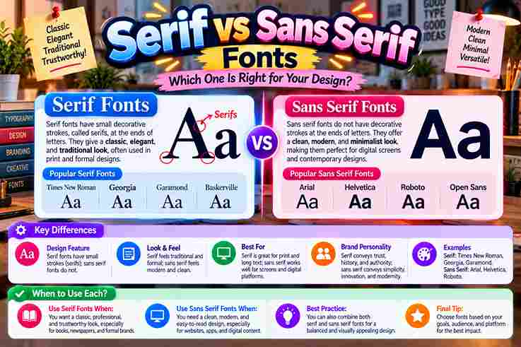
Choosing between Serif fonts and Sans-Serifs is less about rules than understanding their visual differences. In practice, typography works best when its style of design, brand feeling, and good readability support the message and audience.
Serifs bring small decorative strokes and a classic vibe, while sans serif lettering favors a streamlined look, minimalist simple neat forms, and no small lines. The distinction matters because choice changes tone without changing words.
Table of Contents
Serif Vs Sans Serif Font Differences
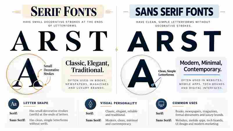
The difference is not merely decorative. Brand perception often reflects processing fluency: serif typefaces score higher for heritage cues, while sans serif typefaces score higher for immediacy, openness, and a distinctly contemporary sense of directness.
Serif typography often signals tradition authority, whereas sans serifs emphasize modernity clarity. Still, execution decides success: good spacing, sensible line length, and adequate contrast can matter more than category labels alone visually in real applications.
What Are Serifs?
A serif is the terminal detail added to letter strokes, often described as small decorative lines or feet at the end of each stroke. These marks give characters stronger differentiation and a historically rooted texture.
Serif design contains four types commonly discussed: old-style, transitional, new-style, and slab serifs. Their forms differ through terminal shape, stroke contrast, and the slope of ovals, letting designers tune warmth, elegance, strength, or drama precisely.
History/Origin Of Serif And Sans Serif Fonts
Serif development reaches beyond printing: ancient Roman stones show carved letter endings, while scribes, brushes, and quills likely shaped finishing habits. Later, centuries book printing normalized these details, turning practical marks into recognizable typographic tradition.
Sans serif forms emerged later through the 19th century, then accelerated with industrialization, modernism, and utilitarian forms. By the early 20th century, designers favored stripped structures that matched changing technology, architecture, advertising, and public communication.
Key Characteristics And Psychological Impact: Serif Vs. Sans Serif Fonts
From a branding perspective, serifs convey trust sophistication tradition craft, while sans serifs communicate clarity modernity friendliness efficiency. I’ve found that style reinforces emotion because visual details shape customers feel, credibility, warmth, accessibility, and authority.
Contrast affects tone: serifs read classic traditional status-oriented elegant, whereas sans serifs perceived minimalist simple neat. In practice, modern friendly minimal styling feels direct, while editorial crafted established premium typography adds depth, heritage, seriousness, refinement.
Most Important Serif Facts
Serif typography carries weight of history, yet its value is practical: the letter details help distinguish letterforms and support comfortable reading in books; measured spacing and line length keep dense passages calm, ordered, and readable.
In practice, serifs are more versatile than their traditional reputation suggests: Old-style serifs can project heritage comfort, while Modern serifs may carry polished, fashion-forward energy, giving brands character without sacrificing clarity, usability, or professional credibility.
Most Important Sans Serif Facts
In contemporary typography, designers choose from countless sans serif families, but popularity alone never guarantees usefulness. The designs prioritize open shapes, consistent spacing, and efficient recognition, especially where interfaces demand fast reading across screen sizes.
Working with brand systems shows why sans serifs remain most popular: they feel neutral without becoming anonymous. Their broad category contains geometric, humanist, and grotesque approaches, letting teams tune personality while preserving clarity across applications.
When/Where To Use Serif Fonts
For brands seeking credibility, serif fonts fit books magazines posters, boutique goods, heritage narratives, and authority-driven services, where structure can express tradition expertise luxury editorial voice while remaining elegant noticeable rather than ornamental or outdated.
I use serifs when print needs depth, for long-form reading, premium packaging, formal headlines, and refined brand storytelling; in a digital environment, screen-optimized serif families can still work when size, spacing, and contrast are tested.
When/Where To Use Sans Serif Fonts
For interface-heavy work, I usually reach for this category first. It suits websites apps email, UI text, navigation, and small labels, because simple forms scale well, load predictably, and support clear scanning across varied displays.
Beyond apps, I use this style where messages must register quickly. Sans serifs dominate signage and short bursts of text because fast scanning matters, especially when viewers move, glance, or read information from a distance.
Readability (Serif Vs Sans Serif)
Although conventional wisdom favors serif for print and sans for screens, that view is only partly true. For long-form text, the specific typeface decides much of the outcome, especially at small sizes with careful contrast.
From my design experience, well-hinted serifs can look great digitally, while well-spaced sans serifs produce comfortable print. Readability improves when sizing spacing, line length, and color contrast are tuned instead of trusting category itself alone.
Combining/Pairing Serif And Sans Serif Fonts
In practice, a refined serif beside a warm humanist sans can create contrast. I usually assign clear roles, using headlines vs body strategically; this separation lets each face contribute character while preserving readability across layouts.
For reliable pairing, choose contrasting families and keep system tight rather than adding variety. Limiting designs to no more than two typefaces creates clearer rhythm, while defined sizes, line heights, and weights maintain disciplined execution.
Also Read: Font vs Typeface: What Is the Difference?
Font Usage In Media
In print, high-contrast serifs can give premium brochures and editorial layouts a richer, more deliberate voice, while a sturdy sans often performs better on promotional pieces where viewers need immediate recognition in practice, from afar.
On digital platforms, sans serifs cleaner support fast scanning across interfaces, while modern serifs screen-optimized can add distinction to long-form reading when line height, color contrast, and spacing are carefully controlled for sustained attention today.
Print Media
From production experience, type lives differently on a page because size spacing contrast can turn the same font from restrained to expressive. An elegant printed label often succeeds through dimensions, ink behavior, and white space.
I have seen changes perception emerge before readers consciously identify letterforms: generous margins calm dense publication pages, heavier stock adds substance, and disciplined alignment makes even modest lettering feel intentional, trustworthy, and professionally finished overall.
Digital Media
From my experience, digital-first environments work best when typography supports quick readability rather than decoration. I judge mobile applications, e-catalogs, and consumer-facing brands by whether type scales beautifully, supports design ops, and preserves hierarchy everywhere.
Serifs deserve attention too. Screen-optimized serifs are gaining ground digital spaces, while thin headlines pair with sturdier text without sacrificing personality. I test actual devices because tight letter-spacing and optical sizes matter more than category.
Other Related Fonts (Added Under Existing Competitor Heading)
Beyond the basic divide, slab serifs, display serif, and Transitional serifs reveal how structure changes tone. In practice, I find Clarendon sturdy, while Didot and Bodoni create sharper high contrast for polished publication layouts today.
On the sans side, Grotesques, Humanist sans serifs, Geometric sans serifs, and Neo-grotesques offer distinct voices. Helvetica feels unobtrusive, Frutiger adds warmth, Futura feels precise, while Inter and Roboto remain highly optimized for screens today.
How To Choose The Right Font
Choosing well starts by asking what the typeface must accomplish, not which style looks fashionable. I consider values associations, then define the required mood so visual character supports communication rather than distracting from the message.
From experience, I check examples similar projects before testing candidates in layouts. That comparison exposes appropriateness quickly: the strongest option feels intentional across headings, body copy, screens, and print without forcing personality into every element.
Myths/Stereotypes/Misconceptions About Serif And Sans Serif Fonts
Calling sans serif boring corporate or assuming serif cannot be modern reduces type selection to stereotypes. A skilled professional questions such shortcuts, testing voice, purpose, medium, and reader comfort before deciding what genuinely suits communication.
Likewise, saying serif makes brand look outdated treats tradition as a limitation. Practitioners do not believe labels; they compare proportions, rhythm, platform, and tone, then find typeface fits brand precisely rather than obeying myths blindly.
New York Times (Serif) — Case Study
A New York Times masthead works because its editorial typography communicates authority before readers process a headline. Rather than feeling old-fashioned, the letterform identity converts heritage into a signal of institutional seriousness and editorial confidence.
From practice, I notice how dense information stays organized without looking mechanical. That layout supports investigation, feels serious, and builds trust through repetition and restraint, explicitly making credibility a behavior rather than a decorative claim.
Google (Sans Serif) — Case Study
This visual system demonstrates how crisp sans serif typography can make a product intuitive rather than merely fashionable. The Google brand turns promise of clarity into practice, giving complex services an immediate, straightforward neutral voice.
From repeated observations, identity approachability is the stronger lesson. Purpose-built for screens and primarily online, the company balances technological prowess with restraint, proving an advanced efficient modern concept succeeds when communication with audience stays direct.
Also Read: Cursed Text Generator – Ultimate Chaos
By Medium
In consultancy audits, paper serifs read beautifully when dense paragraphs need measured pacing, whereas screen-optimized sans preserves recognition at compact resolutions. I treat map primary medium as the opening decision, before aesthetic preference enters evaluation.
For physical collateral, well suited packaging and business cards benefit from forms; online, high-DPI devices reward adaptable composition. My process checks mobile UI screen first, then print one-pager, so medium reveals weaknesses before polish distracts.
By Audience And Demographics
Audience fit matters more than category rules. In client work, I test likely age ranges, accessibility, and category expects before choosing. Younger digital audiences respond to sans serifs, while heritage-minded readers trust serif cues differently.
The useful question is not whether one style is universally better, but who must read it. For small screens, clear letterforms support older users, while luxury crafted spaces can benefit from serif character and sophistication.
Future Trends Of Serif And Sans Serif Fonts
Looking ahead, I expect variable fonts to blur category boundaries: modern beautiful serifs may gain sharper screen behavior, while geometric sans serifs become warmer, more expressive, and responsive across flexible identity systems and device contexts.
On products, accessibility, extended language support, and brand expression will matter more than inherited labels. As trends come and go, strong typography will favor adaptable families performing across screens, print, interfaces, and emerging devices smoothly.
Final Choice
For the final choice, begin with brand’s personality and the dominant contexts where customers encounter it. Then pilot test quickly using real assets, because practical behavior often reveals weaknesses that attractive font specimens quietly hide.
I prefer choosing a family that strengthens brand alignment while remaining manageable for limited design resources. Assign roles before launch, consider your future self, and favor a system your team can apply consistently without interpretation.
Bonus Tips (Remaining, Non-Duplicate) (From Din Studio Competitor Content)
With typography developing rapidly and a huge number of fonts released, the most difficult thing is not get lost in abundance. I compare candidates within mockups, then remove options that weaken recognition or strain scanning.
To understand right choice, inspect each candidate under realistic constraints before committing. Check dense paragraphs, compact labels, enlarged headlines, and monochrome reproduction; whichever option remains coherent across these situations usually deserves the stronger recommendation overall.
Must Visit: Free Case Converter
In Conclusion
After reviewing brand systems, I see typography as a strategic decision: serifs bring heritage authority editorial warmth, while sans serifs bring clarity modernity digital ease. Strong outcomes appear when designers let the job dictate tool.
In practice, I start brand personality, check primary mediums, and consider audience before I pick style. When well-paired families support hierarchy and a bit of testing confirms readability, typography becomes a quiet lasting competitive advantage.
What Is The Difference Between Serif And Sans Serif Fonts?
From practical typography work, the clearest distinction is the presence absence of small lines attached to letters: serif forms add these decorative strokes, while Sans designs remove them, creating a more concise, neater, contemporary structure.
What Is The Main Difference?
In my experience, the main difference becomes obvious at ends of strokes: serif characters carry small features that create a classical, traditional, often formal tone, whereas sans-serif lettering stays cleaner and visually more restrained overall.
What Is A Serif Font?
A serif font is recognized because letters have serifs, small finishing strokes added to their edges. In practice, these details shape a traditional visual voice, while different subcategories differ shape of serifs, weight and contrast.
What Is A Sans-Serif Font?
A sans-serif font is easily identified by absence of ornamental endings. In practice, these concise fonts offer a wide use scope; neo-grotesque options, display text fonts, and new subfamilies let designers tailor tone across projects.
Which Fonts Are Considered Serif And Which Are Sans Serif?
From hands-on practice, I classify TT Livret, TT Bells, and TT Regins as serif selections; TT Norms Pro, TT Commons Pro, and TT Turns are sans serifs, offering straightforward reference points for comparison across projects.