Alt Code Generator Copy & Paste

Alt Code Generator

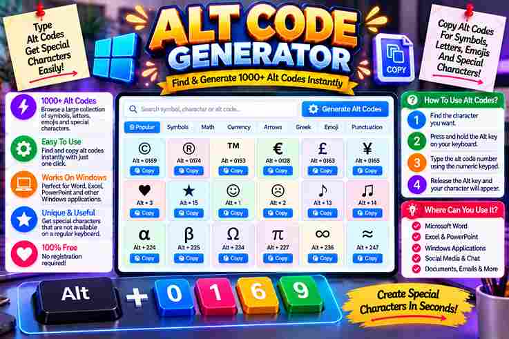
Alt Code Generator Click any card to copy the symbol instantly. Desktop users can hold the Alt key and type the listed code on their number pad. All CategoriesPopular & ShapesMath & FractionsCurrencyArrows & PointersAccents & Letters Symbol copied to clipboard! In my years optimizing workflows, utilizing the classic IBM method remains unmatched. Typing on a modern physical keyboard sometimes requires enabling Num Lock or using the Fn key on compact laptops to access hidden glyphs. We often need diverse symbols, from ancient scripts to math signs. While Microsoft users enjoy native input via Windows-1252, those on macOS often struggle, relying instead on tedious copy paste alternatives for entering characters daily. What Are Alt Codes We often feel restricted by a standard keyboard during daily tasks. I discovered that alt codes unlock hidden pathways, letting us input special characters directly on Windows. By combining keys, we easily summon unreachable glyphs. In my daily professional practice, I often notice people struggle with complex software menus. Simply hold Alt and use your numeric keypad for seamless typing. This elegant system bypasses interfaces to output unique characters instantly. Also Read: HTML Text Generator – Create HTML Code Online About Alt Codes To access rich Unicode symbols without an online generator, these shortcuts are essential. By learning how to type number sequences, you expand your keyboard capability. It is a completely free native computer operating system tool. Writing documents becomes easier when inserting foreign letters or complex math signs. I use the dedicated number pad for rapid text formatting, employing keyboard shortcuts to streamline my creative workflows every single day now. How to Use / How to Type Alt Codes As an operator, I found that executing a precise key sequence requires activating Num Lock first. You must hold Alt key firmly while inputting specific digits on the physical numeric keypad, then simply release Alt. Modern layouts often complicate this process. If you utilize a laptop lacking a dedicated numpad, engaging the functional Fn key bypasses those standard limitations, providing a reliable alternative input method to resolve potential compatibility issues. Common Alt Codes / Examples by Category Injecting a heart symbol or atmospheric music note symbols directly into documentation transforms dry interfaces. As a veteran developer, I often map these custom arrows into hotkeys, bypassing standard layouts for swift, tactile system execution. Adding a sharp registered trademark or a precise degree symbol validates technical data instantly. During audits, we deploy verified check marks to ensure compliance, proving that tiny glyphed outputs anchor professional, robust standard digital assets. Tips / Things to Know When typing special characters, remember that the left Alt key paired with your physical numeric pad acts as a direct hardware bridge. Ensure Num Lock is active, or the intended symbol appears only as navigation. Systematically, legacy BIOS and OEM architectures dictate how modern operating systems process these inputs. Always hold Alt while typing the sequence, then release Alt to let Windows codes instantly translate them into beautiful, clean glyphs. Symbol Test Box Evaluating typography layouts is tricky. Testing how an aesthetic string performs saves time. Enter your raw draft inside our container; the instant visual render prevents formatting errors. Rather than raw Plain layout scripts, copy symbols. Developers often struggle when pasting weird characters directly into web frameworks. Without a proper live validator, your HTML rendering might break completely. Paste experimental combinations here first, then search for styling errors before updating Docs. Category Sub-pages / Related Symbol Links Navigating dense typographic layouts requires absolute structural clarity. I often group standard punctuation alongside geometric circles and sharp squares to balance spatial interfaces. Adding clean lines helps partition complex math data, keeping nested stars visible. Isolating logical symbols ensures smooth workflow integration. Developers frequently pair directional triangles with precise numbers to organize complex fractions. Enclosing these in custom brackets simplifies data comparison, making ancient greek codices completely legible and clear. Interactive Generator Tool Description Our custom interface bypasses archaic keyboard mapping issues entirely. Users can easily drag and drop complex characters directly into the interactive textbox, allowing a live preview of glyph scales before using click to copy commands. We designed this digital ecosystem to generate unique outputs with no signup required, accelerating modern workflows. Achieving instant conversion means every selected symbol integrates flawlessly across diverse web structures and modern platforms without manual formatting. Symbol Categories List Navigating a vast category of alt code symbols streamlines document design. Through my layout work, grouping greek letters alongside currency symbols improves legibility, ensuring we quickly find vital punctuation marks or intricate chess symbols easily. Organizing distinct sets like playing cards or exotic animal symbols clarifies your creative interface. My practice relies on dividing block shapes from everyday common symbols, ensuring every single trademark symbol remains fully visible and structured.
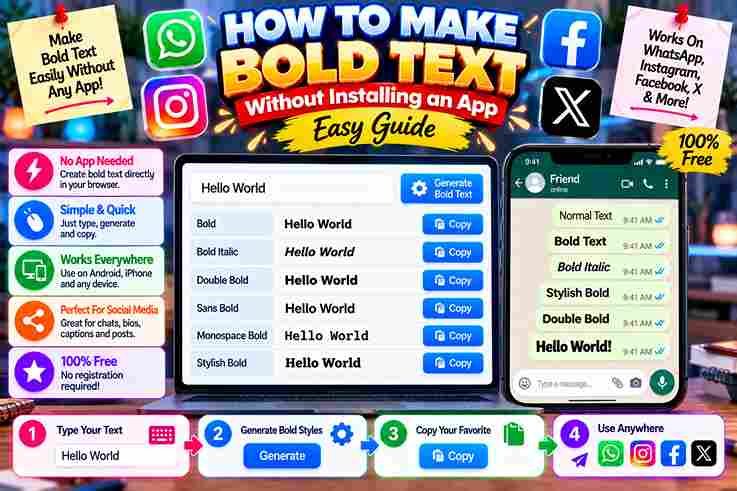
How to Make Bold Text Without Installing an App Easy Guide

How to Make Bold Text Without Installing an App

Digital design begins where native constraints end. Seeking attention on social media forces individuals to transform plain text. We bypass software entirely, finding an effortless way to make posts stand out using raw Unicode characters. Injecting these styled glyphs directly into Instagram captions, Twitter updates, or professional bios immediately establishes a striking visual hierarchy. Simply paste the generated bold fonts anywhere online to strategically emphasize your core context seamlessly today. What Is Bold Text? As a designer, altering typography means adjusting weight. Increasing thickness creates instant emphasis, forcing specific characters to stand out immediately. This mechanical change establishes a clear visual hierarchy across any digital platform or written communication. Beneath the visual surface, this modern bold style does not require complex systemic files. Instead, Unicode automatically transforms standard text into heavier alternative glyphs. This contrast imparts profound significance compared to the basic surrounding text. Also Read: Bold Font Generator: Transform Your Text Instantly Where Can You Use / Post Bold Text? Modern cyber environments offer uncommon channels across expression. Structuring a customized Instagram bio or publishing dynamic social media posts elevates viewer interaction. Tweaking an account username or refreshing network profiles expands virtual audience noticeability significantly. Injecting distinction inside a reddit comment or during executive presentations alters how insights feel. Experienced authors leverage these tactics across news websites and throughout Reddit to capture interest without ever relying on external software installations. When / How to Use Bold Text Thoughtfully Excessive styling often destroys pure design aesthetics. Experienced professionals know that human eyes quickly reject chaotic layouts. We must carefully construct a clean visual hierarchy, selecting specific words strategically to enhance readability rather than cluttering. Isolation makes heavy headings work. Overusing weight will instantly diminish impact. True important information requires breathing room; sparse bold text isolates crucial key points beautifully without ever triggering severe visual fatigue for digital modern readers. How to Convert Text to Bold (Step-by-Step) Skipping installation scripts shifts modern formatting toward a bold text converter instantly. Operating within the digital realm requires direct interaction. I input strings directly into the Input field, activating underlying hidden architecture without any complications. Systems process these obscure characters automatically via an established universal code layer. This systemic translation populates your system clipboard smoothly. Simply paste the newly styled results anywhere, completely avoiding external standalone application downloads very safely. Also Read: The Science Behind Stylish Fonts And Unicode Characters How Does This Tool Work? Bypassing native software restrictions, the cloud generator processes your input text via an open protocol. Modern computers instantly map strings, completely avoiding separate font files entirely. They apply a shared language fulfilling precise global specifications. When users need to format text, utilities do not alter system weight. Instead, they swap standard glyphs for specialized bold characters defined within the Unicode standard, allowing various applications to display genuine bold letters natively. Why Choose the Bold Text Generator? As an expert managing clean interfaces, utilizing a standardized system ensures immediate digital compliance. This structural design allows users to bypass restrictions. Selecting specific bold font styles renders visual shapes using unique character codes directly. To maximize user engagement across any modern website, publishers must create an immediate visual impact. Instead of relying on heavy HTML configurations, these native fonts seamlessly draw attention alongside complex digital emojis globally and efficiently. How to Post Bold Text on Facebook My Facebook posts looked dull among crowded feeds. Seeking a solution, I used an online Font Generator to generate distinct characters. I would copy the styling, altering my normal text inside every caption for impact. Transforming comments and user profiles requires no software. This method helps emphasize specific places where raw content demands attention. Audiences notice those bolded expressions instantly, bypassing standard styling limitations on social feeds with absolute ease. Bold Text (Unicode Alphabets) We bypass standard system fonts by utilizing styled Latin alphabets embedded directly within standard encoding. I often observe academics leveraging these unique characters for specialized purposes, injecting visual emphasis into their raw digital format documents. These mathematical symbols, originally designed so mathematicians could easily format complex equations and numbers, now serve a broader crowd. Using Math bold styles provides instant emphasis without installing any translation software or heavy script files. Also Read: How to Copy and Paste Fonts in Seconds Bold Italic Activating Bold Italics directly shifts cognitive focus, bypassing standard grids. As a veteran typographer, I bypass every demo site to explore raw Unicode text options directly. This manifestation instantly creates a visually prominent artistic hierarchy. Deploying bold italicized text demands absolute intent. Greedy portals try to strip out this expression to avoid clutter, yet my creative styling bypasses their limits, proving that deep gravitational pull never disrupts profound resonance completely. On Reddit Digital identity shapes our daily interactions. When you submit on Reddit, using a web font generator lets you convert text easily and instantly. It bypasses strict limits on standard markdown formatting across multiple social media platforms. Through HTML system translation, characters change dynamically. Instead of relying on a system keyboard shortcut or bloated local software, external websites seamlessly modify your thread comments and titles, even blending styled text with standard emojis. Instagram Experiencing mundane profiles pushed me to bypass restrictions. When algorithms stifle standard comments, creators must actively copy stylized layout aesthetics. An online Font Generator bypasses mobile blocks, injecting customized Instagram feed engagement organically without apps. Platforms rarely natively support heavy emphasis within captions. Changing your display text alters visual hierarchy completely. Crafting unique posts requires adapting universal text formatting frameworks, transforming default interfaces into compelling statements that capture reader attention. Also Read: Wide Text Generator Social Media Standing out on X or TikTok demands psychological triggers. When sharing a holiday greeting post, basic layouts fail. Deploying raw Unicode characters across various online profiles yields massive visibility, ensuring your personal brand dominates communication. Modern engagement across Facebook or LinkedIn requires distinct presentation. Whether broadcasting to subscribers on YouTube or messaging via WhatsApp and SnapChat, utilizing an uninstalled bold text generator transforms your text into an undeniable … Read more

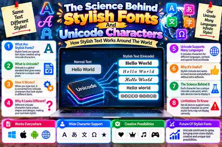
The Science Behind Stylish Fonts And Unicode Characters

The Science Behind Stylish Fonts

As a digital designer, I watched how standard ASCII systems failed to express modern creativity. When Unicode emerged around 1987, it unified human language, allowing styled options like Gothic or Cursive layouts to thrive globally. Every typography character generated by an online tool alters the raw data framework. A distinct code point instructs modern devices to render these letters, reshaping daily digital communication through altered mathematical glyph paths quite seamlessly. What Is Unicode / What Is a Unicode Font? In my years auditing digital typography, I discovered that the entire system operates not through visual magic, but an international standard. Each individual character receives a unique number, ensuring absolute layout consistency across modern platforms. When your device maps this specific code point, it translates raw architectural data rather than changing traditional letters. Consequently, custom Unicode fonts re-engineer these special glyphs dynamically, completely bypassing standard operating font system architecture restrictions. Also Read: How to Copy and Paste Fonts in Seconds How Unicode Fonts / Font Generators Actually Work As an expert, I observe how a font generator operates. The device instantly reads the code of a number assigned to a visual shape, transforming a basic text input into unique stunning architectural art pieces. When a tool maps a normal word into special characters, users copy and paste these across any platform. This matching styled Unicode character seamlessly populates modern usernames, proves that the difference is purely deep structural. Every Character Has a Code Point My years auditing digital typography prove a regular letter hides an underlying Unicode code point. This systemic result provides instant leverage for fancy fonts to bypass standard filters, altering how a device renders custom layout. When platforms parse these characters, the raw text always maintains its core identity even if visual aesthetics change completely. Observers mistake this for a safe design choice, ignoring the complex architectural shifts occurring right now. Tools map normal letters to styled ones As a digital architect, I witness how every online generator swiftly converts basic inputs. Instead of altering actual typefaces, these systems replace normal letters with pre-allocated variations. Consequently, Unicode fonts emerge as uniquely styled glyphs. Behind this mechanism, computers process obscure mathematical alphanumeric symbols rather than standard data encodings. When users copy and paste this output, platforms display a clever trick of architectural mapping, completely redefining modern communication visual aesthetics. Also Read: Is Small Font Bad For Your Eyes? Must Know The Text Stays Text As a seasoned developer, I observe how a plain text field processes input. Instead of traditional formatting, each stylized character stays the same because it relies on a specific, unique code within the global system. In my professional practice, substituting actual font files with raw data alters visual appearance seamlessly. Platforms recognize the underlying character code as regular text, ensuring that the decorative structure persists dynamically across modern communication networks. Compatibility — Why Unicode Fonts Work / Don’t Work Everywhere Operating systems interpret the global standard framework flawlessly, ensuring a pasted result retains its external appearance across diverse websites. Because the underlying text encoding remains stable, modern devices instantly render these exotic characters without issues. However, legacy infrastructure frequently falters. When older systems encounter certain characters, their databases lack the corresponding glyphs to display them properly. Consequently, old devices cannot handle this syntax, dropping crucial support completely and breaking layouts. Are Unicode Fonts Safe to Use? Analyzing accessibility exposes security limitations across various social platforms. Software reading unknown characters might malfunction, meaning modern devices occasionally break rendering. Therefore, people must follow a strict safety instruction before modifying their core computers systems. Safeguarding valuable features requires verifying how algorithmic crawlers scan hidden obscure matrices. When publishing on a new destination platform, Google might filter out critical data if someone omits examining these important details completely beforehand today. Also Read: How to Use Online Font Generators for Instagram & TikTok Like a Pro Common Types of Unicode Font Styles Bold Unicode Many platforms process mathematical variables to generate Bold Text. When you highlight words, algorithms substitute standard code points instantly. This structural adjustment helps emphasize critical messaging within diverse social feeds without altering native frameworks entirely. Designers routinely format profile bios using these obscure mathematical glyphs. For example, adding thick lettering inside media captions bypasses character style limits, offering distinct psychological dominance that traditional typography cannot achieve on mobile applications successfully. Italic Unicode Slanted mathematical symbols offer unique visual engineering solutions for modern digital layouts. When rendering Italic Text, algorithms swap normal Latin structures for specialized code points, transforming standard interface typography into highly sophisticated communication assets effortlessly. Injecting soft emphasis within dense social media descriptions alters how audiences perceive informational hierarchy. For example, practitioners manipulate these specific glyph configurations to craft sophisticated professional signatures that gracefully bypass normal platform design restrictions completely. Cursive or Script Distinct mathematical script blocks simulate elegant styling online without using actual external font assets. Utilizing Cursive Text generates fluid visual loops that resemble custom calligraphy, instantly elevating mundane digital interfaces into highly artistic environments seamlessly. This sophisticated option introduces a warm, handwritten aesthetic directly into strict, automated system fields. For example, users leverage these fluid symbols to project personal authenticity, breaking the rigid, sterile monotony of standard computer communication effectively. Also Read: Why Fancy Fonts Don’t Work On Some Devices Small Caps Deploying a unique miniature text style completely revolutionizes visual presentation strategies inside modern search databases. These specific mathematical symbols display as capitalized shapes but remain scaled down, offering balanced emphasis across text layouts very cleanly. Consider this professional design example: replacing traditional characters with these smaller glyphs preserves layout architecture. The resulting letters mimic corporate publication aesthetics, conveying a sense of authoritative prestige within unformatted biography fields quite brilliantly now. Bubble Text Enclosing individual characters inside distinct circle shapes breaks standard linear layout monotony. This specialized text configuration converts plain alphabetic sequences into standalone graphic components, forcing high reader focus through pure geometric isolation strategies extremely fast. As an example, casual profile creators use these round container symbols … Read more

How to Copy and Paste Fonts in Seconds

How to Copy and Paste Fonts

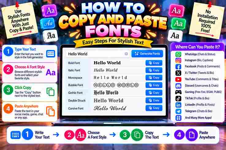
My personal experience with every online generator confirms how altered letters instantly transform an average social profile. Beyond simple fancy choices, incorporating custom symbols dynamically reshapes visual modern design, ensuring your text stands out brilliantly. Achieving a striking aesthetic requires zero technical expertise today. Whether applying a heavy bold weight, flowing cursive, or digital glitch effects, typing alternative characters instantly maximizes user engagement across every mainstream modern platform quite effortlessly. How to Copy and Paste Fonts (Step-by-Step Process) Achieving aesthetic distinction across digital platforms requires a strategic approach. When you copy-paste stylized text into plain text fields, modern devices instantly map the output using unique characters. This process bypasses traditional formatting restrictions completely. Evaluating the final layout ensures optimal cross-platform visibility. By integrating distinctive symbols, your creative design transforms standard typography into a powerful tool for personal branding, allowing visual messages to resonate across diverse online ecosystems seamlessly. Also Read: Is Small Font Bad For Your Eyes? Must Know What Is a Font Generator & How Unicode Makes It Work Operating as a global standard, real Unicode systems swap plain text into stylized Latin-alphabet variants. This process maps letters directly onto hidden Unicode characters, ensuring your Instagram bios look unique across every single online platform. Because this is not CSS trick or not installable font files, the device rendering happens naturally. Your custom text is not image data, meaning it pastes correctly inside WhatsApp messages and busy Discord usernames effortlessly. Where to Use Copy-Pasted Fonts (Use Cases / Platforms) Identity fragmentation happens when digital compatibility breaks across standard operating systems. I managed weird rendering inside competitive gaming platforms like Roblox and Minecraft, proving that strategic layout execution requires deep unicode support for clear audience visibility. Maximizing personal branding means pushing stylized elements directly into Instagram bios to capture immediate user attention. My ongoing testing confirms these aesthetics work beautifully within volatile TikTok captions and custom Discord nicknames, bypassing traditional constraints. 170+ Font Styles in 10 Categories In my practice, optimizing TikTok metrics requires understanding diverse visual moods deeply. Whether I select Gothic architecture for symbols or apply Cursive for romantic captions, changing typography completely revitalizes underperforming Tumblr accounts and Instagram bios. From my observation, designing gaming usernames involves pairing Aesthetic choices with striking layouts. Deploying Bold characters helps your text pop inside crowded feeds, while inflating simple Discord names with Bubble shapes injects a playful vibe. Also Read: How to Use Online Font Generators for Instagram & TikTok Like a Pro 50M+ Fonts Have Been Copied Digital scale demands instant conversion mechanisms. Over fifty million iterations prove that fancy text is not a passing trend but a deep design ecosystem upgrade, allowing users to generate text that bypasses standard system limitations. We observe millions who copy to clipboard these custom structural permutations daily. By deploying Unicode symbols, anyone can seamlessly paste anywhere across global networks, injecting stylish fonts directly into rigid, corporate digital environments quite effortlessly. Explore Font Styles — Find Your Perfect Look Ignoring structural hierarchy completely ruins reader immersion. Consequently, strategic headlines salvage spatial arrangement. Match your message tone to a specified brand vibe, bypassing total visual chaos while ensuring clean readability using select decorative fonts globally. Elevating online styling requires shifting user perspective. Deploying raw creativity drives audience engagement swiftly. Experiment with striking glitch effects or elegant cursive script options, alternating with bubble letters and distinct monospace choices to reinvent expression. Platform Compatibility Digital ecosystems process these symbols uniquely. In my expert view, sharing glyphs across all platforms means target applications must behave as a functional text-accepting platform where code renders. Test your profile on Discord or Instagram. Audience reception fluctuates when unicode characters fail to load properly. I notice seamless synchronization when pasting modern styles into TikTok or WhatsApp. However, older interfaces like Reddit, Facebook, Twitter, or YouTube occasionally reject specific strings. Also Read: Why Fancy Fonts Don’t Work On Some Devices Fonts Generator Features Digital identity shifts entirely when your workflow embraces unexpected psychological archetypes. True subversion requires an aesthetic that bypasses standard compliance. By forcing a custom cursive layout, creators project personal taste directly onto touchscreens of viewers. Our collective obsession with validation demands strategic emphasis across digital domains. Discarding conventional restraint unlocks numerological power within mundane profile bios. We craft subverted gothic typography to decorate virtual assets like custom online interactive stickers. Fonts Generator Tips & Best Practices Through years of digital curation, I learned that mood matching dictating your choice prevents design disasters. For casual design layouts, select subtler font styles instead of overly embellished fonts that clutter screens. Check the results. When you copy and paste, always evaluate how different letters, numbers, or obscure symbols render within the live preview panel. This specific technical workflow guarantees flawless presentation before final deployment on your chosen target platforms. Why Choose Our Fonts Generator? Experience shows that our free font generator provides unmatched flexibility. Because it runs in browser systems with no download required, creators achieve 100 percent free styling adaptations without risking local system safety or cluttering drives. Our architecture processes inputs into plain Unicode text, meaning there is absolutely no security risk involved. Users simply click copy button features to effortlessly export those newly stylized characters and paste anywhere they desire instantly. Also Read: Font generator How to Choose the Right Fancy Font from the Fancy Text Generator? Evaluating diverse fonts requires a strategic eye. If you crave sophistication, select an elegant option, while dramatic projects demand unusual choices. Ultimately, blending modern elements with a vaporwave look ensures your layout transforms ordinary styles. Testing custom characters across target browsers guarantees excellent visibility. Enhancing personal profiles requires catching user eyes instantly. Our long experiential methodology suggests utilizing the integrated preview system before finalizing important promotional headlines across mobile devices.

Is Small Font Bad For Your Eyes? Must Know

Is Small Font Bad For Your Eyes? Must Know

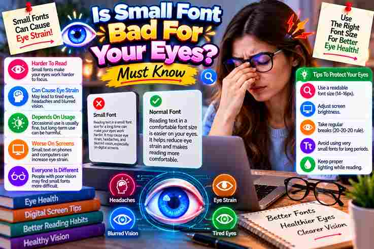
Observing clinical habits reveals that extremely small text forces an immediate ciliary muscle spasm. This structural tension mimics early presbyopia, though no evidence proves it accelerates permanent damage during standard digital readers screen exposure cycles. Psychologically, managing illegible text causes prolonged squinting, yet avoiding reading in the dark cannot mitigate future myopia risk. Patients often become dependent on psychological reassurance rather than their prescribed glasses to fix transient fatigued states. Does Small Text Actually Damage Your Eyes? My clinical expertise clearly shows small font induces temporary strain rather than advanced myopia. Modern patients tracking a tiny page experience blurry vision because the ciliary muscle gets overworked, forcing a significantly reduced viewing distance. Consequently, smartphone users frequently suffer from severe dryness when focused on a tiny digital device. However, changing everyday habits and consciously enlarging text provides immediate ocular rest, proving that fine print causes no permanent damage. Also Read: How to Use Online Font Generators for Instagram & TikTok Like a Pro What Actually Affects Eyesight (Beyond Font Size) Maintaining eye health requires modifying lifestyle choices. Overwhelming screen use triggers structural fatigue when incorrect viewing distance complicates muscular contraction. This constant reading behavior induces acute eye strain rather than causing any lasting biological damage. In professional observation, tired eyes and distressing headaches frequently occur during a complete lack of breaks. Working inside inadequate dim light suppresses normal blinking, which rapidly accelerates temporary eyestrain symptoms without compromising baseline ocular health. Myth 1 – Reading in Low Light/Dark Weakens Eyesight My clinical observation reverses common logic; darkness doesn’t cause permanent damage. Instead, navigating dimness forces neurological adaptation. Patients often blame ancient myths when temporary eyestrain occurs while peering at text on glowing smartphones in bed. Ocular mechanics evolved to process variable illumination seamlessly. Practicing in dim environments merely fatigues ciliary muscles, causing transient difficulty focusing. This heavy workload fatigues your eyes during night reading without permanently harming your baseline vision. Myth 2 – Wearing Glasses Makes Eyes More Dependent on Them My years in clinical vision care prove that wearing glasses never causes permanent damage. Instead, your brain quickly adapts to clear focusing. When removed, your underlying poor vision returns, mimicking an illusion of physical dependency. Patients often report eye strain or eyesight problems when abandoning lenses. However, structural changes dictating adult myopia function independently of optometric aids. Lenses alter light refraction entering both eyes, optimizing clarity without creating anatomical reliance. Also Read: Why Fancy Fonts Don’t Work On Some Devices Myth 3 – Reading in direct sunlight is dangerous In my practice, patients obsess over solar harm while dissecting fine print outdoors. Yet, bright ambient light actually sharpens contrast, meaning a small font inside traditional paper books requires less strenuous accommodation than previously anticipated. Ocular experts confirm that intense radiation causes temporary fatigue rather than permanent biological decay. Peering at illegible text or compact small print outside merely accelerates transient muscle strain, which completely vanishes after entering shaded environments. Prevention/Break Guidance My clinical practice proves that isolating text size misses the real issue. Patients obsess over pixel scaling while ignoring necessary breaks. When you stare relentlessly, your surrounding muscles become completely stiff, causing severe strain symptoms. Instead of fearing intrinsic font-related harm, practitioners prioritize resetting focus mechanics. Actively altering your static viewing distance interrupts accommodation fatigue. Dismiss automated reminders; simply enforce the classic 20-20-20 rule organically to preserve lasting ocular vitality. Also Read: What Are Unicode Fonts Presbyopia vs. Non-Presbyopia Findings Clinicians often misinterpret how a presbyopic eye navigates small typography compared to a non-presbyopic patient. While youth accommodates structural stress effortlessly, aging ocular lenses physically alter focus mechanics, demanding alternative habit corrections over simple fixes. Our research proves optimizing digital font size remains secondary to managing ambient luminescence across both unique cohorts. Neglecting proper illumination triggers early presbyopia symptoms prematurely, forcing structural strain regardless of someone’s baseline physiological refractive state.

Barbie Font Generator Copy And Paste

Barbie Font Generator

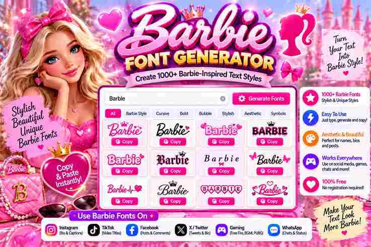
✨ Cursive Text Generator ✨ Hi Barbie! Copy to Clipboard 💖 Copied! Ready to paste into Instagram or TikTok. Generating an iconic aesthetic requires more than standard typography. As a designer, I witness how this creative tool transforms ordinary typography into vibrant cultural statements, instantly elevating personal branding and driving immediate consumer brand recognition. Manipulating customized text designs unlocks psychological layers of nostalgia. My professional experience proves that embedding a unique personality within digital assets disrupts typical algorithmic feeds, allowing standalone phrases to capture attention through pure, unadulterated energy. About Barbie Experiencing design shifts reveals that feminine style challenges traditional corporate logos. This distinct brand color isn’t just marketing; it actively alters gender representation frameworks globally. We witness a unique humanizing element through these visual choices. Our analytical perspective rejects simple superficiality. True dolly glamour weaponizes nostalgia to construct an attention-grabbing matrix where vibrancy dictates consumer behavior. Modern digital users utilize a generator tool to replicate this exact tactical aesthetic instantly online. Also Read: Preppy Fonts Generator ✨ Free Copy & Paste Brand History Deconstructing historical milestones shows how Ruth Handler initiated a massive revolution. Later, the bold redesign mirrored the rising women’s movement, proving that an original script font could transition seamlessly from childhood playthings into cultural statements. Achieving true brand maturity required navigating the chaotic Y2K digital expansion. Decades later, director Greta Gerwig revitalized this trajectory, igniting the global Barbiecore phenomenon that recontextualizes historical design elements for contemporary mainstream audiences everywhere completely. Evolution of the Barbie Logo (by Era) 1959 As a design practitioner, the 1959 American Toy Fair debut showcased immense distinctiveness. That vintage, handwritten-style aesthetic entirely rejected standard licensed fonts, injecting an unrefined brand energy that defied the sterile geometric treatments of eras. Our psychological connection to this iconic design history stems from its approachability. When Ruth Handler birthed the toy company legend in New York City, she avoided a dated look by choosing highly irregular, custom letterforms. 1975 The 1970s marked a radical pivot toward thick, volumetric typography, introducing playful curves that challenged traditional elegance. This bold evolution proves that brand recognition doesn’t always require thin, delicate script typefaces to successfully project confidence. Stepping away from traditional monochrome heritage, this specific era embraced a sprawling cultural symbol via intense color ownership. This visual audacity firmly established a globally recognized brand footprint, outshining the later saturation of McDonald’s red. 1991 By 1991, a major corporate logo redesign streamlined the entire graphics system. It wasn’t just about nostalgia; the company engineered a highly readable, versatile typeface that preserved the fundamental essence of their historical typography strategy. This era proved that brand history benefits heavily from structural visual restraint. As Totally Hair Barbie became the best-selling toy phenomenon of 1992, this specific iteration proved its massive commercial worth across global retail markets. 1999 As the new millennium rapidly approached, the year 1999 introduced a highly structured look. Designers developed Barbie Medium as a downloadable font, allowing passionate enthusiasts to deploy the aesthetic for their own personal use projects. This historic phase reflected a broader digital transition. Alternative lookalike fonts like Bartex and Bontex emerged online, offering a free for personal use license that allowed early web creators to easily experiment with customized typography. 2023 (Movie) / Present Day Today, the current logo leans heavily into heritage nostalgia, utilizing a sleek hand-drawn cursive layout. By referencing the original look, the brand achieved a magnificent blend of deep historical tribute and crisp modern aesthetics perfectly. This global pop-culture phenomenon sparked an explosion of Barbie-inspired designs. Fans worldwide utilize a web-based text effect generator to craft customized profile pictures and vibrant album covers, enjoying the unlimited use of digital creative tools. Barbie-Style Font Names / Lookalike Fonts As an experienced designer, I always bypass restricted assets by identifying functional alternatives. Finding a matching style requires evaluating the playfulness embedded in lettering. Tracking these unique aesthetics ensures compliance while retaining retro brand energy. Replicating the traditional cursive wordmark hinges entirely on selecting similar fonts possessing those iconic, bouncy geometric traits. My projects succeed because I scrutinize every sweep, focusing specifically on how distinctive curves project youthful consumer confidence. Features In my extensive design career, quick flexibility proves paramount. This platform provides seamless control over font size adjustments, alongside advanced styling parameters. Users can inject a vibrant gradient or deep shadow, ensuring outstanding visual delivery. Exporting assets requires flawless execution. Our architecture bypasses complex rendering, instantly delivering crisp outputs with a transparent background. Every modification reflects through a real-time preview, enabling creators to download files in standard PNG format. Why Use This Barbie Font Generator I observe that visual identity establishes deep psychological connections. Utilizing this specific tool allows brands to harness an iconic hue that triggers instant nostalgia, effectively bypassing traditional marketing fatigue across highly competitive online digital landscapes. Audiences constantly demand authentic cultural alignment. Integrating stylized text within contemporary Social Media campaigns dramatically amplifies your overall visual impact, transforming standard messaging into a profound statement of artistic representation that resonates with modern followers. How to Use / How It Works To achieve flawless asset production, execution matters. First, select font styles matching your structural aesthetic goals. Adjust internal fill parameters and an external outline to maximize typography rendering, ensuring every custom color or effect balances. Instantly, hitting the generate button synthesizes your technical assets. I always utilize the actual preview feature before finalizing production cycles. Choosing the swift download option delivers clean, crisp, highly programmatic visual layouts ready for deployment. The Power of Barbie Pink Managing a visual identity requires understanding color psychology. Utilizing Barbie Pink means deploying Pantone 219C to trigger instant emotional reactions, bypassing traditional marketing. This strategic hue acts as the core of a modern brand identity. We often witness radical cultural shifts where color drives commercial subversion. Beyond mere corporate aesthetics, this specific pigment weaponizes femininity within digital design layouts, transforming submissive gender associations into a definitive statement of cultural empowerment. Typography as Brand DNA Analyzing corporate identity proves that typography evolution shapes modern consumer culture. … Read more

Underline Font Generator Copy and Paste

Underline Font Generator

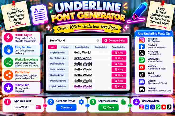
Underline Font Generator Type below to instantly generate copyable text styles for social media. 0 characters Clear Text Single Underline Copy Double Underline Copy Wavy Underline Copy Strikethrough Copy In my design experience, standard layouts look dull. I always use a generator tool to forge a distinctive presence, making specific headlines pop across various digital platforms with a wavy or solid creative content flare. By leveraging a unique mechanism involving Unicode combining characters, this system alters typography directly. My testing confirms privacy first protocols ensure nothing stored ever remains online, delivering completely safe, stylized results for modern digital communication. How to Use / Steps to Generate Underline Text Experiencing broken layouts taught me that pasting your user text yields a stable order immediately. This occurs because our full mixed generator processes a fake underline layer beneath, converting standard characters into custom rendering alternatives. Watching the style list refresh proves that regenerating your customized formatting requires zero remote storage. Local processing ensures total privacy since the entered text remains locked locally, safeguarding sensitive data while creating your stylized outputs. Tips / Best Practices for Using Underline Text Prioritizing clean layout ensures your documents remain easy to read without formatting clutter. Apply subtle highlighting strictly for emphasis on vital phrases rather than whole sentences, preserving textual clarity across busy social media creator captions. When crafting unique usernames for diverse modern devices, select a bold yet highly readable underline design. This strategic custom choice instantly injects a stylish aesthetic, helping profile names pop beautifully within crowded digital interface environments. Use Cases / Where to Use Underline Text Optimizing digital content requires psychological disruption. When formatting social media posts, inserting unique styling helps modern authors grab attention instantly. This strategic emphasis anchors readers, ultimately elevating an individual’s professional online presence quite effectively now. Deploying decorative typography within social bios creates immediate engagement. Creators use stylized text as narrative hooks to isolate critical profile details. Whether differentiating custom usernames or bolding important phrases in captions, selective decoration drives conversion. Style Categories / Feature Highlights Managing digital layout systems requires in-browser rendering mastery, transforming standard glyphs via complex diacritic-stacking routines. My development tests prove that utilizing a Unicode-based Monospace or raw Fraktur aesthetic fundamentally alters interface readability across active platforms. Creating an emphasized visual illusion beneath dynamic characters bypasses traditional styles. Experienced designers instantly observe how a real-time text underline function enhances attention without forcing users into any costly platform subscription tier or software overhead. Related Styles / Other Generators Using a text generator shifts how users perceive digital text decoration across dynamic platforms. Applying a specific Script or dashed style alters user engagement instantly. Ultimately, Unicode outputs redefine readability on Facebook and TikTok feeds. Combining a Bold layout with a Sans Bold presentation creates distinct separation. Choosing an Italic treatment or Double emphasis offers functional variety. These Clean, Decorated assets elevate everyday strikethrough text, modifying generic aesthetic fonts effectively. What This Underline Page Does This platform lets you transform text using a free online tool that alters traditional styling. My experience with these underline styles reveals how simple adjustments elevate visual appeal and make digital layouts look remarkably distinctive. Users get immediate feedback here. Generating unique decorations helps digital creators stand out across various networks. This special utility delivers an instant copy function, bypassing standard device text styling restrictions while keeping operations entirely seamless. How Underline Styles Work My experience shows that systems render these symbols through clever manipulation. Every system styles differently when processing raw data. We observe how an underscore anchors the true appearance by injecting specialized diacritics beneath letters seamlessly. Controlling font thickness requires zero server interaction. Our advanced tools offer exact control over how letters flow. Consequently, distinct underline Unicode styles manifest multiple aesthetic variations now, creating a solid, highly cohesive visible line effortlessly. Also Read: Strikethrough Text Generator ✨ Copy & Paste Technical Explanation — Diacritic Mechanism We observed how combining marks dynamically alter baseline alignments across platforms. Code scripts inject specialized glyphs beneath letters to simulate genuine visual rules. Consequently, standard application headings accept these inputs, transforming basic typing into art. My implementation experience reveals that diacritics occupy specific text blocks seamlessly. This architecture requires no external database, ensuring every generated style remains completely free from tracking while sorting each character into a single distinct category.

Small Text Generator in 1 Click ✨ Copy & Paste

small text generator

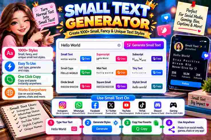
ULTIMATE EDITION Small Text Generator Transform standard copy into intricate small caps, superscript arrays, social media flairs, and advanced Unicode structural designs instantly. Load Sample ABC abc Clear Canvas Chars: 0 Words: 0 Spaces: 0 Read Time: 0s Small Caps Copy Superscript (Tiny High) Copy Subscript (Tiny Low) Copy Bubble Enclosed Text Copy Mathematical Bold Copy Wide Aesthetic (Reddit Flair) Copy Squared Block Text Copy Upside Down (Inverted) Copy Running fontgenerater.com taught me a small text generator isn’t just a novelty tool — it’s a standard way to convert ordinary writing into tiny, stylish fonts using Unicode, giving bios and captions attraction across social media. A small text font also proves practical beyond looks: students format footnotes and references for MLA or APA academic requirements, while gamers choose Discord names and refine an Instagram Bio instantly, completely free and online. What Is a Small Text Generator Operating this tool shatters the illusion of traditional font scaling. Instead of changing sizes, it forces a complex system to convert standard inputs. Your understanding of typography shifts once you realize it maps distinct Unicode. Injecting these stylized outputs reveals how normal letters transform instantly into novel small letters. Practitioners exploit this architectural quirk to fashion smaller characters that remain fully legible across diverse current social media apps and venues. How to Use the Small Text Generator Achieving a distinctive identity across operating systems requires bypassing traditional font limits. This online tool manipulates the Unicode Standard, shifting character sets to yield instant results. Paste your text here for an immediate visual aesthetic. Commanding audience attention on crowded platforms requires unexpected formatting. This ecosystem easily converts standard inputs into a small text font. It remains highly convenient to use when replacing normal text with unique, customized stylistic variations. Why Use This Small Text Generator Deploying a small font generator distorts traditional digital aesthetics deliberately. When screens overflow with loud announcements, going tiny forces users to focus deeply. I use these understated tactics so client bios instantly stand out quietly. Crafting unique names requires subtle textual choices that subvert expectation. My experience shows that adjusting an Instagram Bio or embedding unexpected captions disrupts scrolling patterns, offering a highly stylish alternative to standard, boring online expressions. Where to Use Small Text Deploying micro-scripts across an Instagram bio or Twitter post bypasses standard layout constraints. As a practitioner, maximizing engagement within digital comments requires tactical typographic shifts, forcing digital content to truly stand out inside crowded feeds. Optimizing Facebook comments or distinct Discord names establishes immediate visual authority. Utilizing these scaled characters for aesthetic purposes alters user perception, providing developers unique tactical design advantages across various modern social media digital interfaces globally. Understanding Unicode (How Small Text Works) In my design experience, real visual downsizing is a total illusion. Users do not shrink standard text fields; rather, they swap individual letters for a completely mismatched alphabet cataloged deep inside the global Unicode system. Consequently, digital screens present these rogue unicode symbols from specialized unicode sets quite effortlessly. This phenomenon effectively encapsulates how standalone platforms render unexpected small text fonts, bypassing corporate restrictions through clever, decentralized character engineering choices. Small Text Letters / Alphabets Working with electronic frameworks taught me that selecting the right typography drastically alters project tone. Typical glyphs often crowd the screen, so substituting them with balanced small letters creates a clean, structured, contemporary visual hierarchy. Integrating these minimized symbols across responsive devices completely redefines digital design. My personal testing confirms that scattering styled variations provides a unique look that subtly captures attention without sacrificing any inherent local viewport rendering readability. Also Read: Big Text Generator: Make Words POP! Small Text on Social Media Platforms Tweaking an Instagram BIO successfully bypasses rigid corporate restrictions. Industry expertise proves altered usernames immediately capture feeds. Developing a customized aesthetic assists creators to stand out during hyper-competitive social media posts inside popular digital apps. Deploying miniature scripts inside WhatsApp or YouTube disrupts conventional typographic algorithms. Strategic network experiments reveal timelines on Facebook and Pinterest prioritize stylistic variance. Consequently, optimizing contemporary social media platforms including Reddit or Twitter triggers visibility. How to Choose the Right Small Text Font Selecting optimized typography requires analyzing target interfaces. Manual installing fonts fails on a small screen, demanding smart technology instead. Operators deploy cleaner text to ensure complex formulas or academic equations remain perfectly legible during rendering. Elevating corporate branding involves extracting characters beyond traditional LaTeX environments. Modern graphic design incorporates unique digital art elements, allowing users to seamlessly broadcast customized micro-narratives across popular social media apps without breaking core aesthetic guidelines. Small Caps Navigating the nuances of typography often leads to small caps, a stylistic choice that offers a sophisticated aesthetic. Unlike superscript or subscript characters, these small letters provide a professional and refined modern look for titles. My personal experience with digital design has taught me that using small caps effectively requires a subtle hand. Integrating these fonts into profiles or blogs adds a creative touch while maintaining standard textual readability. Superscript Elevating digital layouts requires understanding how typography shifts higher than normal lines. In my testing, using a caret symbol often fails across platforms, so rendering text that appears as superscript solves layout bugs quite elegantly. When mathematical symbols like cubed values are needed, utilizing specific Unicode blocks ensures stability. These custom alphabetical symbol sets remain fully available in superscript forms, bypassing traditional software limitations to deliver clean, exceptional online typography. Subscript Managing layouts requires deep expertise. When platforms display a lacking subscript alphabet, utilizing online generators fixes it. I routinely encode complex chemistry notations like H2O or various Mathematics symbols through this low mini text system. Inserting a stylized Subscript lowers down any digital symbol effectively. My analytical perspective shows that adding these tiny, custom subscript numbers works smoothly across social platforms like Discord, injecting clear science insights without cluttering screens. Reddit Reddit stands apart from major social networks because every single comment can be uniquely customized. While sometimes misused, employing small fonts alters the narrative depth, shifting how community … Read more

Preppy Fonts Generator ✨ Free Copy & Paste

Preppy Fonts Generator

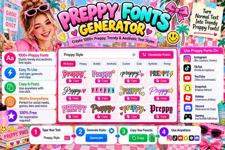
Enter Your Text 0 characters ✨ Add Preppy Emojis 🗑️ Clear Copied to clipboard! 💖 Observing digital subcultures closely reveals how preppy fonts establish an immediate visual signature. Utilizing a free online tool to manifest elegance directly alters engagement metrics across platforms. This uniqueness relies heavily on custom Unicode structures. My extensive consulting work shows that cute fonts inject unexpected playfulness into otherwise stale corporate layouts. When modern creators format text using bold text, they instantly bypass standard platform limitations, successfully redefining typographic styles completely. What Is a Preppy Font Generator Emphasizing visual identity requires distinct tools in design circles. When users input standard text, the underlying engine replaces standard characters with rare Unicode symbols. This dynamic framework outputs an elegant alternative for modern social media. My experience shows that integrating a stylized script completely redefines digital presence. Whether you apply these custom aesthetics inside your personal Instagram bio or utilize flowing cursive variations, the resulting text bypasses restrictive default parameters. How To Use The Preppy Font Generator Forget complex design tools. Instead of wrestling with any typical interfaces, I approach digital typography exactly like personal alchemy. When you input raw thoughts, you literally manifest Unicode symbols creating aesthetic names through pure resonance. A single button press drastically alters your psychological identity online. Simply copy outputs directly to your clipboard and let this glitchy style spread. This subversive technique effortlessly produces a total makeover manipulating visual attention instantly. Also Read: Fontes Aesthetic That Transform Your Style Where/How to Use Preppy Fonts (Platforms & Applications) Styling novel presentation on Instagram or TikTok demands specific vibrancy. Through direct observation, we see that embedding quirky gothic variations inside Roblox or Snapchat ecosystems forces immediate audience focus without any standard technical limitations whatsoever. Steering dynamic communication channels like WhatsApp or Twitter toward deeply stylized messaging disrupts cognitive monotony. Implementing these glyphs remains always free, allowing shrewd practitioners to bypass ordinary constraints and execute highly visual interface layout frameworks. Font Categories & Style Types Managing fonts requires separating mere preppy design from structural sophistication. In my practice, blending elegant cursive fonts alongside a bold bubble style shifts an entire layout, creating balanced leading styles that escape traditional design limitations. Evaluating each category unlocks unexpected digital expressions. Integrating outlined letters offers high readability while anchoring structural whimsy, ensuring that customized decorative fonts subvert standard glyph restrictions to deliver authentic online resonance without compromising systemic value. Key Features Generating unique cursive text demands sharp design skills to manifest real personality. Modern content creators manipulate Unicode characters to bypass standard layout boundaries, ensuring every single profile displays polished elements with highly captivating user experience. Utilizing an advanced font generator unlocks bold gothic fonts alongside beautiful fonts built for cross-platform efficiency, establishing an ideal aesthetic match across multiple digital interfaces without sacrificing the core stylistic values of modern typography systems. Font Changer: Transform Your Text In Seconds Digital aesthetics challenge standard layouts. Using a modern font changer fundamentally transforms simple letters into artistic expressions within seconds. My design trials prove that utilizing this structural shift provides unique typography across standard platforms effortlessly. Observing how an online community interacts reveals that instant fast discovery alters user engagement. Simply execute a quick copy and paste mechanism to deploy fancy fonts that bypass restrictive, boring default device constraints completely today. Preppy Font Examples & Popular Uses Digital identity structures rely on subverting traditional layout expectations. Utilizing an elegant script or altering user playfulness transforms sterile outlets into experiential environments. Practitioners intentionally deploy preppy fonts to trigger deep psychological human reception mechanisms. Linguistic choices establish immediate cultural resonance before reading begins. Integrating unexpected cute letters infuses numerical information with distinct personality, challenging rigid corporate standards. This strategic focus on curated quirkiness redefines visual communication network benchmarks entirely. Normal Text to Fancy Fonts — Quick Examples Embracing a dramatic script font alters digital expression completely, moving beyond standard layouts. My testing reveals how fancy typography breaks traditional presentation boundaries. Transforming standard layouts yields fresh ways to showcase complex, unusual designs effortlessly. Deploying Fraktur or a striking Double Struck Font introduces distinct psychological shifts online. I often combine these with smiley faces to balance intensity, achieving a highly personalized, classy look that standard platforms rarely allow completely. Start Creating Preppy Fonts — Free & Instant Generating an unconventional name with this online font changer provides distinct designs instantly. Through zero delay and no account constraints, crafting fun text relies on classic choices for a completely free ultimate stylistic web outcome. As professionals, arranging elegant or playful words into striking headlines requires no sign-up. Overcoming traditional boundaries with no limits allows anyone to paste anywhere, converting funky fonts and ugly fonts via this 100% free utility. Discovering Charming Cute Letter Fonts Modern digital typography demands a balanced outcome when integrating custom preppy fonts across platforms. Designers often select romantic characters featuring italic formatting to elevate their layout’s aesthetic, blending sans-serif variants with the cutest options available. Achieving this requires analyzing specific Unicode styles and diverse serif structures. Choosing uppercase letters alongside an elegant script gives interfaces a unique option for capturing user attention instantly without sacrificing standard layout readability display metrics. How to Discover and Utilize Cute Letters and Preppy Fonts Digital aesthetics require a refined touch to alter standard social layouts. Expressing personal style shifts how followers perceive online creations. By injecting playful glyphs and custom symbols, creators easily establish a rare sense of uniqueness. Transforming ordinary captions demands fresh typographic choices. Incorporating visual humor into structural designs sparks immediate viewer engagement. Whether developing iconic logos or choosing fancy, bold text options, strategic formatting always reshapes contemporary communication frameworks entirely. Top 10 Pretty Fonts Evaluating digital design reveals that a refined aesthetic transforms basic communication. My consulting work proves selecting curated pretty fonts elevates individual branding instantly. Always prioritize a classic look to anchor layout dynamics effectively across screens. Integrating clean serif fonts establishes structural psychological balance. Incorporating soft edges introduces unmatched visual elegance, avoiding sterile online presentation formats. Audiences interact deeply when platforms … Read more

How to Use Online Font Generators for Instagram & TikTok Like a Pro

Online Font Generators for Instagram

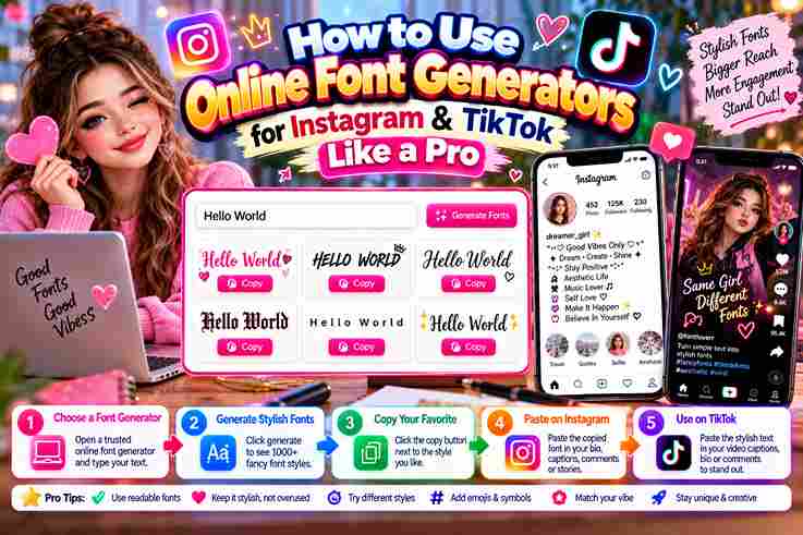
Digital identity demands distinction across major networks. When you discard boring text, profiles instantly transform. Utilizing stylish Unicode characters redefines your presentation on platforms like Instagram and TikTok, bypassing standard user interface restrictions completely now. Our modern generator shifts ordinary communication paradigms by outputting uniquely styled letters instantly. Creators simply copy fancy text from the web interface, then paste it directly into bios to capture immediate audience attention online daily. What Is an Online Font Generator? / What Is a Fonts Generator? (How It Works, Unicode Explained) Operating an online tool bypasses traditional software. Instead of a download, this system utilizes a universal standard for text generation. It instantly converts normal text into decorative Unicode characters, changing visual psychology across global networks. Because systems lack internal font files for styling, custom coding translates inputs within the input box. Consequently, these transformed characters render seamlessly, ensuring absolute compatibility across diverse digital platforms without any unexpected display design hitches. How Online Font Generators Work (Steps / Using the Tool) When digital practitioners open a font generator, the backend platform processes data via a global Unicode protocol rather than local software. You simply type your text, and it instantly converts characters into fancy text online. After generation, users can copy a decorative style directly onto the clipboard. Then, paste this modern look into any chosen TikTok profile or interactive captions to bypass generic layouts, effectively capturing immediate mobile audience attention. Also Read: Pls Donate Text Generator (Copy & Paste) | Fast & Free Step-by-Step Guide: Using a Font Generator for TikTok Achieving algorithmic visibility requires maximizing every design choice. In your text box, type your bio, then click generate. This instantly transforms your profile, ensuring your TikTok account stands out beautifully with unique, stylized fonts immediately. Simply copy the styled version to your clipboard now. Next, paste text into profile settings seamlessly. This entire transformation takes under 30 seconds, bypasses native formatting limits, and redefines your digital presence for every follower. Why/Where People Use Fancy Fonts on Instagram and TikTok (Use Cases) Digital creators frequently struggle to secure a profile visit on competitive platforms. Operating stylish fonts transforms a standard account, ensuring your unique bio style commands immediate attention and establishes a highly recognizable identity out there. Maintaining visual consistency across diverse social profiles drives personal branding success. I find that implementing elegant or edgy typography grants a creative appearance, elevating ordinary Instagram bios into digital expressions of distinct artistic individual sophistication. Profiles Become More Eye-Catching Bespoke personas necessitate highly distinct graphic presentation. Employing modified usernames reshapes mundane grids into magnetic focal zones. Whenever onlookers scan crowded streams, customized aspects guarantee someone’s account radiates prominence rapidly, rising above generic layouts beautifully. Refreshing individual bios directly alters visitor retention. Introducing uncommon alterations across TikTok timelines secures excellent benefit, rendering ordinary handles appear incredibly vibrant while effortlessly standing out among millions of intense rival human producers registered nowadays. Also Read: Fontes Aesthetic That Transform Your Style Better Personal Branding Digital identity relies heavily on distinct typography to stand out in crowded feeds. Utilizing a reliable fonts generator allows creators to systematically personalize their profiles, projecting authority and immediate brand recognition across highly competitive social platforms. Cultivating a specific vibe ensures long-term trust and audience engagement. Choosing the right typography creates structural consistency and consumer familiarity, transforming basic social accounts into memorable, authoritative platforms that instantly command market attention. Creative Expression Digital creators utilize unique styling to elevate their creative expression across modern networks. By transforming standard profiles into visual statements, individual curators establish distinct identities that resonate deeply within algorithmic feeds without relying on tools. This artistic choice enhances personal branding by projecting tailored emotional aesthetics directly onto viewers. Strategic typography enables immediate connection, ensuring that strategic messaging bypasses conventional limitations and transforms routine engagement into unforgettable curated online experiences. Best Font Styles for Instagram and TikTok Digital algorithms exploit human psychology through unexpected interface presentation. Deploying connected letters subverts scrolling fatigue instantly, while choosing high contrast weights creates a strong visual impact that anchors user attention on critical conversion hooks seamlessly. My consulting experience proves that alternating between dark aesthetics and a playful style disrupts standard bio norms. Audiences crave this structural dissonance, which subconsciously infuses an underlying sense of curated sophistication across digital brand profiles. Cursive Fonts Digital expression requires distinct style choices. Implementing cursive fonts transforms standard text, instantly elevating human connection across platforms. My analytics show these flowing scripts capture attention within crowded Instagram bios, bypassing traditional layout limitations seamlessly. Audiences inherently associate fluid loops with prestige. Beyond mere aesthetics, utilizing an elegant script establishes immediate psychological authority. This modern adaptation simulates formal penmanship, transforming ordinary casual interactions into highly sophisticated, memorable brand moments effectively. Bold Fonts Practitioners use bold fonts strategically to emphasize message weight on social media platforms. Instead of standard styling, this bold text helps attract attention instantly, boosting engagement within highly competitive digital feeds like Instagram brand profiles. When optimizing a TikTok bio, heavy letters create an immediate psychological advantage. Experienced creators deploy these unique Unicode characters for headlines, ensuring vital branding elements stand out clearly without breaking overall layout or text readability. Also Read: Symbol Text Generator – Cool Text Instantly! Gothic Fonts Cultivating a dark TikTok account commands attention because digital creators crave subversion over mainstream brightness. Transforming ordinary social media profiles with gothic fonts invokes an authoritative medieval style, instantly launching a dramatic visual identity shift. This deliberate aesthetic historical revival anchors modern digital layouts. Embracing a historic Gothic quality signals profound experiential expertise, showing that timeless classic aesthetics can disrupt rapid algorithmic feeds, maximizing true platform engagement through ancient typography. Bubble Fonts Implementing bubble fonts shifts digital expression completely. I often observe strategic creators leveraging these rounded styles to instantly personalize modern feeds, crafting distinct visual moods that evoke nostalgic vaporwave textures while effortlessly standing out online. My direct testing proves that applying this decorative styling provides playful emphasis without ruining structural readability. Forgo outdated ASCII layouts; instead, embrace this modern approach … Read more