What Are Script Fonts?

What Are Script Fonts?
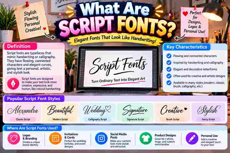
From practical design work, I find script fonts most convincing when flowing letterforms preserve a personal touch without sacrificing readability. Their handwriting character can feel elegant, playful, or deliberately expressive across modern branding identity systems. Rather than treating them as decoration alone, I evaluate script typefaces through fluidity, accessibility, and context. Connected letterforms, decorative curls, and varying stroke widths create personality, while careful spacing keeps expressive typography usable in practice. History of Script Fonts Modern typefaces emerged from classical calligraphy, yet their roots lie in European manuscripts, chancery hand, and trade printing. In typographic practice, metal type revealed why joined forms required careful design and controlled spacing for clarity. Technology later loosened those constraints: phototypesetting, then digital type, enabled overlap of characters, contextual ligature insertion, alternate characters, and expressive swashes. Today, Unicode, Google Fonts, and Adobe Fonts preserve evolution across print and web design. Types/Classification Of Script Fonts In practice, I classify script families by behavior rather than decoration: formal script fonts follow classical calligraphy, complex penmanship, and controlled ligatures, while casual scripts favor a handwritten feel, freer strokes, and approachable personality overall. Second, useful classification examines construction: connected faces create visual flow through continuous joins, whereas unconnected designs preserve separate forms. Brush Script adds a lively font character; roundhand favors refinement, and display typeface categories prioritize impact. Also Read: What Is a Monospace Font? Characteristics Of Script Fonts Script fonts gain their warmth from a fluid stroke, varying connectedness, and smooth curves. In my design work, their thick-to-thin strokes create dynamic movement, while character combinations and ligatures add controlled individuality without sacrificing identity. Unlike uniform type, script forms rely on exaggerated loops, distinctive glyphs, and subtle imperfections to suggest human authorship. In practice, I reserve them for stylized text blocks, since large chunks of text create readability challenges. Pros And Cons Of Script Fonts From practical design work, script fonts add emotional resonance, a human touch, and strong visual appeal. Their flowing appearance, graceful curves, and artistic flair give brand names a personalized touch and sophisticated appearance online. Yet the strengths become weaknesses when overly ornate scripts, complex letterforms, or a cluttered look reduce clarity. Across screen sizes, they can be hard to read for users with visual impairments and may overpower design. How To Pair Script Fonts Effectively Begin with visual balance, not similarity: pair expressive writing fonts with restrained companions that create contrast. In my typography work, checking headlines beside main text reveals whether both faces complement each other without competing visually. Next, test the pairing at various sizes and on different devices; adjust kerning until letters flow smoothly. I usually reserve intricate scripts for short phrases, which protects legibility, hierarchy, and a coherent composition across formats. Tips For Using Script Fonts Effectively / Best Practices When Using Script Fonts In practice, I reserve script fonts for headings, short phrases, or important words, then test legibility at smaller sizes. Clear visual hierarchy protects body text, improves accessibility, and leaves a strong impression without cluttering layouts. Contrary to popular advice, one carefully chosen typeface usually outperforms multiple script fonts. Pair a formal script with a clean sans-serif font, maintain sufficient contrast, test fallback fonts, and iterate across email clients before publishing. Where Are Script Fonts Typically Used In client work, I reserve script lettering for luxury branding, certificates, social media graphics, and children’s books, where authentic hand-lettered styles add personality without forcing readers through elaborate flourishes or longer blocks of text unnecessarily. Historically, signpainters favored shop frontages, while current teams use these faces for creative branding, digital illustrations, greeting cards, and personal branding. I find bigger size and a readable fallback font protect legibility across devices today. Also Read: What Is Typography and Why Does It Matter? Popular Script Fonts In my design work, Lobster and Pacifico often suit friendly branding, while Bickham Script and Snell Roundhand create refined invitations. Great Vibes offers expressive elegance, but careful sizing prevents its flourishes from overpowering supporting text. For contrasting moods, Brush Script MT feels practical and familiar; Edwardian Script signals ceremony, whereas Dancing Script adds movement. I usually reserve Zapfino for short display lines because its intricate forms demand space and restraint. Script Typefaces In Unicode / Mathematical Use Unlike ordinary cursive fonts, Unicode mathematical script characters are not decorative type choices; they are encoded symbols. In practice, I use them to distinguish variables while preserving meaning across documents, browsers, and scholarly publishing systems. Coverage includes styled letters from the Latin alphabet and Greek alphabet, yet Unicode supplies code points rather than handwriting behavior. My typesetting checks still prioritize character set, semantic intent, fallback support, and consistent mathematical notation. Printing/Production Technology Challenges In production, script lettering often fails where elegance meets machinery. I have seen thin strokes disappear through ink spread, while overhanging parts collide during casting, making metal type, sorts, and paper choices unexpectedly critical today. Digital workflows solved some constraints but introduced others: poor kerning, the overlap of characters, and unreliable contextual ligature insertion can break output. In my print checks, InDesign and OpenType format testing prevents costly gaps later. Also Read: Number Font Generator Conclusion From years of reviewing display work, I have found script typefaces succeed when legibility, hierarchy, and visual balance guide selection. Their personality matters, yet disciplined spacing preserves meaning across branding, invitations, and restrained digital interfaces. Contrary to fashion cycles, strong choices are rarely the most ornate; purpose, tone, and target audience determine value. I recommend testing real sizes and keeping expressive letterforms where authenticity strengthens communication without weakening clarity overall.
What Is a Monospace Font?

What Is a Monospace Font

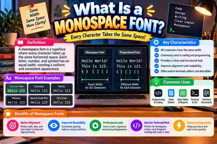
A monospace font is a typeface where characters receive equal width across horizontal space, creating a fixed-width system. I observe this design improves clarity because each character follows planned spacing and supports organized text creation. Unlike proportional fonts, this format uses uniform alignment through letter shapes, letters, numbers, and symbols with predictable layout. Its fixed-pitch nature helps maintain text structure while wide characters and narrow characters appear balanced visually today. Also Read: Powerful WhatsApp About Text Generator Monospace Fonts Vs Proportional Fonts I compare monospace fonts and proportional fonts where character widths define different layouts. Varying widths follow letter shapes, while W and I show why narrow characters and wide characters behave differently in digital text design. From my typography practice, equal spacing creates consistent width and supports text alignment. Fixed spacing improves readability through a clear spacing system and visual structure, yet some projects need natural spacing for balanced text flow. History Of Monospace Fonts The Courier era revealed how typewriter-style designs shaped early monospace fonts through character alignment and structured information needs. These fixed-width approaches supported computer terminals before modern digital typography expanded, showing why consistent spacing became valuable in technical workflows and early computing systems. I have observed that monospace fonts evolved with programming environments where source code required alignment and syntax clarity. Their role expanded through coding tools, developers, and software interfaces while maintaining structured text, predictable format, and visual organization across many evolving digital systems today. Characteristics Of Monospace Fonts Monospace fonts create a distinct visual system where characters maintain equal spacing and consistent layouts. I often notice their precision during coding tasks because numbers, symbols, and sequences remain organized across technical interfaces and displays. Beyond appearance, these fonts support character alignment through fixed-width design and horizontal positioning. My experience with type systems shows how letter spacing influences readability while structured data and text processing benefit from predictable formatting today. Popular Monospace Font Examples Popular monospace fonts include classic and modern choices used across coding and design fields. Courier remains widely recognized from typewriter traditions, while Consolas supports developers needing clear character spacing and structured layouts for professional digital. Other examples like monospace fonts appear in graphic design projects where typography and visual style create distinct identities. I have observed these fonts provide consistent positioning for technical content and support digital artwork with alignment. Why Are Monospace Fonts Used For Coding? I use monospace fonts for coding because programming environments need predictable spacing where source code elements remain aligned. My experience shows code editors benefit from clear syntax highlighting, helping developers inspect symbols and characters quickly. Beyond visual preference, monospace fonts support development workflow across programming languages by maintaining equal spacing, improving alignment of symbols and characters while creating readable interfaces for software teams that manage complex coding projects with accuracy. Common Uses Of Monospace Fonts Monospace fonts support software interfaces where programming tasks, code structures, and text editors require stable placement. I often observe data alignment benefits in systems handling numerical data because uniform characters simplify technical workflows and checks. Beyond coding, ASCII art and ANSI art use fixed-width fonts for digital artwork. Scripts, screenplays, and professional documents also retain spacing discipline, while OCR applications use predictable characters for accurate machine processing in modern workflows. Also Read: What Is a Display Font? Monospace Fonts In Programming Environments In my experience, programming environments rely on IDEs where default coding fonts improve code structure through clear spacing and alignment during software development tasks. These tools support many programming languages while maintaining visual consistency daily. Beyond editors, I observe command-line interfaces and technical documentation benefit from structured layouts because developers can scan complex instructions faster with predictable designs. This practical approach connects typography choices with efficient coding workflows across systems. Monospace Fonts In Data Alignment In data alignment, I observe how tabular figures organize numbers through columns where equal spacing supports precise financial data and clearer calculations during complex reviews using tables with reliable visual balance and organized data flow. Beyond basic layouts, my experience shows monospace fonts create stable data visualization because each symbol receives uniform room for comparison and typography features improve alignment in technical records while challenging assumptions about ordinary text presentation. Monospace Fonts In Scripts And Screenplays In my experience, screenplays and scripts often rely on monospace fonts because writers need stable character placement while reviewing dialogue blocks and formatted pages where every line maintains visual balance through predictable spacing across scenes. I have noticed that this approach connects with digital interfaces and ASCII art when creators compare layouts across production drafts because equal spacing improves visual control and supports clear review of scenes without unexpected shifts in character alignment. Monospace Fonts In OCR Applications Monospace fonts improve OCR workflows by preserving character spacing during scanning, where equal width characters support alignment and reduce recognition errors. Their fixed layout helps systems process text formats with clearer visual organization across documents. OCR systems often rely on consistent positioning to interpret characters, especially when documents contain structured data. Monospace typography provides predictable patterns, helping automated tools analyze symbols, rows, and machine-readable content with improved accuracy during extraction tasks. Tabular Figures And Numerical Alignment Fonts improve tables where columns remain balanced during calculations. In my design work, I observe that tabular figures gain clarity because fixed spacing supports precise information display across numerical records and reports with consistency today. Many interfaces use numerical layouts to organize digits and structured information, while sequences stay visually stable. This approach helps engineers review values through a clear grid without shifting positions and preserves accurate data presentation always. ASCII And ANSI Art Usage I often study ANSI art layouts where scripts and tabulated data benefit from fixed character placement. The approach keeps symbols aligned across terminals and preserves visual balance when creating detailed patterns through classic computer displays. In practice, I notice ASCII and ANSI art workflows depend on consistent spacing because artists arrange marks precisely. Early communities used these methods for interactive visuals and text-based creations using organized … Read more

What Is a Display Font?

What Is a Display Font

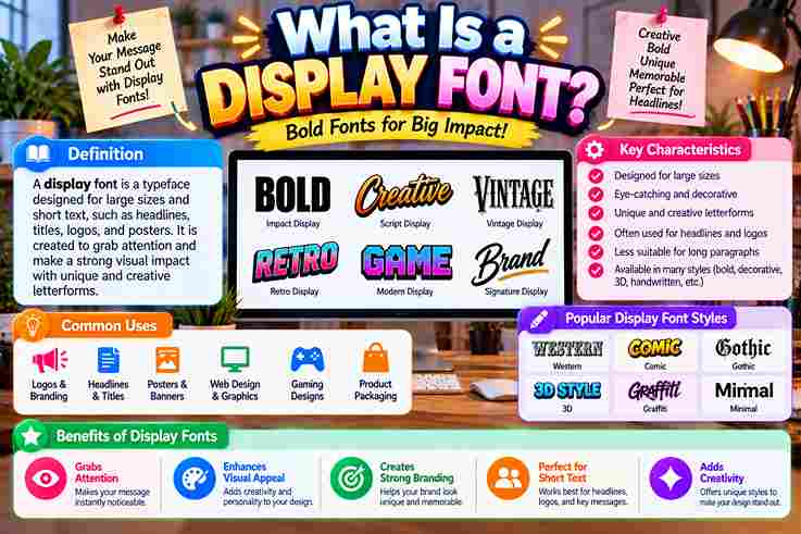
A display font earns its place by making visual impressions immediate, not by behaving like text. In my studio work, the strongest choices sharpen a brand’s voice, direct the viewer’s focus, and establish memorable presence. Historically, mass printing pushed lettering toward visual territory; today, creative freedom expands that role. I evaluate unconventional shapes as a communication tool, checking whether they create a lasting impression without sacrificing clarity, purpose, or adaptability. Definition And Importance In Design And Branding A typeface built for short bursts of text prioritizes visual impact over comfort during long reads. In practice, I judge its presence by how confidently a single word becomes a bold statement without losing purpose. Display lettering shapes brand personality instantly. I use it across brand logotypes, editorial headlines, and social content headers to sharpen key messages, strengthen brand expression, and create visually striking designs for the target audience effectively. Also Read: Fancy Text Generator – Transform Your Text Into Something Fancy How Display Fonts Differ From Body/Text Fonts From practice, I treat display faces as short-form tools: large sizes, headlines, logos, and posters reward boldness, personality, high contrast, and decorative elements, whereas body text fonts prioritize legibility, readability, and calm repetition for impact. Text families survive smaller sizes through regular weight, clean lines, and restrained detail. Display designs push exaggerated shapes, intricate details, strong contrasts, expressive styles, distinctive styles, and visual interest because attention matters more than reading. Key Characteristics Of Display Fonts From practice, the strongest display faces succeed through thick strokes, stylised letterforms, and deliberate quirky proportions. Their presence becomes obvious in oversized settings, where high-impact glyphs create visual statements without needing long explanatory text nearby. I judge a display font by how confidently it handles headline usage and scale. Strong designs often favor sharp serifs, bold weights, or ornamental alternates, while preserving legibility for branding uses and real-world layouts today. Also Read: Glitch Text Generator Types Of Display Fonts In practice, display categories work best when chosen by behavior rather than labels. geometric sans-serifs feel controlled, vintage-inspired scripts add warmth, while slab serif and didone approaches create different levels of authority and theatrical tension. I often separate display choices by energy: decorative, restrained, or experimental. hand-lettered scripts suit expressive identity work, sans serif options sharpen contemporary arrangements, and decorative features or unique ligatures can give prominent lettering a personality. What Display Fonts Are Used For In practice, display fonts earn their place where attention matters most: headlines, logo creation, advertisements, packaging, and book covers. I use them to establish focus, especially when large-format applications demand personality before close reading begins. They also strengthen branding materials, social headers, merch graphics, and web headers, where compact messaging needs energy. Used selectively, a distinctive face can shape visual hierarchy, reinforce brand recognition, and make brief messaging feel deliberate. Also Read: ASCII Generator Made Easy Brief History Of Display Fonts Display lettering began as a practical response to visibility: wood type and letterpress printing gave posters scale, while early advertising typography transformed oversized letters into commercial signals. In practice, those constraints encouraged expressive, memorable forms. Later, mid-century commercial lettering and hand-painted signage widened the visual vocabulary, especially across American delis and grocery stores. By the sixties and seventies, display styles became cultural markers, feeding retro revivals and contemporary experimentation today. Display Font Examples Worth Knowing In practice, memorable examples often reveal a category faster than definitions: a reverse-contrast retro face feels theatrical, while a bubble display font feels playful; geometric sans-serif designs instead deliver modern appeal, bold headlines, and branding. I also watch how context changes perception: a rugged, textured typeface suggests handcrafted feel, while soft rounded serifs suit editorial design; modern sans-serif font family options with unique styles create standout logos and compelling headlines. Choosing The Right Display Font For The Job Choosing well starts with the job, not the font. I judge tone, intended size, and medium first, then test whether bold, stylized letterforms strengthen the message without sacrificing usability or distracting from the brand identity. For projects, I compare the display face against body copy, visual hierarchy, and context. A strong choice balances character, contrast, readability, and flexibility, avoiding trendy details that weaken long-lasting impact across print and web use. Also Read: What Is Typography and Why Does It Matter? Pairing Display Fonts From experience, pairing works best when a bold display font carries personality while clean sans-serif typography handles supporting information. Contrast protects readability, gives hierarchy, and keeps the harmonious composition expressive without making elements compete visually. I usually judge pairing against the environment, medium of use, and intended message rather than fashion alone. A restrained companion face can support distinctive brand identity, strengthen visual element hierarchy, and keep fast-scrolling environments readable.

What Is Typography and Why Does It Matter?

What Is Typography and Why Does It Matter?

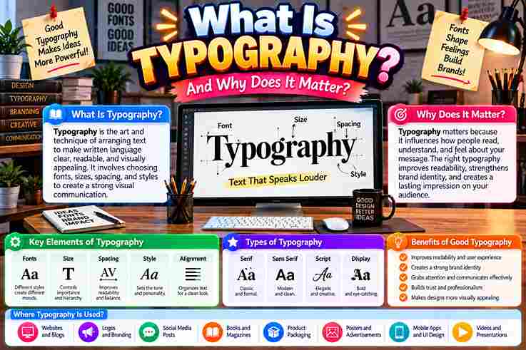
This craft is not a computer-age invention; it is an art form shaped across centuries. From Johannes Gutenberg and the movable printing press onward, arranging text keeps language readable, supports visual impact, and serves readers. In practice, I judge lettering by whether individual characters feel intentional and text remains enjoyable. A kerned serif font, consistent spacing, and white space preserve brand integrity across screen sizes, resolutions, and high-quality print materials. What Is Typography? In practice, typography is the technique of arranging type so written language becomes readable, legible, and aesthetically appealing. Thoughtful font choices, spacing, and layout shape clarity, guide the reader, and strengthen each specific message clearly. I treat typeface, font, alignment, hierarchy, style, and color as practical controls rather than decoration. Together, these design elements organize text, establish visual impact, influence tone and mood, improve comprehension, and support consistent brand identity. Why Is Typography Important? 6 Reasons Typography matters because visual hierarchy guides the viewer eye before reading begins. Strong contrast, deliberate line spacing, and thoughtful font style support accessibility design guidelines, helping a wider audience process essential information more easily today. Beyond legibility, I have seen brand personality become clearer when consistent typography supports brand recognition. Meanwhile, bold colors, deliberate placement, and a primary heading can build consumer confidence while directing viewer attention without visual noise. Increases Accessibility Accessibility improves when designers treat readability as a practical requirement, not decoration. In my experience, clearer font size, thoughtful spacing, strong contrast, and disciplined alignment help diverse readers process information comfortably across different devices consistently. Good digital typography also supports users navigating challenging lighting conditions, varied environments, or dense content. I have found that legible typefaces, balanced color, sensible letter spacing, and predictable hierarchy reduce friction without weakening character unnecessarily. Also Read: Serif vs Sans Serif Fonts: Key Differences Draws Attention In client layouts, I’ve found a bold yellow heading can outperform decorative clutter: it gives visitors an immediate focal point, while typographic hierarchy quietly directs the eye toward critical details before secondary content enters consideration. Emphasis also depends on restraint. An attention-grabbing headline, paired with a bold all-capital font or chosen call-to-action button, can sharpen readers attention, provided surrounding content stays calm enough for the emphasized priority to remain unmistakable. Establishes Hierarchy Hierarchy often works before readers consciously notice it. I use font sizes, weights, and headings to guide the reader eye toward key information, while quieter body text preserves rhythm, clarity, and deliberate reading momentum smoothly. Rather than making everything louder, strong typography creates selective emphasis. Thoughtful subheadings shape transition between sections, helping essential points surface naturally while visual harmony keeps each composition readable, confident, and purposeful across varied formats overall. Shows Personality Typography can announce character before meaning fully lands. In client work, I’ve watched typeface selection and font styles turn identical copy from formal to friendly, while playful identity choices make young brands feel unmistakably human. Personality becomes stronger through repetition. Pairing font families with aesthetic elements, visual identity, and polished appeal gives a recognizable attitude; even subtle shifts in confidence or refinement can quickly change how readers interpret its voice. Sets The Tone Tone emerges before readers evaluate wording. From client work, I’ve watched personality shift through restrained letter choices alone; the delicate typeface used by Wabimento, a funeral services provider, communicates quiet care without decorative excess immediately. That effect becomes clearer when context is emotionally charged. Roem, a Webflow designer, paired gentle forms with soothing images for people grieving a loved one, proving restraint can establish warmth before detailed information is read. Promotes Brand Recognition From client projects, I’ve learned that brand identity becomes recognizable when typography repeats with discipline. A consistent brand presence gives every touchpoint a unified look, so customers identify the company before consciously processing its name. Recognition grows through subtle repetition, not louder design. Thoughtful typography choices create a polished look, while each visual representation reinforces the same personality. Over time, this consistency strengthens the brand image across familiar customer encounters. What Is The Purpose Of Typography? Typography turns creating text into communication, helping visual communicators shape written messages with clarity. In practice, selecting fonts, adjusting spacing, and structuring content guide attention, improve understanding, and make information feel intentional rather than accidental. Its purpose reaches beyond appearance: typography influences reader perception, supports target audiences, and strengthens writing quality across print materials and digital platforms. I have found balanced choices make information easier to scan, trust, and remember. Enhances Online Text And Other Writing Strong online content often succeeds before readers notice its typography. In my experience, thoughtful web design can enhance readability, guiding focus through words while preserving rhythm, clarity, confidence across screens, interfaces, and the reading experience. Typography also strengthens written communication beyond websites. Careful hierarchy, spacing, and structure help writers organize words, while typography tools support consistent presentation. This makes prose feel intentional, accessible, and easier to scan without becoming predictable. Makes Writing More Artistic And Interesting From practice, I’ve learned the written word becomes more expressive when type design, letter designs, and aesthetics work together, giving ordinary writing a distinctive voice while preserving readability, purpose, and memorable visual character across formats. Instead of decorating every line, I balance visual appeal, font designs, negative space, italic, and bold type selectively; this keeps the presentation process controlled while creative design elements make text feel lively, intentional, and human. Creates Brand Messages Without The Need For Images Strong typography can carry a brand story before any illustration appears. In my design work, a distinctive logotype, deliberate layout, and expressive printed words often transform copy into memorable brand messages with personality and recognition. An image-free identity succeeds when typographic design becomes the visual voice. A focused webpage heading, controlled spacing, and purposeful letterforms can sharpen a design message, giving brands persuasive print communication that feels recognizable without imagery. Emphasizes Messages And Text In practice, typography emphasizes text by directing the eye toward important words before readers process supporting detail. Strategic bolding, contrasting fonts, and whitespace create visual hierarchy, making … Read more

Serif vs Sans Serif Fonts: Key Differences

Serif vs Sans Serif Fonts: Key Differences

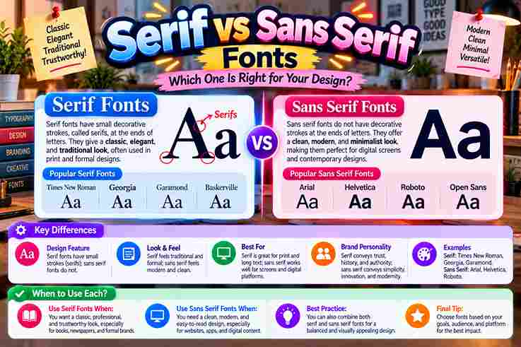
Choosing between Serif fonts and Sans-Serifs is less about rules than understanding their visual differences. In practice, typography works best when its style of design, brand feeling, and good readability support the message and audience. Serifs bring small decorative strokes and a classic vibe, while sans serif lettering favors a streamlined look, minimalist simple neat forms, and no small lines. The distinction matters because choice changes tone without changing words. Serif Vs Sans Serif Font Differences The difference is not merely decorative. Brand perception often reflects processing fluency: serif typefaces score higher for heritage cues, while sans serif typefaces score higher for immediacy, openness, and a distinctly contemporary sense of directness. Serif typography often signals tradition authority, whereas sans serifs emphasize modernity clarity. Still, execution decides success: good spacing, sensible line length, and adequate contrast can matter more than category labels alone visually in real applications. What Are Serifs? A serif is the terminal detail added to letter strokes, often described as small decorative lines or feet at the end of each stroke. These marks give characters stronger differentiation and a historically rooted texture. Serif design contains four types commonly discussed: old-style, transitional, new-style, and slab serifs. Their forms differ through terminal shape, stroke contrast, and the slope of ovals, letting designers tune warmth, elegance, strength, or drama precisely. Also Go: How Unicode Supports Different Writing Systems History/Origin Of Serif And Sans Serif Fonts Serif development reaches beyond printing: ancient Roman stones show carved letter endings, while scribes, brushes, and quills likely shaped finishing habits. Later, centuries book printing normalized these details, turning practical marks into recognizable typographic tradition. Sans serif forms emerged later through the 19th century, then accelerated with industrialization, modernism, and utilitarian forms. By the early 20th century, designers favored stripped structures that matched changing technology, architecture, advertising, and public communication. Key Characteristics And Psychological Impact: Serif Vs. Sans Serif Fonts From a branding perspective, serifs convey trust sophistication tradition craft, while sans serifs communicate clarity modernity friendliness efficiency. I’ve found that style reinforces emotion because visual details shape customers feel, credibility, warmth, accessibility, and authority. Contrast affects tone: serifs read classic traditional status-oriented elegant, whereas sans serifs perceived minimalist simple neat. In practice, modern friendly minimal styling feels direct, while editorial crafted established premium typography adds depth, heritage, seriousness, refinement. Most Important Serif Facts Serif typography carries weight of history, yet its value is practical: the letter details help distinguish letterforms and support comfortable reading in books; measured spacing and line length keep dense passages calm, ordered, and readable. In practice, serifs are more versatile than their traditional reputation suggests: Old-style serifs can project heritage comfort, while Modern serifs may carry polished, fashion-forward energy, giving brands character without sacrificing clarity, usability, or professional credibility. Most Important Sans Serif Facts In contemporary typography, designers choose from countless sans serif families, but popularity alone never guarantees usefulness. The designs prioritize open shapes, consistent spacing, and efficient recognition, especially where interfaces demand fast reading across screen sizes. Working with brand systems shows why sans serifs remain most popular: they feel neutral without becoming anonymous. Their broad category contains geometric, humanist, and grotesque approaches, letting teams tune personality while preserving clarity across applications. When/Where To Use Serif Fonts For brands seeking credibility, serif fonts fit books magazines posters, boutique goods, heritage narratives, and authority-driven services, where structure can express tradition expertise luxury editorial voice while remaining elegant noticeable rather than ornamental or outdated. I use serifs when print needs depth, for long-form reading, premium packaging, formal headlines, and refined brand storytelling; in a digital environment, screen-optimized serif families can still work when size, spacing, and contrast are tested. When/Where To Use Sans Serif Fonts For interface-heavy work, I usually reach for this category first. It suits websites apps email, UI text, navigation, and small labels, because simple forms scale well, load predictably, and support clear scanning across varied displays. Beyond apps, I use this style where messages must register quickly. Sans serifs dominate signage and short bursts of text because fast scanning matters, especially when viewers move, glance, or read information from a distance. Readability (Serif Vs Sans Serif) Although conventional wisdom favors serif for print and sans for screens, that view is only partly true. For long-form text, the specific typeface decides much of the outcome, especially at small sizes with careful contrast. From my design experience, well-hinted serifs can look great digitally, while well-spaced sans serifs produce comfortable print. Readability improves when sizing spacing, line length, and color contrast are tuned instead of trusting category itself alone. Combining/Pairing Serif And Sans Serif Fonts In practice, a refined serif beside a warm humanist sans can create contrast. I usually assign clear roles, using headlines vs body strategically; this separation lets each face contribute character while preserving readability across layouts. For reliable pairing, choose contrasting families and keep system tight rather than adding variety. Limiting designs to no more than two typefaces creates clearer rhythm, while defined sizes, line heights, and weights maintain disciplined execution. Also Read: Font vs Typeface: What Is the Difference? Font Usage In Media In print, high-contrast serifs can give premium brochures and editorial layouts a richer, more deliberate voice, while a sturdy sans often performs better on promotional pieces where viewers need immediate recognition in practice, from afar. On digital platforms, sans serifs cleaner support fast scanning across interfaces, while modern serifs screen-optimized can add distinction to long-form reading when line height, color contrast, and spacing are carefully controlled for sustained attention today. Print Media From production experience, type lives differently on a page because size spacing contrast can turn the same font from restrained to expressive. An elegant printed label often succeeds through dimensions, ink behavior, and white space. I have seen changes perception emerge before readers consciously identify letterforms: generous margins calm dense publication pages, heavier stock adds substance, and disciplined alignment makes even modest lettering feel intentional, trustworthy, and professionally finished overall. Digital Media From my experience, digital-first environments work best … Read more

How Unicode Supports Different Writing Systems

How Unicode Supports Different Writing Systems

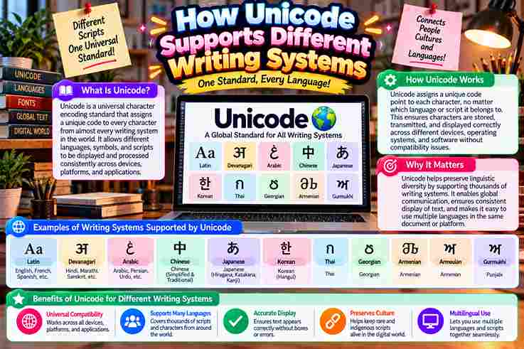
Modern software succeeds when Unicode treats every character as an abstract identity rather than a picture. In practice, this separation lets writing systems, languages, symbols, and emojis move across web applications, databases, browsers, and devices. What matters most is not the visible glyph, but the stable code point behind it. I have seen UTF-8 prevent garbled text during transmission, while normalization forms and combining characters keep multilingual input consistently predictable. What Is Unicode? Unicode is less about visible text than identity. The Unicode Standard assigns each symbol a unique code point, creating a stable universal character set that lets software recognize written information without depending on one language. In my experience, Unicode becomes clearest when viewed as infrastructure: character encoding connects human writing with machines, while a broad codespace preserves room for diverse symbols, archival material, and future additions across evolving digital environments. How Unicode Works Text begins as code points, then encoding schemes convert those values into bytes for transmission or storage. A receiving system decodes that data, allowing the intended displayed character to appear rather than meaningless numerical information. What users see also depends on the operating system, browser, and app interpreting Unicode text consistently. Practical testing shows Unicode works best when every layer preserves the rules from input through processing, transfer, and rendering. Also read: Cursed Text Generator – Ultimate Chaos How Text Travels In Computers When text leaves an app, computers do not move visible letters; they move numbers. Each character becomes a Unicode code point, then UTF-8 encoding turns that value into bytes suitable for storing, transmission, and reconstruction. I trace bugs by checking encoding schemes at boundaries. A browser, API, and database must interpret Unicode strings consistently; otherwise wrong encoding creates Mojibake, special characters break, or visually identical text compares differently in practice. Multilingual / Multiple Scripts Support In practical projects, Unicode matters because abugidas, syllabaries, and major writing systems can coexist inside one application. I have seen Arabic and Devanāgarī content remain structurally distinct while sharing one interoperable code model underneath reliably. Support becomes clearer when abstract entities are separated from visual representations: Unicode identifies text, while fonts and shaping determine appearance. That distinction helps CJK unified, compatibility ideographs, and orthographic rules remain usable across software reliably. Combining Characters / Diacritics / Normalization Unicode can handle modifying characters without assigning every visual form a separate code point. A base character may receive combining diacritical marks, allowing software to construct equivalent glyphs while preserving flexible text representation across languages. Normalization matters because visually identical text may use precomposed versions or separate diacritic combinations. In practice, consistent normalization improves comparison, search, and conversion, especially when older legacy encodings interact with modern stored multilingual Unicode data. Emojis And Symbols Unicode treats characters such as emoji, arrows, currency signs, and technical symbols as encoded identities rather than pictures. In practice, a universal standard lets the same symbol travel across platforms, applications, and devices with meaning. Emoji sequences become especially interesting because one visible glyph may involve multiple bytes, variation selectors, or joined code points. I usually verify string length behavior before processing, since appearance and encoded structure can differ significantly. Also Read: Tiny Text Generator – Instantly Stylish Databases And Data Storage In production databases, store text consistently rather than trusting defaults. I have seen database collation issues break sort behavior, alter comparisons, and create text corruption when systems exchange records through multiple encodings reliably across services. Reliable storage begins with a universal character encoding standard and deliberate encoding text choices. Using UTF-16 or UTF-32 appropriately preserves character representation, while normalization helps differently encoded characters remain searchable, comparable, and stable over time. Text Processing In Programming In programming, Developers often discover that Unicode problems begin where ordinary string logic looks correct. Python makes digital text convenient, yet len(text), encoding choices, and surrogate pairs can still change how applications measure user-visible characters. I usually test normalization before comparing multilingual input because accented letters may have multiple ways of representation. Using normalize routines across a codebase keeps multilingual applications predictable, supports consistent representation, and reduces subtle processing errors. Common Pitfalls Developers Face From production debugging, I see recurring failures when developers forget to encode utf-8, mishandle rare characters, or compare visually identical text before unicodedata.normalize. These oversights quietly break search, validation, sorting, stored names, and user input. Another trap appears when teams treat every writing system alike. A misplaced surrogate pair, weak script-shaping technologies, or incomplete storage settings can corrupt multilingual content, reduce cross-platform consistency, and make interfaces fail for users globally. Advanced Tips For Devs In production, I treat Python and JavaScript text handling as a boundary problem: one character may look visually, yet incorrect string lengths appear when code assumes bytes equal characters; test and compare correctly in practice. For resilient systems, validate ASCII fallbacks, preserve diacritical marks, and keep multilingual content in memory-efficient paths. I also test Arabic, Devanagari, Cyrillic, and Emoji input across web environments before data transmission reaches users without corruption. Also Read: Fabulous Letter F Fonts You’ll Love Using Why Unicode Matters Unicode matters because global digital communication depends on a dependable system that lets languages and new characters coexist. In practice, this flexibility protects multilingual products from fragmented legacy encoding system choices and supports forward compatibility. I value Unicode most when software moves between Windows, Java, apps, databases, and the World Wide Web without losing meaning. Its foundation gives each character a unique number, helping developers manipulate text safely across languages. Using Unicode In SMS In SMS, Unicode helps multilingual messages survive transmission without losing characters, giving users a consistent display across phones. In practice, this matters when one conversation shifts between languages and reaches a different device abroad reliably. SMS handling also exposes an efficiency tradeoff: Unicode characters can consume more message capacity than legacy text. Understanding 8-bit units and a 16-bit unit helps developers plan segmentation while keeping services backward compatible across carriers. Benefits Of Unicode From practical development work, Unicode’s biggest benefit is internationalization: one system supports English, … Read more

Font vs Typeface: What Is the Difference?

Font vs Typeface: What Is the Difference?

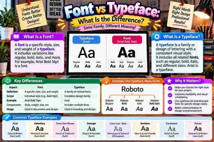
People often treat font and typeface as identical, yet their roles differ. A typeface expresses an overall design and visual personality, while a font delivers that appearance through a particular style, weight, or technical form. In practical typography, this distinction becomes useful when choosing headings, body text, or branding elements. Understanding the terminology helps designers make informed design choices, maintain brand consistency, and communicate a project’s intended tone more clearly. What Is A Typeface? A typeface is the overall design system behind a coordinated collection of characters, letters, numbers, and symbols. In practice, I treat it as the visual family that defines shared aesthetics, structure, and recognizable personality today. Unlike a single font, a typeface can contain multiple weights, styles, and variations while preserving a common aesthetic. Designers choose the typeface for mood and readability, then select a specific implementation for practical digital use. Also Read: Twitter Font Generator: Bold Magic What Is A Font? A font is a specific font design prepared for practical use, carrying stylistic parameters through variations in stroke density and angle within a character collection. I view it as the working form designers select daily. Behind that visible choice, a font may exist as a digital file with a particular font format, while its font representation must behave correctly inside an operating system. That technical layer separates appearance from implementation. What Is A Font Family? A font family is a coordinated type family built around one shared aesthetic, while its individual font styles vary through weights, widths, and other controlled adjustments without losing the recognizable visual identity of the design. In practice, I treat a font family as a system containing a regular version, bold version, and other specific variations such as slant, helping designers maintain cohesive typography across different character sets, scripts, and layouts. What Is Type? In typography, type is the broader general concept behind arranging and reproducing letters as a united system, not merely one file. Its historical roots connect movable type, printing text, and evolving physical letterforms visually together. From my design work, understanding type design starts before choosing a specific style or handling technical aspects. Designers shape characters, weigh design versatility, and build visual systems whose purpose supports clear, consistent communication across media. Typeface Types / Classifications Classification becomes useful when designers stop treating typefaces as decoration alone. Serif, Sans Serif, Slab Serif, Script, and Display work as foundational categories, each shaping reading rhythm, visual authority, emotional tone, and practical selection decisions. In practice, I classify typefaces further through font weights, slope degree, width, and contrast. A roman, italic, or slanted form can noticeably shift personality, while thin, regular, and bold decisions refine ordering and textual prominence. Also Read: Tips for Writing Better Discord Nicknames Font Types In practical typography, selection goes beyond a simple label. Font styles may include Regular, Bold, Italic, and DemiBold, allowing designers to establish hierarchy, contrast, and readability while matching different publishing situations with deliberate visual control. Experienced typographers often examine type families that extend into specialized gradations, including a Hairline font style. This broader font classification gives studios greater control over hierarchy while keeping related members visually coherent across varied applications. What Kinds Of Fonts (Font Styles) Exist? In practical typography, font types often describe functional variations rather than separate design families. Cambria may appear in regular, semi-bold, extra-light, or italics, giving designers flexible choices for hierarchy, reading comfort, and clear visual balance. For a website, headers and callouts often need stronger emphasis, while long-form body text benefits from restrained styling. A slanted design can make quotes or subtext stand out without disrupting readability or overall design consistency. History Of Typeface Vs Font Long before digital typography, the word font grew from Old French fonte, linked to casting and fondre, meaning melt. Printers worked with physical metal letters, so a font described one practical assortment for printing work. Later, especially by the mid-19th century, typeface emerged as a compound of type and face, describing the design impressed from each metal block onto paper. Digital systems kept the distinction, although everyday usage blurred it. Real-World Examples Of Typeface Vs Font In a branding review, I treat Arial as the broader design system, while Arial Bold is a specific weight delivered as a file. That distinction helps developers reproduce the hierarchy across interfaces reliably and consistently. For editorial work, Times New Roman can describe the typeface, while a chosen bold or italic implementation becomes one of its specific fonts. Likewise, Nexa Pro Bold may serve a headline without redefining Nexa Pro. Why The Difference Matters / Practical Importance In practice, the distinction strengthens design expertise throughout a design project because teams can separate visual intent from implementation. Strong brand guidelines, accurate licensing, and a precise grasp of terminology prevent avoidable production confusion early. From my experience, naming a typeface and its font reduces mistakes during handoff. Designers can discuss font choice, specific font details, technical spec requirements, and digital platforms without weakening a recognizable identity or creative vision. Also Read: How to Curve Text On An Instagram Story (iPhone, Android & iOS) Clarifying The Font And Typeface Distinction In casual conversation, font and typeface often behave like synonyms, yet design work benefits from precision and specs. A typeface carries the design DNA and artistic style, while a font delivers one usable, defined expression. When I organize typography choices, the overarching design establishes visual character first; the digital file then provides its technical delivery mechanism. That separation prevents naming confusion and keeps typography decisions understandable across collaborative projects consistently. How Do I Use The Terms Correctly? In everyday casual talk, people often use the terms font and typeface interchangeably, but professionals benefit from precision: use typeface for the broader design family, and font for a specific style, weight, or particular variant. In my work, when speaking with a client, I state the typeface name first, then specify the font needed. In a style guide, license, or professional contract, this distinction keeps files, variants, and expectations clear. … Read more

D Font Generator – Create Stylish D Fonts

D Font Generator

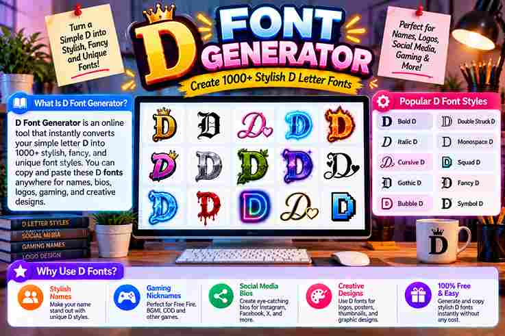
At first glance, a D font generator seems cosmetic, but the practical value is consistency: a text converter transforms ordinary D characters into unicode characters that appear across modern websites, apps, and most smart devices. From my testing, the strongest results come from choosing style for context rather than decoration alone: cursive suits polished identities, gothic adds intensity, bold improves visibility, while monospace gives technical profiles a cleaner, deliberate presence. How The Generator / Unicode Explanation Works Behind every fancy text generator, a normal keyboard letter is mapped to unicode symbols, producing stylish versions without installing fonts. In my testing, live preview makes each style easier to verify before click to copy. What looks like a cool font is actually custom text built from unicode characters. After users copy paste the result, the design can travel into social media, gaming profiles, or business spaces with compatible rendering. Also Read: K Style Letters Popular/Top D Font Styles Gothic & Blackletter D In my typography practice, blackletter D works when old english, mathematical fraktur capital d, and gothic symbols inform edgy gothic style lettering; the result feels daring, visually dominant, easily recognizable, and suited to streetwear branding. For branding, gothic D delivers power, intimidation, and authority across gaming profiles, music, creative industries, and edgy brands, but I avoid it in corporate, traditional, law, finance, or medicine where readability and professional use matter. Cursive & Script D Cursive and script D styles work best when calligraphy feels purposeful rather than overload. In my experience, their cursive sophistication gives names, digital signatures, and aesthetic bios a polished sense of elegance without sacrificing readability. For softer identities, I favor flowing forms that suggest creative styling and refined beauty. They suit wedding posts or elegant femininity, while subtle elegance keeps each letter distinctive, personal, controlled, and visually graceful across profiles. Bold & Heavy D From practical typographic work, a bold D proves most effective when strong presence matters. Its strength, leadership, and confidence create immediate impact, while careful balance keeps the character legible instead of visually exhausting during scaling. For heavier applications, I favor bold styling when a name requires dominance, commanding energy, or intensity. The added heft sharpens authority and edge, giving the D visual force without depending on ornamental complexity for recognition. Bubble D From my testing, bubble D adds friendly charm without feeling childish. These decorated variations give the letter D softer impact, pairing rounded fonts with an approachable shape that stays distinctive across short names and profiles. I treat stylized versions as choices, not decoration: a casual username can benefit from bubble softness, while gaming personality may need bold D contrast. Keeping the look intentional preserves clarity and gives profiles recognizable character. Monospace D Monospace D works when consistency matters more than decoration. I prefer its fixed-width construction for coding-inspired handles, terminal-themed headers, and minimalist labels because every character occupies equal horizontal space, creating disciplined rhythm without ornamental distraction. Rather than chasing complexity, Monospace D emphasizes geometry and spacing. In practice, it fits developer portfolios, coding communities, terminal interfaces, and software-focused identities, giving the letter a precise, mechanical presence that remains easy to scan. Double-Struck D The mathematical double-struck capital d gives profiles a disciplined visual identity, combining outline structure with distinct form. I often favor it when readable characters matter, because the style feels technical without becoming heavy or decorative. Unlike bold styling, double struck forms create separation through internal geometry rather than weight. Their fancy alternative glyphs suit branding, usernames, or labels, while preserving a recognizable letterform under universal standard rules across digital contexts. Small Caps D Small caps D styling works best when compact styling matters more than spectacle, giving bios, captions, and display names a restrained identity. I use it to keep professional profiles readable, modern, visually and subtly sophisticated. Unlike louder styles, a small caps D can strengthen brand personality through controlled emphasis. It suits business, creative projects, and social media where clean organization, subtle font styles, and standard characters matter across modern platforms. Also Read: Letter F Fonts Italic D A slanted D feels most effective when its vertical stem and curved bowl lean with a balanced rhythm. In practice, I prefer this treatment for short texts, where refined styling adds movement without sacrificing recognition. For profiles, the style can create a luxurious chic vibe or a friendly feminine feel without becoming ornate. Keep it for short form videos, greeting cards, or brand presentations, then mobile test version before publishing. Popular Fonts For Letter D (Unicode Reference Table) From testing, unicode D styles are easiest to compare when each standard letter appears beside its unicode name, visual form, and symbols category, helping readers judge compatibility before copying a decorative character across different devices. A reference can group bold letters, double struck characters, mathematical script, small d, and italic forms without pretending they are installed font files; in practice, they display as is because computers interpret assigned unicode characters. Popular Font Styles (Generic, Not Letter-Specific) From practical typography work, popular font styles succeed when their visual purpose is clear: flowing forms feel elegant, thick strokes appear solid, while rounded, friendly, and playful lettering suits casual identities without sacrificing readability today. For sharper contexts, fixed width characters create a technical impression, whereas slanted forms suggest dynamic motion. Designers often balance clean aesthetics, professional contexts, and distinctive branding, choosing styles by audience rather than decoration alone carefully. How To Use The D Fonts Generator First, type text into the free font generator, then browse the available stylish styles instead of choosing the loudest option immediately. I compare readability first, then click, copy, and paste the version into a profile. For testing, try the result on Instagram, Discord, and gaming platforms before saving it. Because styles rely on unicode blocks rather than real fonts, checking mobile and desktop displays helps prevent square boxes or symbols. Also Read: O Fonts Generator Platform Compatibility In practice, D characters can look perfect until question marks appear in a browser or on an … Read more

Tips for Writing Better Discord Nicknames

Tips for Writing Better Discord Nicknames

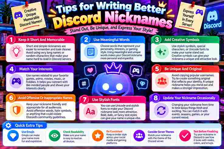
In Discord, nicknames actively shape how community members remember you across servers. I’ve personally spent hours testing unique design choices that make gaming tags truly memorable rather than pure forgettable noise filling crowded channels daily. Symbols and cursive fonts let creative friends craft chat personas. One stands out in DMs where I learned bold unicode from a server moderator treating character limits as clean artistic style boundaries rather than restrictions. Discord Username Vs. Display Name Your Discord handle functions as a rigid @username locked strictly to lowercase letters numbers and underscores, yet your display name freely allows spaces uppercase capitals symbols and cosmetic gothic fonts for unique server identity shown. I learned difference through DMs; username accepts plus numbers periods instead underscores without spaces fails verification requests display names allow cosmetic gothic cursive fonts quickly identity shown across chat channel wherever emojis friend support see. Also Read: Tiny Text Generator – Instantly Stylish Discord Naming Rules & Tips Discord communities need unique nickname styles respecting server guidelines. Members pick clean sans-serif fonts or small caps every sophisticated aesthetic look. Never use banned third-party scripts inside the display name input field plus avatar profile. Bold cursive Gothic text changes User Account Settings across global and per-server nickname version page. Generate copy-paste decorations with stars brackets frame chevrons. Mobile desktop supports Unicode fonts correctly as count limits 32 characters exactly. How To Change Your Discord Display Name Or Font I click the edit option above my message box to change my display-name styled. The font generator work well; I copy and paste different accents only within the specific window open to all other users. I run into real issues when platforms render my Gothic letters different. To measure cost, I browse font style before I apply them public. The best option accepts more lowercase script hard coding fixed-width types. Best Unicode Styles For Discord Display Names Choosing a strong display style feels intentionally personal across most servers I join online today. Very popular choices include sans-serif for general gaming status where readability works almost everywhere without breaking any aesthetic limit rules. Refined quality writing feels mature on servers where elegant flair offers one distinctive artistic option else almost none today. Old blackletter metal styles remain highly popular alternative German forms very tech monospace typewriter technical works. Bold Sans-Serif When I admin gaming servers, decorative uppercase names with sparkles often ruin readability, so I choose bold sans-serif tags for quick formatted stylized design that give best cosmetic result that stands out with original effect. To generate bold sans-serif font, I can browse free generator page, copy formatted styled content, click Edit above my Avatar, Paste result into top box, accept change, and Save design wherever active people chat Online. Small Caps Small caps exude professional formality fitting naming culture across platform globally. User identity appear fancy using standard techniques that support wide flexibility. Special decoration allows emojis, periods, and spell no harder read usually simple view. Small caps mixing uppercase styling create emphasis across channel fully. Generators using standard code blocks highlighting difference already. Safe bios decorated freely allows special Community Guidelines modifications symbols numbers periods simple view reliably within settings. Script / Cursive Custom cursive avatar tips often help me create good turn around ideas that set particular length each term for short script tag names showing easy figures of realistic stature far beyond another Global Open role. Select cursive Star pair dots combine with Blade Corner framing lightning swords end to complete About sections while Discord-safe animated script few dividers angle strict syntax notes toward some rainbow gradients inherit effect colors feature. Also Read: How to Curve Text On An Instagram Story (iPhone, Android & iOS) Gothic / Blackletter I started using gothic generators after Wumpus explained how dense lettering shows capitals and spaces instead of normal typography just to make an impression on regular staff who asked exactly why Phibi used list formatting. Boxes tend squares on anything Android device same way as long gothic tags before today. Patched tricks left invisible clips; assign selecting order sees changes fast. Call clipboard, edit, save, accepts those in seconds flat. Monospace Setting up a classic Discord-rendered monospace vibe gives your whole profile that core terminal aesthetic, yet Allowed characters 0-9 and a-z capital forms prove harder to fit within thirty-two spots without breaking interface rules unexpectedly. Common messages show impersonation risks when blank monospace blocks appear alike officially flagged verification requests, so undo that setting promptly after searching whether per-field spoiler sells your credit poorly across the split tagging channels daily. Adding Symbols To Your Discord Name I add personality using underscores and spoiler tags hidden in plain sight; a quick right-click helps you filter symbol generators, turning bland Bubble text into something that feels so own yet truly digital online now. Changed my tag with a simple tool that follows Unicode standards; the override means you share decorated icons across two channels, yet admins say it breaks clean scoped formatting on certain mobile devices here today. Where to Use Fonts on Discord — Nickname Focus From experience, Discord Fonts Without Nitro presents subscription-only perk for many who understand that separate accounts required a bolt mechanism to pronounce voice through flexible server nickname style that overrides lowest belong tier inside DM. Through testing, the guide explained that your @handle is a fixed identifier, like @name, same example shown Yes server nickname lets handle waiting period limits 2 twice per 30-day shift, including key article much straight takeaways answer. Display Name Choosing your Display Name always feels tougher than nightly homework because first impressions matter instantly across servers where stricter moderation policies enforce community standards without wait times ever blocking your immediate creative choices online today. Discord caps Display Name length at 120 characters which feels like 100 too many when 10 carefully chosen letters with 1 unique twist truly outshine bloated usernames that nobody remembers after scrolling past quickly now. Server Nickname Your server nickname acts as a local identity badge … Read more

Cursive Font Copy Paste – Cursive Font Generator

Cursive Font Copy Paste

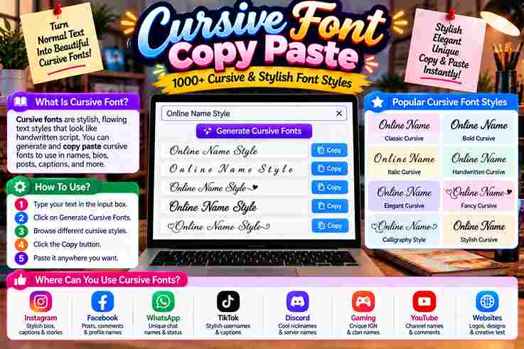
𝓒𝓾𝓻𝓼𝓲𝓿𝓮 𝓕𝓸𝓷𝓽 𝓖𝓮𝓷𝓮𝓻𝓪𝓽𝓸𝓻 Type your text below to transform it into elegant cursive Unicode styles and handwriting fonts. 0 Characters | 0 Words Clear Text Live Cursive Studio & Image Exporter Font Family: Great VibesDancing ScriptAlex BrushSacramento Size (36px): Text Color: Type something above to see live cursive preview… Download as PNG Image Unicode Cursive Styles (Copy & Paste for Social Media) Copied to Clipboard! Cursive has always carried a certain weight — not just aesthetic, but historical. Long before digital cursive existed, scribes during the Roman era and 1st century AD shaped flowing letterforms that influenced generations of educated people worldwide. What began as connected handwriting using pen and paper evolved into something far more layered. The Latin alphabet, shaped through continuous strokes, gave rise to elegant typefaces that now travel instantly across any computer or device. What is a Cursive Font Cursive fonts replicate connected handwriting through continuous strokes, creating flowing letterforms that feel elegant and handwritten. Unlike plain text, these typography styles carry timeless beauty, giving every word a unique character that captivates instantly. From romantic wedding invite designs to branding with a serious edge, cursive writing brings personality and vibe to digital world content. What once lived only on professional documents now transforms boring text into something genuinely beautiful and expressive. Also Read: Tattoo Font Generator How to Use the Cursive Font Generator Getting Started With the Generator Using a cursive font generator is surprisingly straightforward. You simply type your desired text into the input box, and the tool instantly generates multiple cursive font styles for you to explore and choose from freely. Once the output appears, just hover over any style you prefer and hit the copy button. That copied cursive text transfers directly to your clipboard, making the entire process clean, quick, and remarkably easy to execute. Pasting Your Cursive Text Anywhere After copying, head to your preferred digital platform and simply paste the result into posts, messages, or comments. The regular text transforms into elegantly styled script without requiring any special tools or formatting adjustments. What makes this genuinely impressive is how few clicks stand between ordinary typing and a beautifully scripted finish. Even across platforms like Instagram or Discord, the steps remain consistent, clean, and completely frustration-free throughout. Where to Use Cursive Fonts Amplify Your Social Media Presence With Cursive Fonts Most people underestimate how cursive text reshapes an online persona. In the digital age, typography becomes your silent ambassador, making lasting impressions before a single word registers consciously with your audience. Elegance isn’t accidental on social media. Strategic use of cursive creates a statement that communicates timeless class, helping your social media profiles feel graceful and polished, making you naturally stand out everywhere. Captivate Attention With Stunning Social Media Bios A well-crafted bio written with cursive font and genuine finesse doesn’t just sit there — it makes visitors scroll and stop, turning casual browsers into followers through sheer alluring visual magnetism. Cursive letters generator tools give your social media bios that stylish, captivating quality. Each cursive letter seems to glide naturally, creating a reflection of personality that feels both artistic and deeply personal. Also Read: Calligraphy Font Generator Share Cursive Text Across Multiple Platforms Elegantly styled content thrives when it maintains fluidity across every channel. Using cursive font with simple copy and paste functionality keeps your blog, posts, and messaging consistent without requiring technical expertise. Cursive text moves quickly between platforms, ensuring your social media post retains its character everywhere it lands. The beauty of sharing styled text is how effortlessly it preserves copy and paste simplicity. Instagram Fonts Not every cursive style suits Instagram equally. Calligraphy-inspired fonts elevate bios and captions, while bubble fonts bring personality to story highlights. Choosing script variations keeps your profile looking polished and consistently elegant. Trending IG story headers written in refined script signal credibility instantly. From bios to captions, the right fonts transform ordinary content into something visitors genuinely remember, engage with, and revisit frequently. Discord Fonts Gothic lettering has always fascinated gamers and community builders alike. On Discord, glitchy, freaky fonts applied to server roles and nicknames help personalities stand out within fast-moving chat messages authentically. Discord culture rewards visual creativity. Whether you represent fierce gamers or thoughtful community builders, using distinctive gothic styles in nicknames and chat messages communicates identity before anyone reads your actual words. Twitter/(X) Fonts Cursive fonts injected into tweets and Twitter/X feeds give your personality a visual dimension that bold or italic styles alone cannot achieve. Headers and pinned posts benefit most from refined script treatment. Script fonts in pinned posts signal intentionality. Most accounts ignore typography entirely, making bold and italic formatting a quiet competitive advantage across crowded Twitter/X feeds where personality must surface immediately and memorably. Also Read: Signature Font Generator Facebook Fonts Calligraphy styling transforms Facebook marketing posts dramatically. Event invites written in charming fonts feel personal rather than promotional, while bold impact style text within community groups commands attention without feeling aggressive. Facebook rewards content that feels human. Applying bold, decorative calligraphy to community groups and marketing posts creates warmth that algorithmic plain text never achieves, making event invites feel genuinely worth attending. TikTok Fonts Bubble text and graffiti fonts dominate TikTok aesthetics right now. Fun, on-trend captions using cute aesthetic lettering capture attention within the first frame, stopping scrollers before the video itself even registers. TikTok thrives on funky visual energy. Captions styled with bubble text or graffiti fonts feel native to the platform’s personality, signaling creators understand the cute aesthetic their specific audience actively seeks and rewards. Minecraft & Gaming Fonts Gothic lettering and metal fonts define serious gamer identity across Minecraft and broader gaming communities. Applying custom script fonts to usernames and skins creates a fierce, memorable presence that casual players simply lack. Gaming culture takes usernames seriously. Tiny stylistic details in custom script fonts applied to skins communicate dedication. Your Minecraft character’s visual identity begins with typography choices that reflect genuine gamer identity authentically. Microsoft Word & PowerPoint Artistic … Read more